
pROCパッケージの使い方
まず、pROCパッケージを使用してROC曲線を作成し、AUCを計算する例を示します。
# パッケージのインストールと読み込み
install.packages("pROC")
library(pROC)
# サンプルデータの読み込み
data(aSAH)
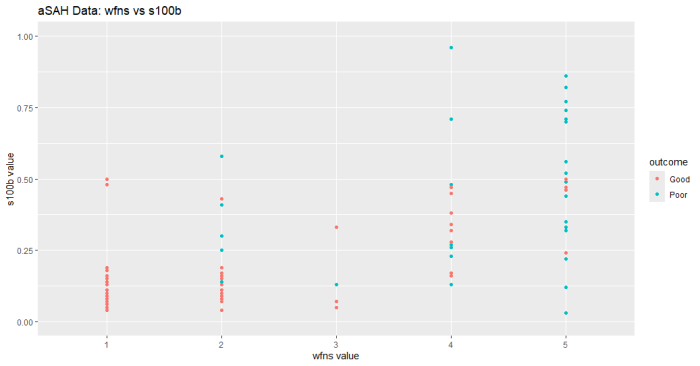
# 散布図の作成 データの外観を確認する
ggplot(aSAH, aes(x=wfns, y=s100b, color=outcome)) +
geom_point() +
labs(title="aSAH Data: wfns vs s100b",
x="wfns value",
y="s100b value")+
scale_y_continuous(limits = c(0, 1))
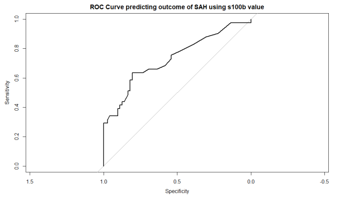
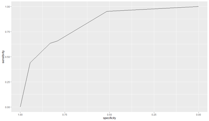
# ROC曲線の作成 s100b血清値でSAHの予後予測する設定
roc_obj <- roc(aSAH$outcome, aSAH$s100b)
# ROC曲線のプロット
plot(roc_obj, main="ROC Curve predicting outcome of SAH using s100b value")
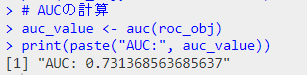
# AUCの計算
auc_value <- auc(roc_obj)
print(paste("AUC:", auc_value))
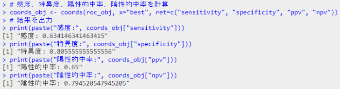
# 感度、特異度、陽性的中率、陰性的中率を計算
coords_obj <- coords(roc_obj, x="best", ret=c("sensitivity", "specificity", "ppv", "npv"))
# 結果を出力
print(paste("感度:", coords_obj["sensitivity"]))
print(paste("特異度:", coords_obj["specificity"]))
print(paste("陽性的中率:", coords_obj["ppv"]))
print(paste("陰性的中率:", coords_obj["npv"]))
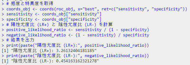
# 尤度比を算出、その前に改めて感度と特異度を取得
coords_obj <- coords(roc_obj, x="best", ret=c("sensitivity", "specificity"))
sensitivity <- coords_obj["sensitivity"]
specificity <- coords_obj["specificity"]
# 陽性尤度比 (LR+) と 陰性尤度比 (LR-) を計算
positive_likelihood_ratio <- sensitivity / (1 - specificity)
negative_likelihood_ratio <- (1 - sensitivity) / specificity
# 結果を出力
print(paste("陽性尤度比 (LR+):", positive_likelihood_ratio))
print(paste("陰性尤度比 (LR-):", negative_likelihood_ratio))
aSAHデータ(一部)

データの概観
plot出力
AUCの計算
s100bでoutcomeを予測する予後予測の性能としての計算
感度・特異度・陽性的中率・陰性的中率
陽性尤度比・陰性尤度比
小技
このパッケージ、パイプを使うと、だいぶシンプルで見やすくなります
ここでは予測に上述のs100bの代わりにwfnsを使用してみました
data(aSAH)

library(dplyr) #パイプを使用するためにパッケージを使用

roc2.1 <- aSAH %>% roc(outcome, wfns)
ggroc(roc2.1)
RのpROCパッケージの主な関数
| 関数名 | 説明 | 使用例 |
|---|---|---|
roc() | ROC曲線を作成 | roc(response, predictor) |
plot() | ROC曲線を描画 | plot(roc_object) |
auc() | ROC曲線のAUCを計算 | auc(roc_object) |
ci() | ROC曲線の信頼区間を計算 | ci(roc_object) |
coords() | ROC曲線上の特定の点の座標を取得 | coords(roc_object, "best") |
ggroc() | ggplot2を使用してROC曲線を描画 | ggroc(roc_object) |
roc.test() | ROC曲線の統計的な比較 | roc.test(roc_object1, roc_object2) |
smooth() | ROC曲線を平滑化 | smooth(roc_object) |
var() | ROC曲線のAUCの分散を計算 | var(roc_object) |
ROCRパッケージの使い方
次に、ROCRパッケージを使用してROC曲線を作成し、パフォーマンスを評価する例を示します。
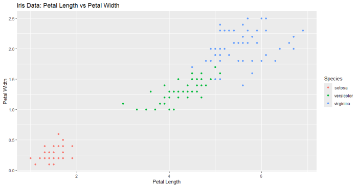
その前にiris データをプロット。ここではPetalLengthが5以上でvirginicaと判断する予測方法のパフォーマンスを調べるようにします
# 基本パッケージの読み込み
library(ggplot2)

# irisデータセットの読み込み
data(iris)

# 散布図の作成
ggplot(iris, aes(x=Petal.Length, y=Petal.Width, color=Species)) +
  geom_point() +
  labs(title="Iris Data: Petal Length vs Petal Width",
       x="Petal Length",
       y="Petal Width")
# パッケージのインストールと読み込み
# install.packages("ROCR")
library(ROCR)
# irisデータセットの読み込み
data(iris)
# 二値分類のためのデータ準備
iris_binary <- iris
iris_binary$Species <- ifelse(iris$Species == "virginica", 1, 0)
# 予測値としてPetal.Lengthを使用し、閾値5で二値化
predictions <- ifelse(iris_binary$Petal.Length >= 5, TRUE, FALSE)
labels <- iris_binary$Species
# Predictionオブジェクトの作成
pred <- prediction(as.numeric(predictions), labels)
# パフォーマンスオブジェクトの作成
perf <- performance(pred, measure = "tpr", x.measure = "fpr")
# ROC曲線のプロット
plot(perf, main="ROC Curve with Petal Width Threshold")
# AUCの計算
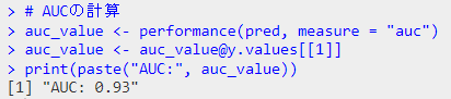
auc_value <- performance(pred, measure = "auc")
auc_value <- auc_value@y.values[[1]]
print(paste("AUC:", auc_value))
結果のプロット
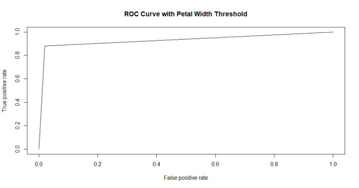
結果が奇麗すぎ(データのプロット見たらわかるように、一つの変数で種をきれいに分離できますからね)