ざっくり何について書かれているのかを把握しやすいようなマインドマップにまとめてみました。情報の抽出にはCopilotを使用しました。ところどころおかしなところがあるのは把握しています。気が向いたら修正したいとは思っていますが、とりあえず、そのまま掲載しています。どこの項に知りたいことが書かれているのかを探す向きにはこういうまとめも有用だろうと思います。実務に重要なポイントは元の文章を確認する必要があります。
もとになったのは平成29年版
Q&A 長いので2つのパートに分割しました


ざっくり何について書かれているのかを把握しやすいようなマインドマップにまとめてみました。情報の抽出にはCopilotを使用しました。ところどころおかしなところがあるのは把握しています。気が向いたら修正したいとは思っていますが、とりあえず、そのまま掲載しています。どこの項に知りたいことが書かれているのかを探す向きにはこういうまとめも有用だろうと思います。実務に重要なポイントは元の文章を確認する必要があります。
もとになったのは令和6年3月27日一部改訂版

What are the molecular targeted drugs for cancers with BRCA1 and BRCA2 gene mutations?
BRCA1およびBRCA2遺伝子変異を持つがんに対する分子標的薬で注目されているのはPARP阻害剤(PARPi)です。現在、FDAに承認されているPARPiは4種類あり、これらはBRCA1/2欠損がんの治療に利用されています(Ragupathi et al., 2023)。
最初に承認されたPARPiであるオラパリブは、BRCA変異を持つ卵巣がん患者の治療において非常に有望な結果を示しています(Venkitaraman, 2009; Tangutoori et al., 2015)。PARPiは、がん細胞のゲノム不安定性を利用してDNA損傷応答を標的とし、従来の化学療法と比較してより腫瘍細胞選択的なアプローチを提供します(O’Connor, 2015)。
PARPiの細胞毒性は、BRCA1/2変異腫瘍の複製が困難なゲノム領域に過剰な複製ストレスを誘導することによると考えられています(Ragupathi et al., 2023)。現在進行中の研究では、PARPiと免疫チェックポイント阻害薬を組み合わせて臨床結果を向上させる方法が探求されています(Ragupathi et al., 2023)。さらに、PARPiは他のさまざまながんタイプに対しても、単独療法および他の治療法との併用療法としての利用が検討されています(Tangutoori et al., 2015)。
このように、PARP阻害剤はBRCA1/2遺伝子変異を持つがん患者にとって新たな希望となる治療法であり、今後の研究と臨床応用が期待されています。
Molecular targeted drugs for cancers with BRCA1 and BRCA2 gene mutations primarily focus on PARP inhibitors (PARPi). Four FDA-approved PARPi are currently available for treating BRCA1/2-deficient cancers (Ragupathi et al., 2023). Olaparib, the first approved PARPi, has shown promise in treating ovarian cancer patients with BRCA mutations (Venkitaraman, 2009; Tangutoori et al., 2015). PARPi exploit the genomic instability of cancer cells by targeting the DNA damage response, offering a more selective approach compared to traditional chemotherapy (O’Connor, 2015). The cytotoxic effect of PARPi is believed to result from inducing excessive replication stress in difficult-to-replicate genomic regions of BRCA1/2 mutated tumors (Ragupathi et al., 2023). Ongoing research explores combining PARPi with immuno-oncology drugs to enhance clinical outcomes (Ragupathi et al., 2023). Additionally, PARPi are being investigated for use in various other cancer types, both as monotherapies and in combination with other treatments (Tangutoori et al., 2015).
References
O’Connor, M. J. (2015). Targeting the DNA Damage Response in Cancer. 60(4), 547–560. https://doi.org/10.1016/j.molcel.2015.10.040
Ragupathi, A., Singh, M., Perez, A. M., & Zhang, D. (2023). Targeting the BRCA1/2 deficient cancer with PARP inhibitors: Clinical outcomes and mechanistic insights. 11, 1133472. https://doi.org/10.3389/fcell.2023.1133472
Tangutoori, S., Baldwin, P., & Sridhar, S. (2015). PARP inhibitors: A new era of targeted therapy. 81(1), 5–9. https://doi.org/10.1016/j.maturitas.2015.01.015
Venkitaraman, A. R. (2009). Targeting the molecular defect in BRCA-deficient tumors for cancer therapy. 16(2), 89–90. https://doi.org/10.1016/j.ccr.2009.07.011
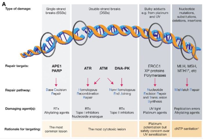
図の解説:PARP(ポリ(ADP-リボース)ポリメラーゼ)は、主に一重鎖DNA切断(single-strand breaks, SSB)の修復に関与しています。具体的には、以下のようなDNAダメージを修復します:
PARPは、これらの損傷を修復することで、細胞のゲノム安定性を維持し、細胞の生存を助けます。しかし、BRCA1やBRCA2遺伝子に変異がある場合、これらの修復経路が正常に機能しないため、PARP阻害剤(PARPi)はこれらのがん細胞に対して特に効果的です。PARPiはPARPの機能を阻害することで、がん細胞に蓄積するDNA損傷を増加させ、最終的にがん細胞の死を誘導します。
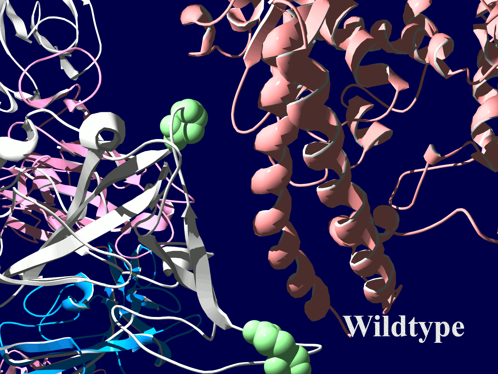
PARP分子と、Olaparibの結合を結晶構造で眺めてみました。この構造だと、PARPたんぱく質に結合したOlaparibは分子の中に深く埋もれているように見えます。(結合した後にたんぱく質の構造変化が起きる?)緑色の分子がolaparibで、それ以外が human PARPのcatalytic domain。下図は下記文献のデータを基にわたくしが作図しました。
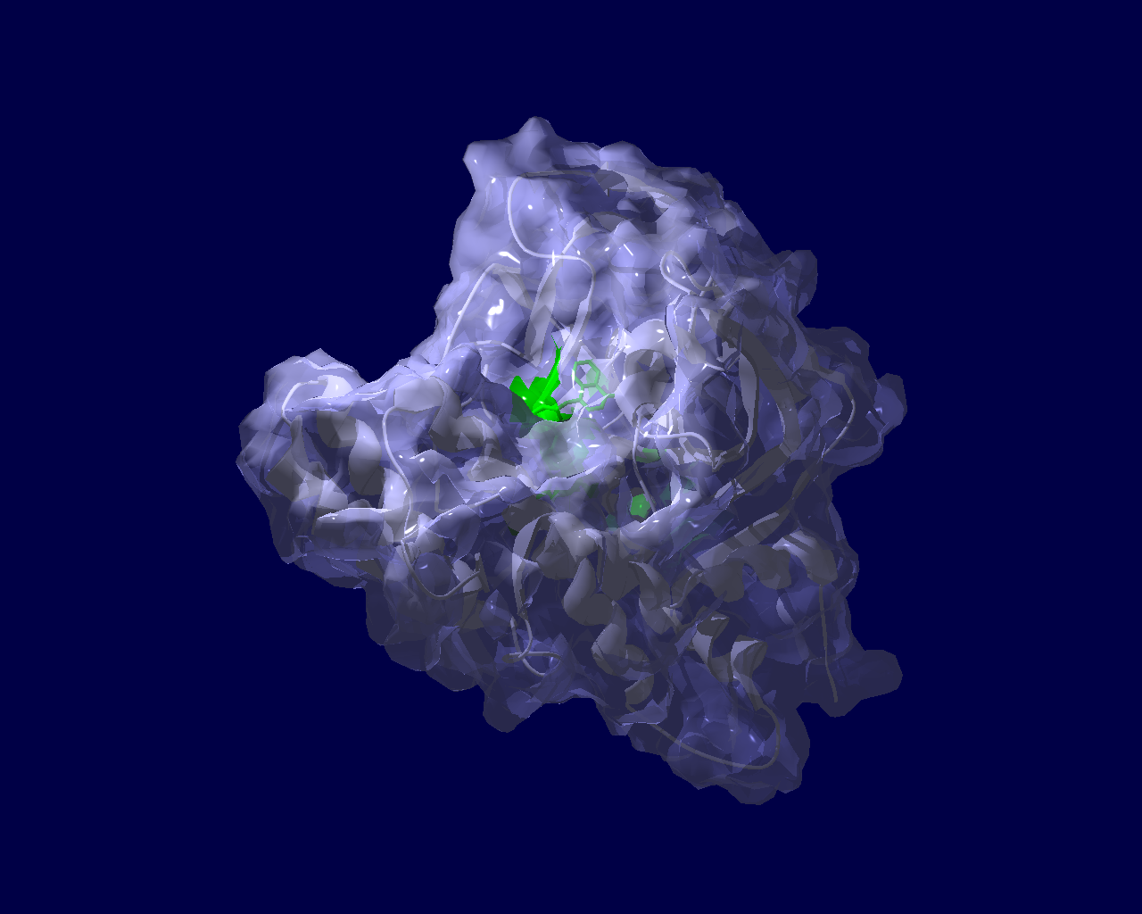
Ogden, T. E. H., Yang, J.-C., Schimpl, M., Easton, L. E., Underwood, E., Rawlins, P. B., McCauley, M. M., Langelier, M.-F., Pascal, J. M., Embrey, K. J., & Neuhaus, D. (2021). Dynamics of the HD regulatory subdomain of PARP-1; substrate access and allostery in PARP activation and inhibition. 49(4), 2266–2288.
https://doi.org/10.1093/nar/gkab020
アイキャッチ画像のような図を論文で見ていて、どうやって描いたもので何を意味するのか自分でもとデータから図を描きつつ見方を学ぼうという事で書籍を開きながら試してみました。その時のチョコっとした学びを書き留めた備忘録です。
#初心者によるやってみた系の記事
参考にしたのは「ゼロから実践する 遺伝統計学セミナー〜疾患とゲノムを結びつける」という本です。参考というか、このホームページに書いていることは、この本に書かれていることをたどっただけです。書籍にはCGYWINのインストール、plinkの使い方から、マンハッタンプロットまで丁寧に書かれていますので、この書籍を読めば私のホームページは見る価値があまりないかもしれません。
ここで、今回使用したRのスクリプトを掲載しようと思っていたのですが、そのスクリプトというのが上記書籍を購入したらダウンロードできるというデータの中にあるスクリプトで、ごくわずか変更(ファイル格納ディレクトリやデータファイル名を変更)した程度なので、さすがに掲載したらまずそうだと思いとどまり、別の例で示します。
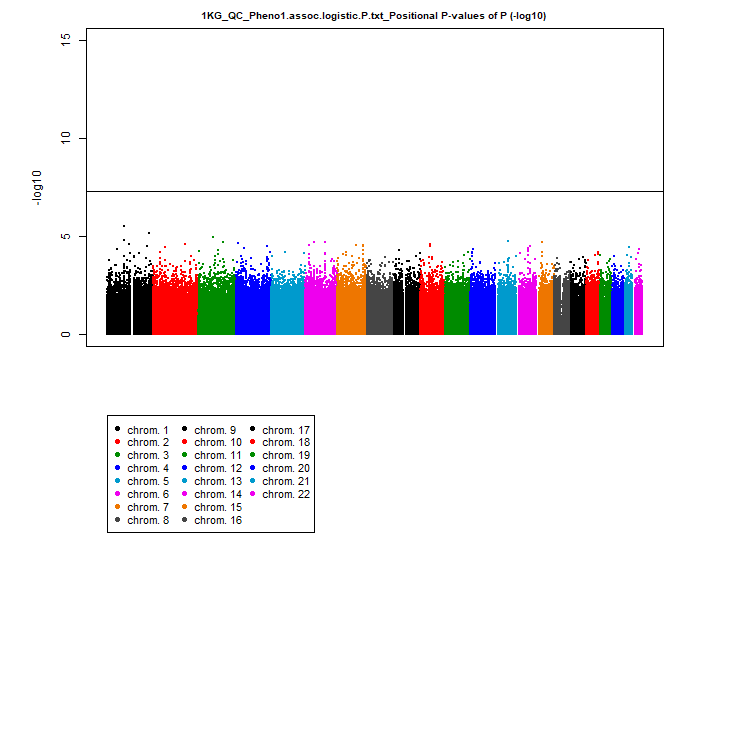
CRANから、Rのパッケージqqmanをインストールしてあるとして次になります。
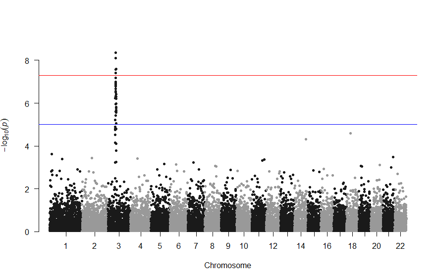
library(qqman)
manhattan(gwasResults, chr="CHR", bp="BP", snp="SNP", p="P" )
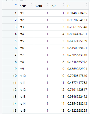
gwasResultsはパッケージqqman付属のデータで、次のようにSNPの名称・染色体・位置・表現型と当該SNPとの関連性がないと仮定した場合の確率P値の4項目のデータが16470行続きます。
で、このスクリプトの結果は次の図のようになります。
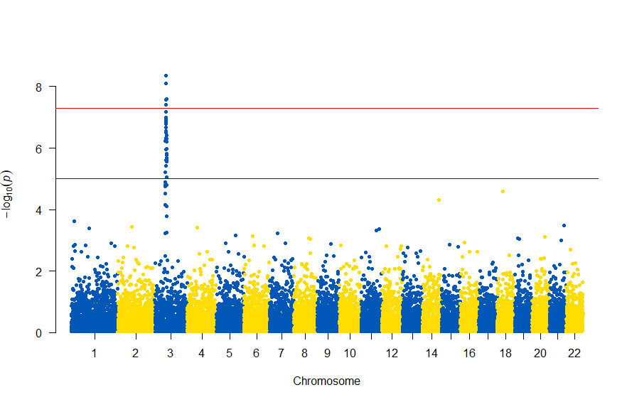
色が寂しいので、同じデータでウクライナを思わせるカラーで表現すると
# Load the library
library(qqman)

# Make the Manhattan plot on the gwasResults dataset
manhattan(gwasResults, chr="CHR", bp="BP", snp="SNP", p="P",  col = c("#0057B7", "#FFDD00"))
次のようになります
図の中のSNPを表示するには , annotatePval = 0.01 を追加します
# Load the library
library(qqman)

# Make the Manhattan plot on the gwasResults dataset
manhattan(gwasResults, chr="CHR", bp="BP", snp="SNP", p="P",  col = c("#0057B7", "#FFDD00"), annotatePval = 0.01)
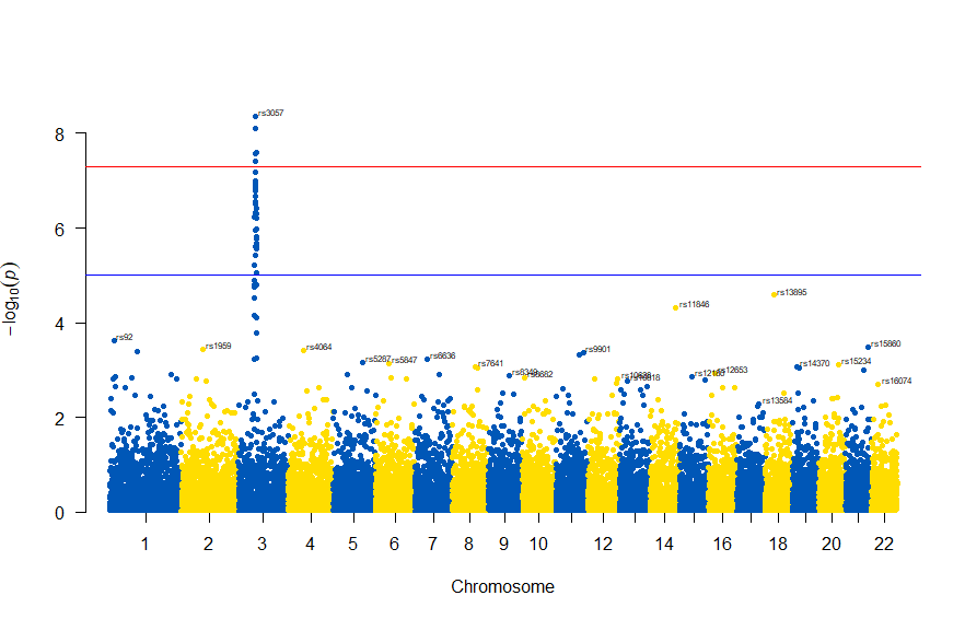
3番染色体の集中していくつものSNPが高い-log10(p)値を示すのに頂上の変異しか名前が表示されないので annotateTop = FALSE というオプションをつけてみました。
# Load the library
library(qqman)

# Make the Manhattan plot on the gwasResults dataset
manhattan(subset(gwasResults, CHR == 3), chr="CHR", bp="BP", snp="SNP", p="P"
          ,  col = c("#0057B7", "#FFDD00"), annotatePval = 0.001
          , annotateTop = FALSE, main = "Chr 3")
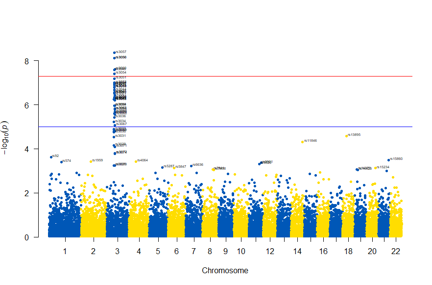
3番目の染色体に関連のありそうなSNPが集中しているようなので3番目のsubsetを表示してみます。肝は subset(gwasResults, CHR ==3) の個所です。
# Load the library
library(qqman)

# Make the Manhattan plot on the gwasResults dataset
manhattan(subset(gwasResults, CHR == 3), chr="CHR", bp="BP", snp="SNP", p="P"
          ,  col = c("#0057B7", "#FFDD00"), annotatePval = 0.001
          , annotateTop = FALSE, main = "Chr 3")
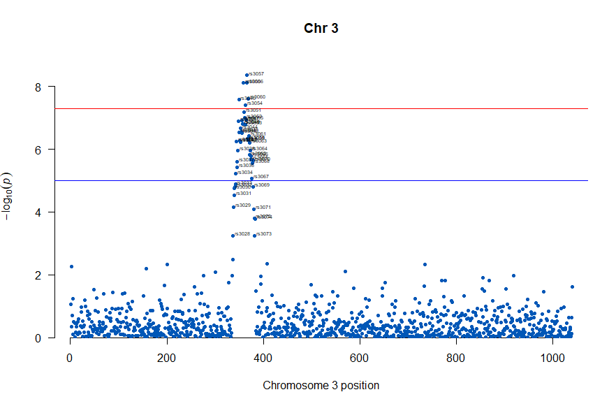
気になるあたりをもう少し拡大します
# Load the library
library(qqman)

# Make the Manhattan plot on the gwasResults dataset
manhattan(subset(gwasResults, CHR == 3), chr="CHR", bp="BP", snp="SNP", p="P"
          ,  col = c("#0057B7", "#FFDD00"), annotatePval = 0.001
          , annotateTop = FALSE, main = "Chr 3", xlim = c(200,500))
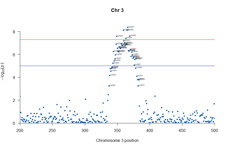
上記の作図は単純で、各Chromosome上のそれぞれの位置でp値をプロットしただけのものなので、結局はp値を計算して大きな外れ値(-> association)を示す位置を目視で確認しやすくしたものだという事がわかりました。
肝となるのはp値の計算になります。それでは、p値をどうやって計算していたかというと、複数人のSNPのデータと、それぞれのサンプル(の人)の興味のある表現型のデータを用いて表現型と無関係なSNPか表現型とassociateしているSNPかを計算しています。
plink.exe (windows用)がインストールされていて、冒頭の書籍の付録のファイル 1KG_EUR_QC.bed, 1KG_EUR_QC.bim, 1KG_EUR_QC.fam とかのデータがあったとして、コマンドプロンプトで次を実施しました。
plink.exe --bfile 1KG_EUR_QC --out 1KG_QC_Pheno1 --pheno phenotype1.txt --logistic --ci 0.95
上記で作成されるファイルから、p値等のデータを抽出するのにawkを使いました。awkを使うのに、MacOSだとawkはデフォルトで入っているのですが、今回はwindowsを使いましたのでCYGWINで実行しました。
awk '{print $2"\t"($1*100000000000+$3)"\t"$12}' 1KG_QC_Pheno1.assoc.logistic > 1KG_QC_Pheno1.assoc.logistic.P.txt
この出力で生成される 1KG_QC_Pheno1.assoc.logistic.P.txt ファイルを上の方で記したRスクリプトのインプットとすることで、マンハッタンプロットを描くことができました。
さらなる練習用という事で「心筋梗塞1666症例および対照健常者3198名のGWAS」データが公開されており、使用についての制限がないためこちらのデータで試してみました。
(制限がない=NBDC非制限公開データとは、アクセスに制限を設けることなく、誰でも利用することが可能な公開データです。)
次のサイトからダウンロードしました。
https://humandbs.biosciencedbc.jp/
「ゼロから実践する 遺伝統計学セミナー〜疾患とゲノムを結びつける」に従った例でawkで行っっていた、行の抽出の部分はをsqlで行いました。
好みの問題かもしれませんが、windowsでlinux emulatorみたいなのを稼働させてawk走らせるより、Microsoft AccessのSQLで抽出するのが素直に開発しやすいと感じました。
SELECT Release_L12vsUniv06_AllSample.[#SNPID] AS SNP, Release_L12vsUniv06_AllSample.chr AS chr, Release_L12vsUniv06_AllSample.chrloc AS location, Release_L12vsUniv06_AllSample.ptrend AS p INTO [0010 GWAS_results]
FROM Release_L12vsUniv06_AllSample;
で作図は次のようにしました。
library(readxl)
library(qqman)
GWAS_results <- read_excel("0010 GWAS_results.xlsx")
manhattan(GWAS_results, chr="chr", bp="location", snp="SNP", p="p"
, col = c("#0057B7", "#FFDD00"), annotatePval = 0.00001
, annotateTop = FALSE)
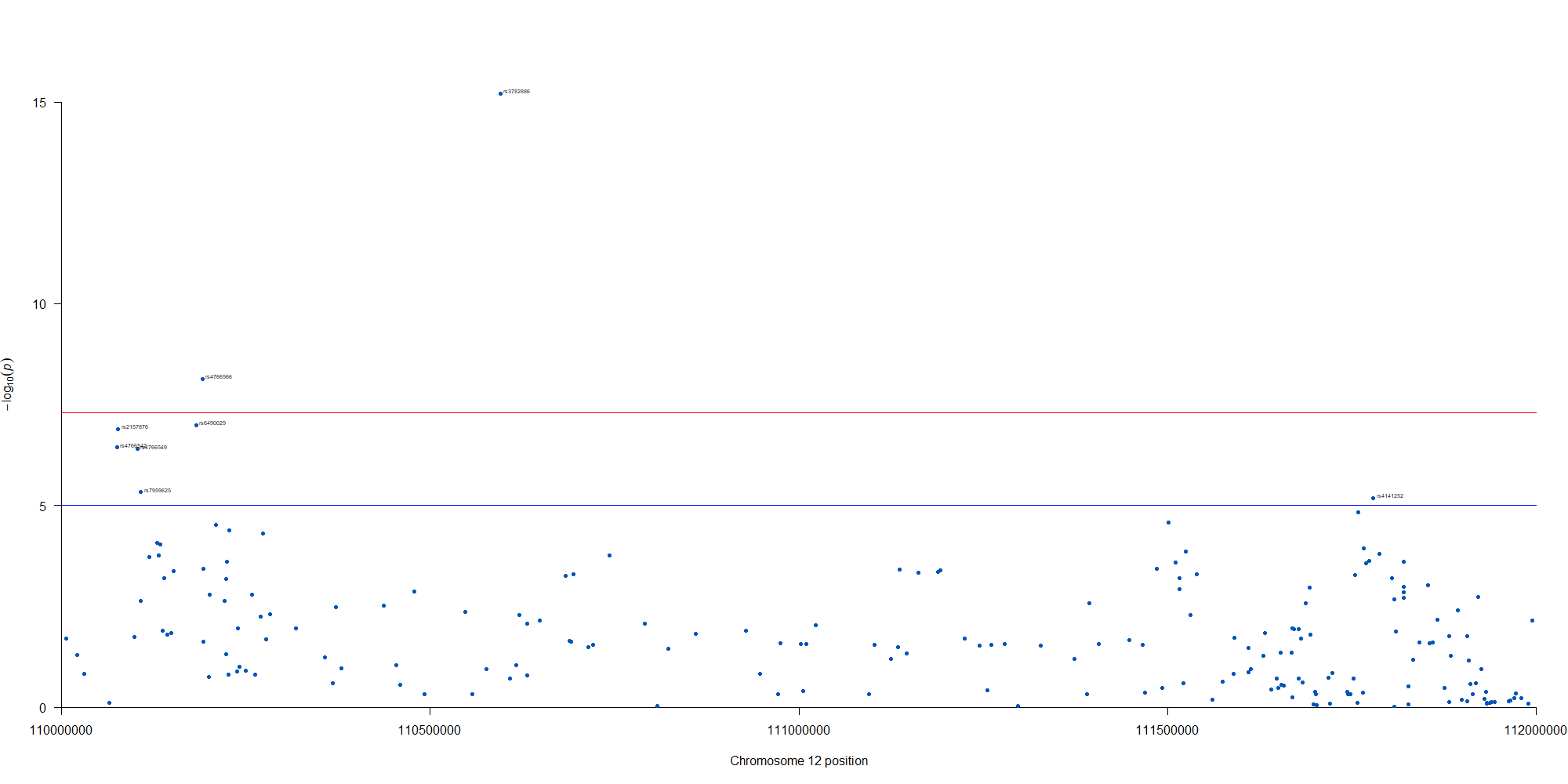
manhattan(subset(GWAS_results, chr == 12), chr="chr", bp="location", snp="SNP", p="p"
, col = c("#0057B7", "#FFDD00"), annotatePval = 0.00001
, annotateTop = FALSE, xlim = c(1.1e+8, 1.12e+08))
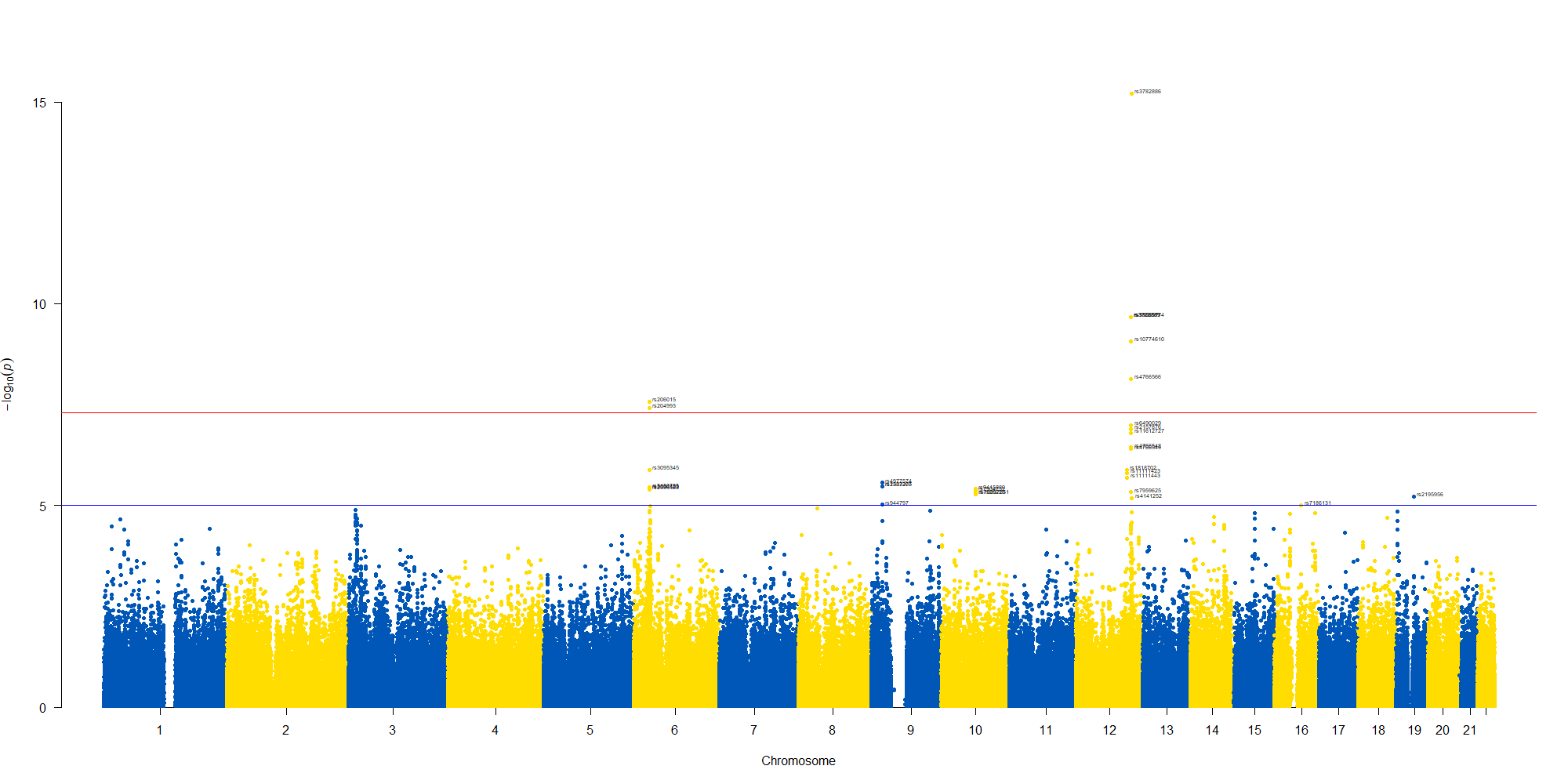
12番染色体の3’側に不均衡が集中している様なのでそのあたりを拡大したりしました。
2021.11.26 WHOがCOVID-19の原因ウイルスであるSARS-CoV-2の新規の変異(B.1.1.529)を評価するために、アドバイザリーグループ(The Technical Advisory Group on SARS-CoV-2 Virus Evolution (TAG-VE))を開催しました。
南アフリカの最近の感染拡大と、B.1.1.529の検出の増加がcoinciding (一致している?)していて、予備的な検証ではこのバリアントによる再感染のリスクが高いことが示唆されているそうです。
現在のSARS-CoV-2PCR診断では、引き続きこの変異体が検出されます。いくつかの研究室で、広く使用されている1つのPCRテストでは、3つのターゲット遺伝子の1つが検出されない(S遺伝子ドロップアウトまたはS遺伝子ターゲット障害と呼ばれる)ため、シーケンスの確認が完了するまで、このテストをこのバリアントのマーカーとして使用できることが示されています。このアプローチを使用すると、このバリアントは以前の感染の急増よりも速い速度で検出されており、このバリアントが感染拡大にアドバンテージを持っている可能性があることを示唆しています。
アルファベット順で ν(ニュー)とξ(クサイ)をスキップしてのο(オミクロン)だそうです。習という中国で多い名前や英語の単語のnewを避けるためだそうです。
> avoid confusion with the English word “new” and the common Chinese surname Xi
B.1.1.529は多くの変異を示します。(下図はwiki pediaから)多くの箇所に変異が検出されます。
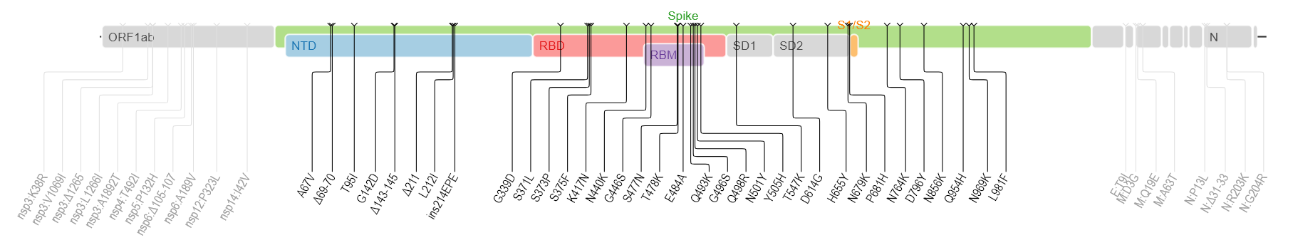
spike蛋白のアミノ酸残基にかかる変異だけでも以下のものが含まれるそうです。
A67V, Δ69-70, T95I, G142D, Δ143-145, Δ211, L212I, ins214EPE, G339D, S371L, S373P, S375F, K417N, N440K, G446S, S477N, T478K, E484A, Q493K, G496S, Q498R, N501Y, Y505H, T547K, D614G, H655Y, N679K, P681H, N764K, D796Y, N856K, Q954H, N969K, L981F
どう、料理したら良いかなぁ
新型コロナウイルス肺炎COVID-19の原因ウイルスである、SARS-CoV-2ウイルスのSpikeタンパク質のアミノ酸配列についてみてみました。一般にウイルスで変異のない株を野生型と呼びます。野生型のタンパク質のアミノ酸残基の配列を見ると、484番目のアミノ酸残基がE(Glutamic Acid, Glu)で、501番目のアミノ酸残基はN(Asparagine, Asn)です。
ちなみに変異の書き方ですが、この484番目のEがK(Lysine, Lys)に変異した場合E484Kと表記します。同様に501番目のNがY(Tyrosine, Tyr)に変異した場合にN501Yと表記します。
LOCUS       QOS45029                1273 aa            linear   SYN 28-OCT-2020
DEFINITION  SARS-CoV-2 spike [synthetic construct].
ACCESSION   QOS45029
VERSION     QOS45029.1
DBSOURCE    accession MW036243.1
KEYWORDS    .
SOURCE      synthetic construct
  ORGANISM  synthetic construct
            other sequences; artificial sequences.
REFERENCE   1  (residues 1 to 1273)
  AUTHORS   Wussow,F., Chiuppesi,F. and Diamond,D.
  TITLE     Development of a Multi-Antigenic SARS-CoV-2 Vaccine Using a
            Synthetic Poxvirus Platform
  JOURNAL   Unpublished
REFERENCE   2  (residues 1 to 1273)
  AUTHORS   Wussow,F., Chiuppesi,F. and Diamond,D.
  TITLE     Direct Submission
  JOURNAL   Submitted (23-SEP-2020) Hematology, City of Hope, 1500 E Duarte Rd,
            Duarte, CA 91010, USA
FEATURES             Location/Qualifiers
     source          1..1273
                     /organism="synthetic construct"
                     /db_xref="taxon:32630"
                     /clone="C35/41"
     Protein         1..1273
                     /product="SARS-CoV-2 spike"
     CDS             1..1273
                     /coded_by="MW036243.1:145058..148879"
                     /transl_table=11
ORIGIN
        1 mfvflvllpl vssqcvnltt rtqlppaytn sftrgvyypd kvfrssvlhs tqdlflpffs
       61 nvtwfhaihv sgtngtkrfd npvlpfndgv yfasteksni irgwifgttl dsktqslliv
      121 nnatnvvikv cefqfcndpf lgvyyhknnk swmesefrvy ssannctfey vsqpflmdle
      181 gkqgnfknlr efvfknidgy fkiyskhtpi nlvrdlpqgf saleplvdlp iginitrfqt
      241 llalhrsylt pgdsssgwta gaaayyvgyl qprtfllkyn engtitdavd caldplsetk
      301 ctlksftvek giyqtsnfrv qptesivrfp nitnlcpfge vfnatrfasv yawnrkrisn
      361 cvadysvlyn sasfstfkcy gvsptklndl cftnvyadsf virgdevrqi apgqtgkiad
      421 ynyklpddft gcviawnsnn ldskvggnyn ylyrlfrksn lkpferdist eiyqagstpc
      481 ngvEgfncyf plqsygfqpt Ngvgyqpyrv vvlsfellha patvcgpkks tnlvknkcvn
      541 fnfngltgtg vltesnkkfl pfqqfgrdia dttdavrdpq tleilditpc sfggvsvitp
      601 gtntsnqvav lyqdvnctev pvaihadqlt ptwrvystgs nvfqtragcl igaehvnnsy
      661 ecdipigagi casyqtqtns prrarsvasq siiaytmslg aensvaysnn siaiptnfti
      721 svtteilpvs mtktsvdctm yicgdstecs nlllqygsfc tqlnraltgi aveqdkntqe
      781 vfaqvkqiyk tppikdfggf nfsqilpdps kpskrsfied llfnkvtlad agfikqygdc
      841 lgdiaardli caqkfngltv lpplltdemi aqytsallag titsgwtfga gaalqipfam
      901 qmayrfngig vtqnvlyenq klianqfnsa igkiqdslss tasalgklqd vvnqnaqaln
      961 tlvkqlssnf gaissvlndi lsrldkveae vqidrlitgr lqslqtyvtq qliraaeira
     1021 sanlaatkms ecvlgqskrv dfcgkgyhlm sfpqsaphgv vflhvtyvpa qeknfttapa
     1081 ichdgkahfp regvfvsngt hwfvtqrnfy epqiittdnt fvsgncdvvi givnntvydp
     1141 lqpeldsfke eldkyfknht spdvdlgdis ginasvvniq keidrlneva knlneslidl
     1201 qelgkyeqyi kwpwyiwlgf iagliaivmv timlccmtsc csclkgccsc gscckfdedd
     1261 sepvlkgvkl hyt
//
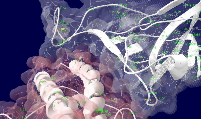
多くの変異が発生するはずのウイルスで、E484KやN501Yの変異は感染性や伝播性の増加が懸念されるとされています。この変異のある場所は、ヒトの細胞に侵入する際にまず結合する分子であるangiotensin-converting enzyme2 (ACE2)との結合に重要だとされています。このあたりを昨年も見た記憶がありますが、変異のウイルスが国内でも報告されるようになってきましたので、その変異の起こる部分が立体的にどういう位置にあたるのか、SARS-CoV-2 SpikeとAEC2が結合してる立体構造を調べたデータの公開データを元に見てみました。まずは野生型のSpikeで示します。緑色のモコモコしたのが変異すると悪い性質を獲得するのではないかと心配されている場所のアミノ酸残基を示します。(下図)
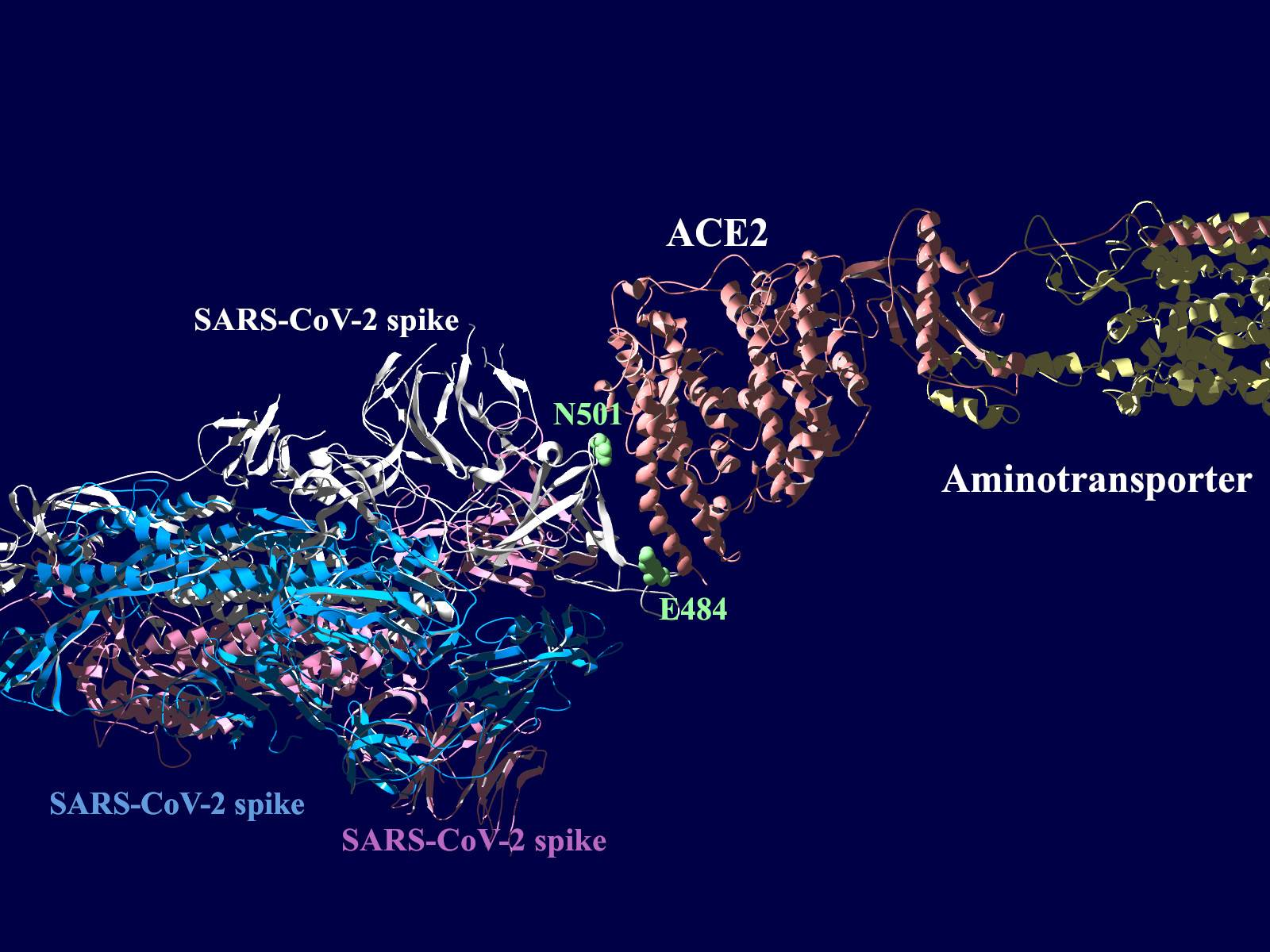
上図の当該のアミノ酸残基を、変異したアミノ酸残基に置き換えた図もしめします。(下図)側鎖のエネルギーだけ小さくなるように調整はしましたが、示された構造全体は動かない設定ですので本当にこの形になっているとは期待できません。

その変異部分の拡大図です(下図)
アミノ酸の基本的な分類に荷電の陽性・陰性があります。E484Kは484番目のEがKに変異した事を示します。野生型のEは陰性荷電を示す酸性極性側鎖アミノ酸で、一方変異型のKは陽性荷電を示す塩基性アミノ酸です。感染性等が増加する懸念は、荷電が逆転することでACE2への結合に変化が起きると推定されることから来ているものと思われます。また、ワクチンの効果が減弱するという懸念もあります。この懸念は、ワクチンの効果が結合領域(328-533aa)に対する抗体によるところがあって、この変異が結合領域の中心付近の484aaに存在している点に加えて、荷電が逆転することで抗体の結合にも変化が起きると推定されるところからきているのではないかと思います。
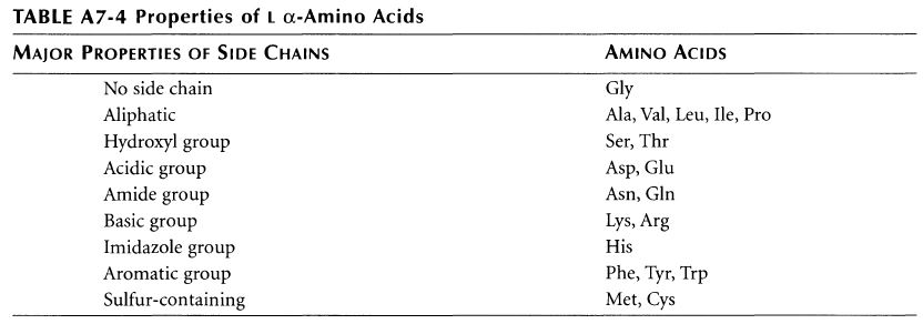
ちなみに基礎知識としてアミノ酸側鎖の性質と、略号をまとめた物をコールドスプリングハーバー(CSH)の実験プロトコール集のような書籍のMolecula Cloning a laboratory manual volume 3から抜粋です。E (Glu)がAcidic groupで、K(Lys)がBasic groupとなっています。
cBioPortal for Cancer Genomicsとは何か、という問いについてはオリジナルのサイトをみていただくのが速いのでしょう。公開された遺伝子関連情報(変異情報、遺伝子発現情報、臨床情報他)と解析ツールを組み合わせたもの、というのが私の理解です。これを使って何が判るのか、ということを少し触ってみましたので、メモしてゆきます。
今回はまず第一弾として遺伝子変異にかかる情報を表示してみました。
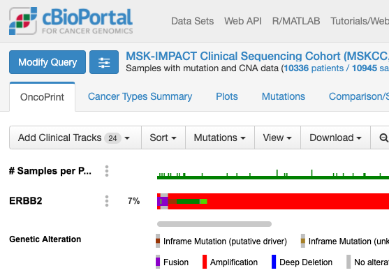
cBioPortalでは解析しやすい形で格納されたデータが提供されています。今回はとりあえずこの提供されたデータを表示することにします。次の図はcBioPortalのトップページです。
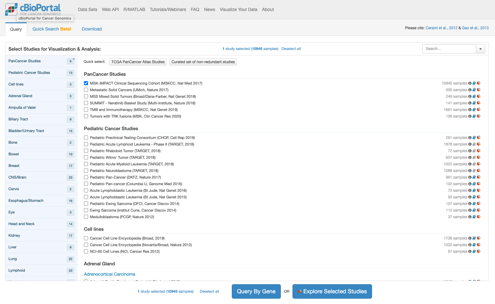
上記でボタンをクリックすると推移する画面が次です。
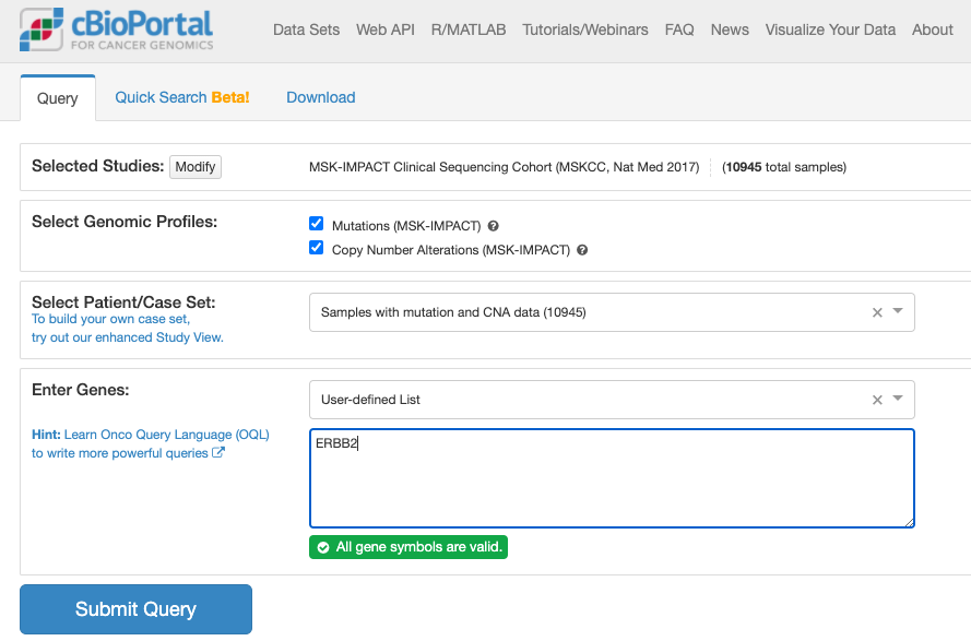
上記でクリックしてしばらくすると表示される画面が次の通りです。
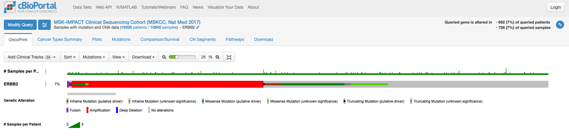
この画面はOnco Printというタブの情報が示されています。赤くて太いラインが目に入ります。下のレジェンドをみますと、これはgene amplificationを示しています。この図もよく見るといろいろな情報があります。解析対象の症例の7%の症例に何らかの変異がある、あるいは、解析対象のサンプルの7%のサンプルに何らかの異常があること、ドライバー変異もあれば、意義が不明の変異もあることも示されています。点変異の様なものもあれば他の遺伝子への融合や途中で翻訳が終わるtruncationになる変異もあります。
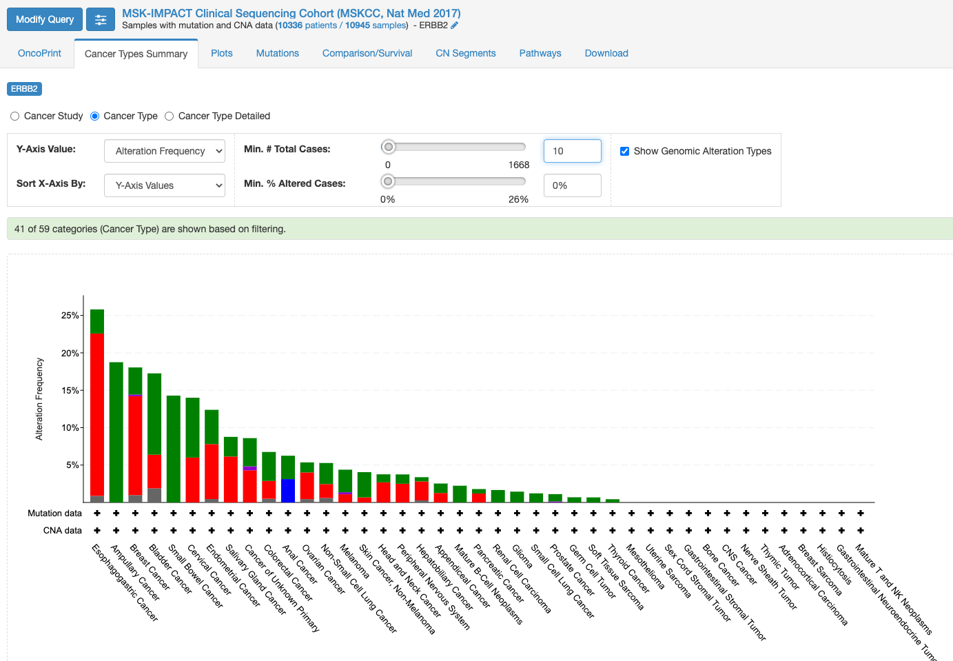
変異の頻度が比較的多いのが食道癌で、Amplificationの頻度が多い様です。
「Mutation」タブをクリックすると次の画面になります。
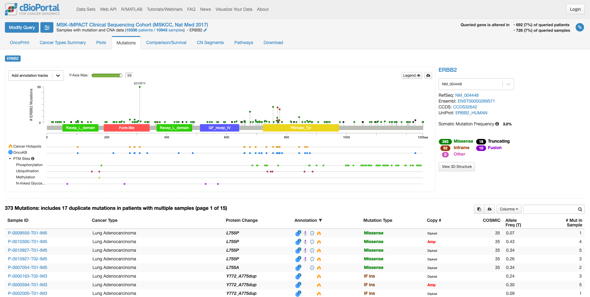
この画面では、遺伝子の中のどこに変異があるのか、ある場合は頻度も見て取れます。また、遺伝子の各ドメインが表示されています。たとえば、図の中で飛び出して目立っている、S310F/Yは310 番目のセリンがフェニルアラニンやタイロシンに変わる変異が報告されていることを示しています。その変異がある場所が翻訳後の蛋白質としてはFurin-likeドメインに存在することもわかります。そして、高い位置に丸があるのはその変異の頻度が多いことを示しています。この緑の丸をクリックすると、下の症例リストも変化します。
上図の状態で、右中程にあります虫メガネのアイコンのボックスに「lung」と入力してみますと、肺がんの情報に書き換えられます。(他のがん種の情報を除いた形で表示されます。)
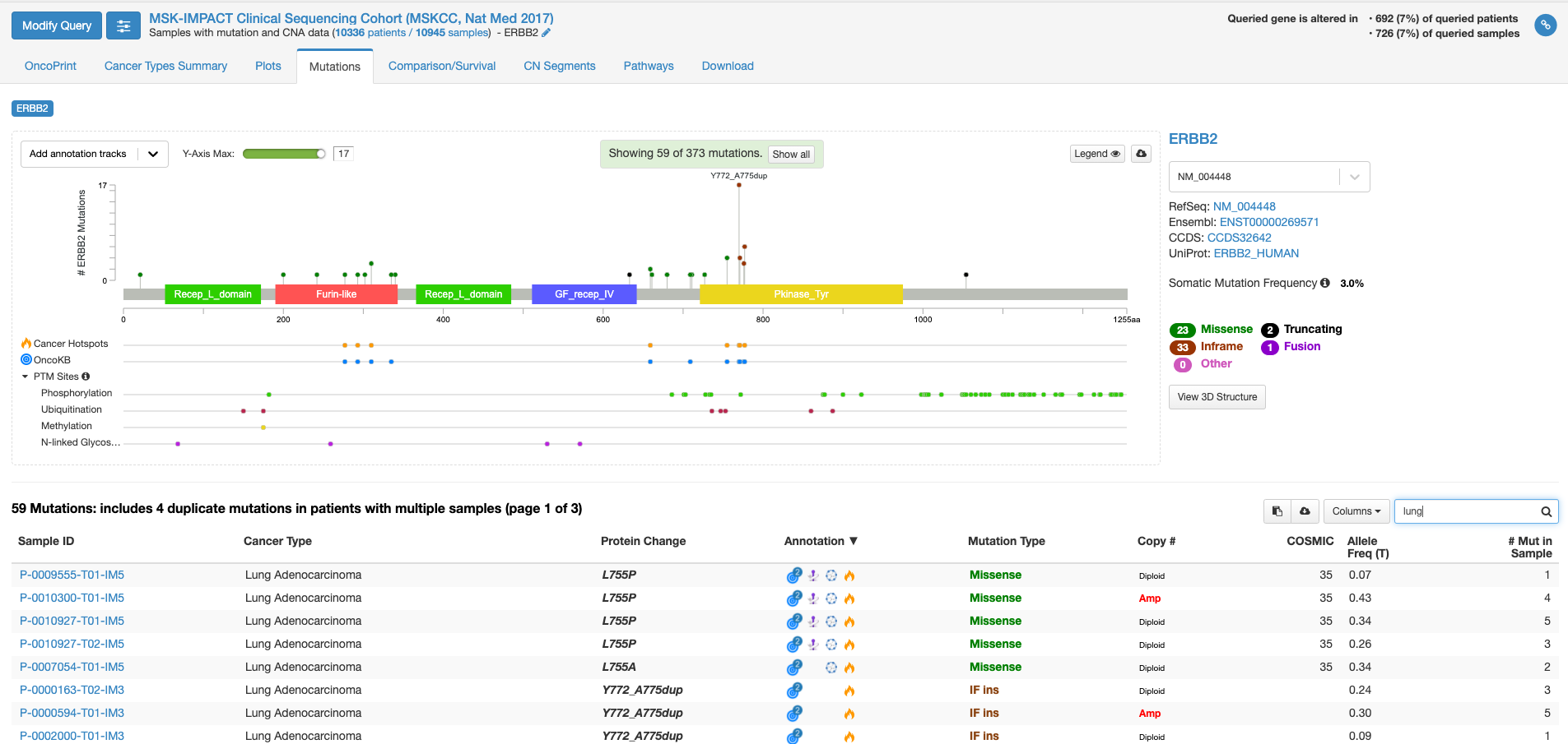
全がん種の情報では変異の頻度が高かった310番目のアミノ酸残基の変異は目立たなくなりまして、代わりにY772_A775 dupという変異の頻度が目立っています。この変異があるのはタイロシンリン酸化酵素ドメインと呼ばれる部分になります。この変異をクリックして置いて、下の症例リストのアノテーションのアイコンにマウスをオーバーする(クリックはしない)と、この変異がhot spotにある事や、oncogenicの変異であることが表示されます。
虫メガネアイコンにBreastと入れて見ると今度は乳がんでの情報が表示されます。若干見た目は代わりますが、乳がんも肺がん同様に、タイロシンリン酸化酵素ドメインでの変異が多いことがわかります。一方、bladderと入力しますと、細胞外ドメインの変異が多く、細胞内のタイロシンリン酸化酵素ドメインの変異が相対的に少ないことがわかります。
今度は右側の「view 3D structure」ボタンを押してみます。
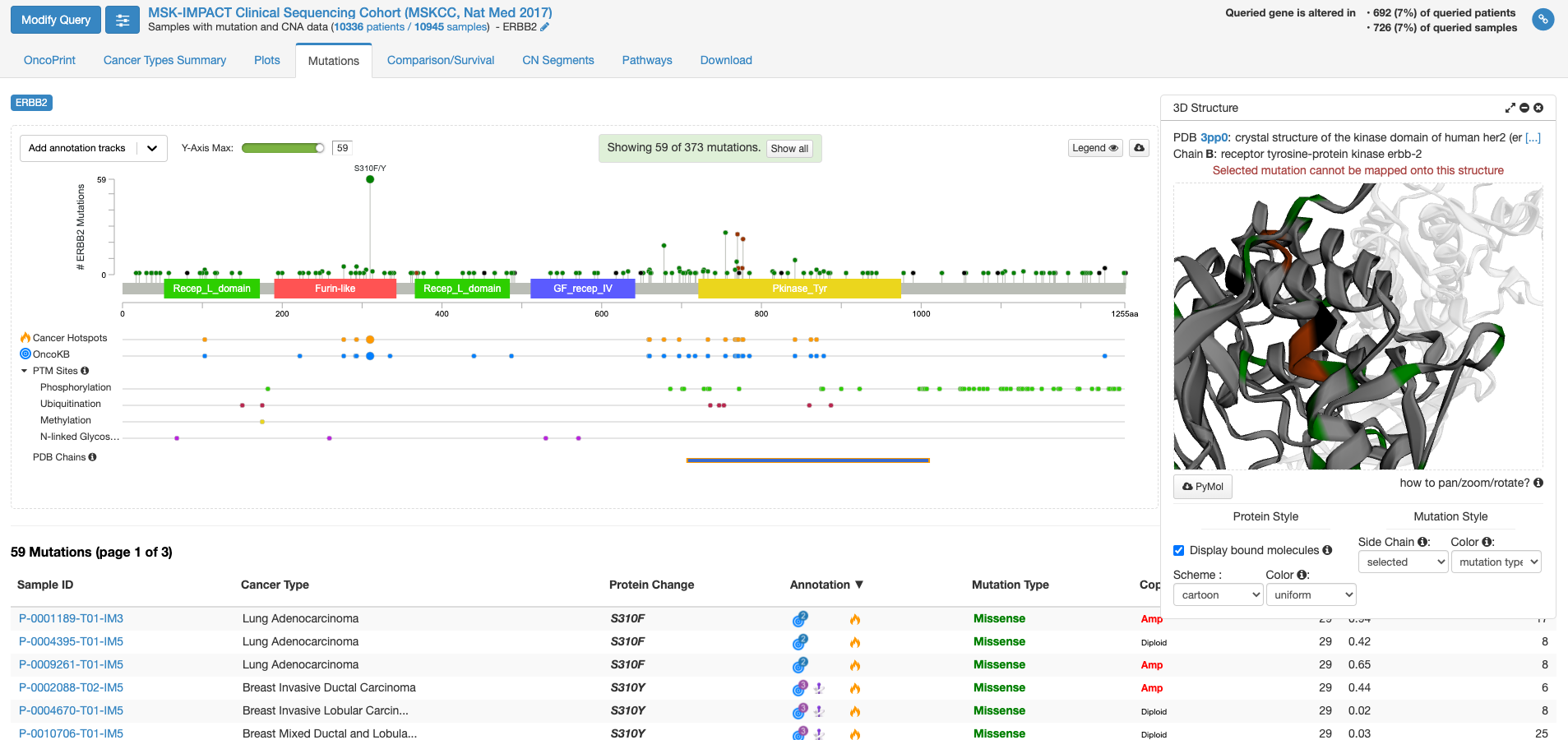
PDB chains のあたりにマウスを持ってくると、PDBのどの立体構造情報で表示するかを選ぶことができる様になります。上図は一番上の行の右側(C末端側)の四角をクリックした状態です。右側の窓に立体構造が表示されまして、これをくりくり回したり拡大縮小して表示したりすることができます。グレーの中に緑やエンジの着色がなされている場所は変異が報告されている場所を示します。
他にも、機能がついていますがとりあえず変異に関しての面白そうな機能はこんなところです。
COVID19の原因ウイルスであるSARS-Cov-2のゲノム配列が公開されているのでとりあえず眺めてみました。こういうのは、ちょっと遺伝子を扱う研究的なことをやったことのある人にとっては、元ファイルを見た方が速いんでしょうけど。以前はアクセション番号とか言っていましたが、シーケンスのIDは次の通りです;NCBI Reference Sequence: NC_045512.2
約29.9千塩基とシーケンスは長いのでこのページの下の方に示すとして、主な構造です。GC% 約38%。11種類の遺伝子から12種類の成熟タンパク質が翻訳されると報告されています。上流(5′-末)から順に見ていきます。265塩基の5′-UTRに引き続いて出てくるタンパク質をコードしているとされる配列はORF1abとされています。
gene 266..21555
大きな遺伝子が設定されています
CDS join(266..13468,13468..21555)
ココは興味深いところで、13468までのコドンをtta aacと読んでおいて、一塩基分5’側に引き返して、その最後のcを次のコドンの頭と読み替えています。(2度Cを読むような感じ)
13451 gca[A]..caa[Q]..tcg[S]..ttt[F]..tta[L]..aac[N]..ggg[G]..ttt[F]..gcg[A]..gtg[V].. taa[stop] ->
13451 gca[A]..caa[Q]..tcg[S]..ttt[F]..tta[L]..aac[N]..cgg[R]..gtt[V]..tgc[C]..ggt[G]..gta[V]..agt[S]..gca[A]…
ribosomal_slippage
note="pp1ab; translated by -1 ribosomal frameshift"
と注釈が入っています。リボゾームがスリップして、フレームシフトを起こすようです。この現象は2005年にはコロナウイルスで報告があります。1
ORF1 a/bは大きなペプチドで、複数のたんぱく質(mature protein)をコードしています。その機能は、良く判りません。
ORF1 a/bに続く遺伝子は「S」 スパイクタンパク質をコードする遺伝子です。このタンパク質がACE2と結合してヒト細胞に侵入するのに大きな役割を担っていると報告されています。
gene            21563..25384
                gene="S"
アミノ酸配列です
/translation="MFVFLVLLPLVSSQCVNLTTRTQLPPAYTNSFTRGVYYPDKVFR
SSVLHSTQDLFLPFFSNVTWFHAIHVSGTNGTKRFDNPVLPFNDGVYFASTEKSNIIR
GWIFGTTLDSKTQSLLIVNNATNVVIKVCEFQFCNDPFLGVYYHKNNKSWMESEFRVY
SSANNCTFEYVSQPFLMDLEGKQGNFKNLREFVFKNIDGYFKIYSKHTPINLVRDLPQ
GFSALEPLVDLPIGINITRFQTLLALHRSYLTPGDSSSGWTAGAAAYYVGYLQPRTFL
LKYNENGTITDAVDCALDPLSETKCTLKSFTVEKGIYQTSNFRVQPTESIVRFPNITN
LCPFGEVFNATRFASVYAWNRKRISNCVADYSVLYNSASFSTFKCYGVSPTKLNDLCF
TNVYADSFVIRGDEVRQIAPGQTGKIADYNYKLPDDFTGCVIAWNSNNLDSKVGGNYN
YLYRLFRKSNLKPFERDISTEIYQAGSTPCNGVEGFNCYFPLQSYGFQPTNGVGYQPY
RVVVLSFELLHAPATVCGPKKSTNLVKNKCVNFNFNGLTGTGVLTESNKKFLPFQQFG
RDIADTTDAVRDPQTLEILDITPCSFGGVSVITPGTNTSNQVAVLYQDVNCTEVPVAI
HADQLTPTWRVYSTGSNVFQTRAGCLIGAEHVNNSYECDIPIGAGICASYQTQTNSPR
RARSVASQSIIAYTMSLGAENSVAYSNNSIAIPTNFTISVTTEILPVSMTKTSVDCTM
YICGDSTECSNLLLQYGSFCTQLNRALTGIAVEQDKNTQEVFAQVKQIYKTPPIKDFG
GFNFSQILPDPSKPSKRSFIEDLLFNKVTLADAGFIKQYGDCLGDIAARDLICAQKFN
GLTVLPPLLTDEMIAQYTSALLAGTITSGWTFGAGAALQIPFAMQMAYRFNGIGVTQN
VLYENQKLIANQFNSAIGKIQDSLSSTASALGKLQDVVNQNAQALNTLVKQLSSNFGA
ISSVLNDILSRLDKVEAEVQIDRLITGRLQSLQTYVTQQLIRAAEIRASANLAATKMS
ECVLGQSKRVDFCGKGYHLMSFPQSAPHGVVFLHVTYVPAQEKNFTTAPAICHDGKAH
FPREGVFVSNGTHWFVTQRNFYEPQIITTDNTFVSGNCDVVIGIVNNTVYDPLQPELD
SFKEELDKYFKNHTSPDVDLGDISGINASVVNIQKEIDRLNEVAKNLNESLIDLQELG
KYEQYIKWPWYIWLGFIAGLIAIVMVTIMLCCMTSCCSCLKGCCSCGSCCKFDEDDSE
PVLKGVKLHYT
Sに続く配列がORF3a
gene            25393..26220
                /gene="ORF3a"
ORF3aに続くのは、SARS-Cov-2 ウイルスの構造タンパク質であるエンベロープをコードする遺伝子です。
gene            26245..26472
                /gene="E"
アミノ酸配列です
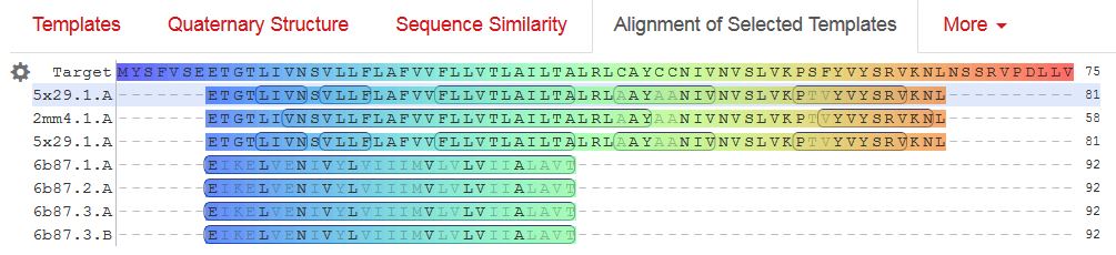
/translation="MYSFVSEETGTLIVNSVLLFLAFVVFLLVTLAILTALRLCAYCC
NIVNVSLVKPSFYVYSRVKNLNSSRVPDLLV"
Envelopeにはあまり、面白そうなリガンドが含まれる相同性のある構造が報告されていないようなので、アライメントした結果をここに貼っておきます。
gene E に続くのは、gene Mです。
gene            26523..27191
                /gene="M"
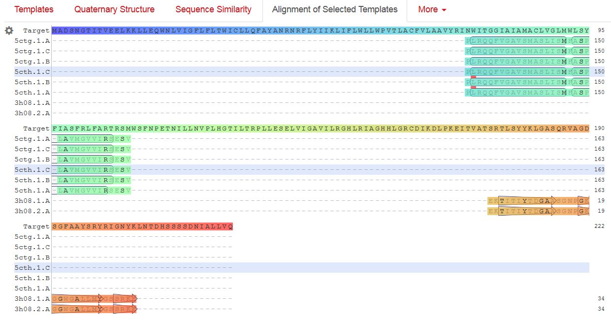
アミノ酸配列です。
/translation="MADSNGTITVEELKKLLEQWNLVIGFLFLTWICLLQFAYANRNR
FLYIIKLIFLWLLWPVTLACFVLAAVYRINWITGGIAIAMACLVGLMWLSYFIASFRL
FARTRSMWSFNPETNILLNVPLHGTILTRPLLESELVIGAVILRGHLRIAGHHLGRCD
IKDLPKEITVATSRTLSYYKLGASQRVAGDSGFAAYSRYRIGNYKLNTDHSSSSDNIA
LLVQ"
M-proteinで相同性検索すると、リガンドが含まれる構造が8種類あるのですが、既知の構造とSARS-CoV-2のM-proteinで相同性がある範囲が狭いのと、テンプレートのリガンドの位置が気に入らないので、これ以上深追いしないという事で、アライメントを公開します。
gene Mに続くのは、ORF6, 7a, 7b, 8です。
gene            27202..27387
                /gene="ORF6"
gene            27394..27759
                /gene="ORF7a"
gene            27756..27887
                /gene="ORF7b"
gene            27894..28259
                /gene="ORF8"
ORF 8につづくのは、gene Nで、これはnucleocapsid phosphoproteinをコードします。
gene            28274..29533
                /gene="N"
アミノ酸残基です
/translation="MSDNGPQNQRNAPRITFGGPSDSTGSNQNGERSGARSKQRRPQG
LPNNTASWFTALTQHGKEDLKFPRGQGVPINTNSSPDDQIGYYRRATRRIRGGDGKMK
DLSPRWYFYYLGTGPEAGLPYGANKDGIIWVATEGALNTPKDHIGTRNPANNAAIVLQ
LPQGTTLPKGFYAEGSRGGSQASSRSSSRSRNSSRNSTPGSSRGTSPARMAGNGGDAA
LALLLLDRLNQLESKMSGKGQQQQGQTVTKKSAAEASKKPRQKRTATKAYNVTQAFGR
RGPEQTQGNFGDQELIRQGTDYKHWPQIAQFAPSASAFFGMSRIGMEVTPSGTWLTYT
GAIKLDDKDPNFKDQVILLNKHIDAYKTFPPTEPKKDKKKKADETQALPQRQKKQQTV
TLLPAADLDDFSKQLQQSMSSADSTQA"
gene Nに続いて出てくる読み枠が最も3′-末のORF10です。
gene            29558..29674
                /gene="ORF10"
これに引き続いて3′-UTR配列が来ます。
ORIGIN
        1 attaaaggtt tataccttcc caggtaacaa accaaccaac tttcgatctc ttgtagatct
       61 gttctctaaa cgaactttaa aatctgtgtg gctgtcactc ggctgcatgc ttagtgcact
      121 cacgcagtat aattaataac taattactgt cgttgacagg acacgagtaa ctcgtctatc
      181 ttctgcaggc tgcttacggt ttcgtccgtg ttgcagccga tcatcagcac atctaggttt
      241 cgtccgggtg tgaccgaaag gtaagatgga gagccttgtc cctggtttca acgagaaaac
      301 acacgtccaa ctcagtttgc ctgttttaca ggttcgcgac gtgctcgtac gtggctttgg
      361 agactccgtg gaggaggtct tatcagaggc acgtcaacat cttaaagatg gcacttgtgg
      421 cttagtagaa gttgaaaaag gcgttttgcc tcaacttgaa cagccctatg tgttcatcaa
      481 acgttcggat gctcgaactg cacctcatgg tcatgttatg gttgagctgg tagcagaact
      541 cgaaggcatt cagtacggtc gtagtggtga gacacttggt gtccttgtcc ctcatgtggg
      601 cgaaatacca gtggcttacc gcaaggttct tcttcgtaag aacggtaata aaggagctgg
      661 tggccatagt tacggcgccg atctaaagtc atttgactta ggcgacgagc ttggcactga
      721 tccttatgaa gattttcaag aaaactggaa cactaaacat agcagtggtg ttacccgtga
      781 actcatgcgt gagcttaacg gaggggcata cactcgctat gtcgataaca acttctgtgg
      841 ccctgatggc taccctcttg agtgcattaa agaccttcta gcacgtgctg gtaaagcttc
      901 atgcactttg tccgaacaac tggactttat tgacactaag aggggtgtat actgctgccg
      961 tgaacatgag catgaaattg cttggtacac ggaacgttct gaaaagagct atgaattgca
     1021 gacacctttt gaaattaaat tggcaaagaa atttgacacc ttcaatgggg aatgtccaaa
     1081 ttttgtattt cccttaaatt ccataatcaa gactattcaa ccaagggttg aaaagaaaaa
     1141 gcttgatggc tttatgggta gaattcgatc tgtctatcca gttgcgtcac caaatgaatg
     1201 caaccaaatg tgcctttcaa ctctcatgaa gtgtgatcat tgtggtgaaa cttcatggca
     1261 gacgggcgat tttgttaaag ccacttgcga attttgtggc actgagaatt tgactaaaga
     1321 aggtgccact acttgtggtt acttacccca aaatgctgtt gttaaaattt attgtccagc
     1381 atgtcacaat tcagaagtag gacctgagca tagtcttgcc gaataccata atgaatctgg
     1441 cttgaaaacc attcttcgta agggtggtcg cactattgcc tttggaggct gtgtgttctc
     1501 ttatgttggt tgccataaca agtgtgccta ttgggttcca cgtgctagcg ctaacatagg
     1561 ttgtaaccat acaggtgttg ttggagaagg ttccgaaggt cttaatgaca accttcttga
     1621 aatactccaa aaagagaaag tcaacatcaa tattgttggt gactttaaac ttaatgaaga
     1681 gatcgccatt attttggcat ctttttctgc ttccacaagt gcttttgtgg aaactgtgaa
     1741 aggtttggat tataaagcat tcaaacaaat tgttgaatcc tgtggtaatt ttaaagttac
     1801 aaaaggaaaa gctaaaaaag gtgcctggaa tattggtgaa cagaaatcaa tactgagtcc
     1861 tctttatgca tttgcatcag aggctgctcg tgttgtacga tcaattttct cccgcactct
     1921 tgaaactgct caaaattctg tgcgtgtttt acagaaggcc gctataacaa tactagatgg
     1981 aatttcacag tattcactga gactcattga tgctatgatg ttcacatctg atttggctac
     2041 taacaatcta gttgtaatgg cctacattac aggtggtgtt gttcagttga cttcgcagtg
     2101 gctaactaac atctttggca ctgtttatga aaaactcaaa cccgtccttg attggcttga
     2161 agagaagttt aaggaaggtg tagagtttct tagagacggt tgggaaattg ttaaatttat
     2221 ctcaacctgt gcttgtgaaa ttgtcggtgg acaaattgtc acctgtgcaa aggaaattaa
     2281 ggagagtgtt cagacattct ttaagcttgt aaataaattt ttggctttgt gtgctgactc
     2341 tatcattatt ggtggagcta aacttaaagc cttgaattta ggtgaaacat ttgtcacgca
     2401 ctcaaaggga ttgtacagaa agtgtgttaa atccagagaa gaaactggcc tactcatgcc
     2461 tctaaaagcc ccaaaagaaa ttatcttctt agagggagaa acacttccca cagaagtgtt
     2521 aacagaggaa gttgtcttga aaactggtga tttacaacca ttagaacaac ctactagtga
     2581 agctgttgaa gctccattgg ttggtacacc agtttgtatt aacgggctta tgttgctcga
     2641 aatcaaagac acagaaaagt actgtgccct tgcacctaat atgatggtaa caaacaatac
     2701 cttcacactc aaaggcggtg caccaacaaa ggttactttt ggtgatgaca ctgtgataga
     2761 agtgcaaggt tacaagagtg tgaatatcac ttttgaactt gatgaaagga ttgataaagt
     2821 acttaatgag aagtgctctg cctatacagt tgaactcggt acagaagtaa atgagttcgc
     2881 ctgtgttgtg gcagatgctg tcataaaaac tttgcaacca gtatctgaat tacttacacc
     2941 actgggcatt gatttagatg agtggagtat ggctacatac tacttatttg atgagtctgg
     3001 tgagtttaaa ttggcttcac atatgtattg ttctttctac cctccagatg aggatgaaga
     3061 agaaggtgat tgtgaagaag aagagtttga gccatcaact caatatgagt atggtactga
     3121 agatgattac caaggtaaac ctttggaatt tggtgccact tctgctgctc ttcaacctga
     3181 agaagagcaa gaagaagatt ggttagatga tgatagtcaa caaactgttg gtcaacaaga
     3241 cggcagtgag gacaatcaga caactactat tcaaacaatt gttgaggttc aacctcaatt
     3301 agagatggaa cttacaccag ttgttcagac tattgaagtg aatagtttta gtggttattt
     3361 aaaacttact gacaatgtat acattaaaaa tgcagacatt gtggaagaag ctaaaaaggt
     3421 aaaaccaaca gtggttgtta atgcagccaa tgtttacctt aaacatggag gaggtgttgc
     3481 aggagcctta aataaggcta ctaacaatgc catgcaagtt gaatctgatg attacatagc
     3541 tactaatgga ccacttaaag tgggtggtag ttgtgtttta agcggacaca atcttgctaa
     3601 acactgtctt catgttgtcg gcccaaatgt taacaaaggt gaagacattc aacttcttaa
     3661 gagtgcttat gaaaatttta atcagcacga agttctactt gcaccattat tatcagctgg
     3721 tatttttggt gctgacccta tacattcttt aagagtttgt gtagatactg ttcgcacaaa
     3781 tgtctactta gctgtctttg ataaaaatct ctatgacaaa cttgtttcaa gctttttgga
     3841 aatgaagagt gaaaagcaag ttgaacaaaa gatcgctgag attcctaaag aggaagttaa
     3901 gccatttata actgaaagta aaccttcagt tgaacagaga aaacaagatg ataagaaaat
     3961 caaagcttgt gttgaagaag ttacaacaac tctggaagaa actaagttcc tcacagaaaa
     4021 cttgttactt tatattgaca ttaatggcaa tcttcatcca gattctgcca ctcttgttag
     4081 tgacattgac atcactttct taaagaaaga tgctccatat atagtgggtg atgttgttca
     4141 agagggtgtt ttaactgctg tggttatacc tactaaaaag gctggtggca ctactgaaat
     4201 gctagcgaaa gctttgagaa aagtgccaac agacaattat ataaccactt acccgggtca
     4261 gggtttaaat ggttacactg tagaggaggc aaagacagtg cttaaaaagt gtaaaagtgc
     4321 cttttacatt ctaccatcta ttatctctaa tgagaagcaa gaaattcttg gaactgtttc
     4381 ttggaatttg cgagaaatgc ttgcacatgc agaagaaaca cgcaaattaa tgcctgtctg
     4441 tgtggaaact aaagccatag tttcaactat acagcgtaaa tataagggta ttaaaataca
     4501 agagggtgtg gttgattatg gtgctagatt ttacttttac accagtaaaa caactgtagc
     4561 gtcacttatc aacacactta acgatctaaa tgaaactctt gttacaatgc cacttggcta
     4621 tgtaacacat ggcttaaatt tggaagaagc tgctcggtat atgagatctc tcaaagtgcc
     4681 agctacagtt tctgtttctt cacctgatgc tgttacagcg tataatggtt atcttacttc
     4741 ttcttctaaa acacctgaag aacattttat tgaaaccatc tcacttgctg gttcctataa
     4801 agattggtcc tattctggac aatctacaca actaggtata gaatttctta agagaggtga
     4861 taaaagtgta tattacacta gtaatcctac cacattccac ctagatggtg aagttatcac
     4921 ctttgacaat cttaagacac ttctttcttt gagagaagtg aggactatta aggtgtttac
     4981 aacagtagac aacattaacc tccacacgca agttgtggac atgtcaatga catatggaca
     5041 acagtttggt ccaacttatt tggatggagc tgatgttact aaaataaaac ctcataattc
     5101 acatgaaggt aaaacatttt atgttttacc taatgatgac actctacgtg ttgaggcttt
     5161 tgagtactac cacacaactg atcctagttt tctgggtagg tacatgtcag cattaaatca
     5221 cactaaaaag tggaaatacc cacaagttaa tggtttaact tctattaaat gggcagataa
     5281 caactgttat cttgccactg cattgttaac actccaacaa atagagttga agtttaatcc
     5341 acctgctcta caagatgctt attacagagc aagggctggt gaagctgcta acttttgtgc
     5401 acttatctta gcctactgta ataagacagt aggtgagtta ggtgatgtta gagaaacaat
     5461 gagttacttg tttcaacatg ccaatttaga ttcttgcaaa agagtcttga acgtggtgtg
     5521 taaaacttgt ggacaacagc agacaaccct taagggtgta gaagctgtta tgtacatggg
     5581 cacactttct tatgaacaat ttaagaaagg tgttcagata ccttgtacgt gtggtaaaca
     5641 agctacaaaa tatctagtac aacaggagtc accttttgtt atgatgtcag caccacctgc
     5701 tcagtatgaa cttaagcatg gtacatttac ttgtgctagt gagtacactg gtaattacca
     5761 gtgtggtcac tataaacata taacttctaa agaaactttg tattgcatag acggtgcttt
     5821 acttacaaag tcctcagaat acaaaggtcc tattacggat gttttctaca aagaaaacag
     5881 ttacacaaca accataaaac cagttactta taaattggat ggtgttgttt gtacagaaat
     5941 tgaccctaag ttggacaatt attataagaa agacaattct tatttcacag agcaaccaat
     6001 tgatcttgta ccaaaccaac catatccaaa cgcaagcttc gataatttta agtttgtatg
     6061 tgataatatc aaatttgctg atgatttaaa ccagttaact ggttataaga aacctgcttc
     6121 aagagagctt aaagttacat ttttccctga cttaaatggt gatgtggtgg ctattgatta
     6181 taaacactac acaccctctt ttaagaaagg agctaaattg ttacataaac ctattgtttg
     6241 gcatgttaac aatgcaacta ataaagccac gtataaacca aatacctggt gtatacgttg
     6301 tctttggagc acaaaaccag ttgaaacatc aaattcgttt gatgtactga agtcagagga
     6361 cgcgcaggga atggataatc ttgcctgcga agatctaaaa ccagtctctg aagaagtagt
     6421 ggaaaatcct accatacaga aagacgttct tgagtgtaat gtgaaaacta ccgaagttgt
     6481 aggagacatt atacttaaac cagcaaataa tagtttaaaa attacagaag aggttggcca
     6541 cacagatcta atggctgctt atgtagacaa ttctagtctt actattaaga aacctaatga
     6601 attatctaga gtattaggtt tgaaaaccct tgctactcat ggtttagctg ctgttaatag
     6661 tgtcccttgg gatactatag ctaattatgc taagcctttt cttaacaaag ttgttagtac
     6721 aactactaac atagttacac ggtgtttaaa ccgtgtttgt actaattata tgccttattt
     6781 ctttacttta ttgctacaat tgtgtacttt tactagaagt acaaattcta gaattaaagc
     6841 atctatgccg actactatag caaagaatac tgttaagagt gtcggtaaat tttgtctaga
     6901 ggcttcattt aattatttga agtcacctaa tttttctaaa ctgataaata ttataatttg
     6961 gtttttacta ttaagtgttt gcctaggttc tttaatctac tcaaccgctg ctttaggtgt
     7021 tttaatgtct aatttaggca tgccttctta ctgtactggt tacagagaag gctatttgaa
     7081 ctctactaat gtcactattg caacctactg tactggttct ataccttgta gtgtttgtct
     7141 tagtggttta gattctttag acacctatcc ttctttagaa actatacaaa ttaccatttc
     7201 atcttttaaa tgggatttaa ctgcttttgg cttagttgca gagtggtttt tggcatatat
     7261 tcttttcact aggtttttct atgtacttgg attggctgca atcatgcaat tgtttttcag
     7321 ctattttgca gtacatttta ttagtaattc ttggcttatg tggttaataa ttaatcttgt
     7381 acaaatggcc ccgatttcag ctatggttag aatgtacatc ttctttgcat cattttatta
     7441 tgtatggaaa agttatgtgc atgttgtaga cggttgtaat tcatcaactt gtatgatgtg
     7501 ttacaaacgt aatagagcaa caagagtcga atgtacaact attgttaatg gtgttagaag
     7561 gtccttttat gtctatgcta atggaggtaa aggcttttgc aaactacaca attggaattg
     7621 tgttaattgt gatacattct gtgctggtag tacatttatt agtgatgaag ttgcgagaga
     7681 cttgtcacta cagtttaaaa gaccaataaa tcctactgac cagtcttctt acatcgttga
     7741 tagtgttaca gtgaagaatg gttccatcca tctttacttt gataaagctg gtcaaaagac
     7801 ttatgaaaga cattctctct ctcattttgt taacttagac aacctgagag ctaataacac
     7861 taaaggttca ttgcctatta atgttatagt ttttgatggt aaatcaaaat gtgaagaatc
     7921 atctgcaaaa tcagcgtctg tttactacag tcagcttatg tgtcaaccta tactgttact
     7981 agatcaggca ttagtgtctg atgttggtga tagtgcggaa gttgcagtta aaatgtttga
     8041 tgcttacgtt aatacgtttt catcaacttt taacgtacca atggaaaaac tcaaaacact
     8101 agttgcaact gcagaagctg aacttgcaaa gaatgtgtcc ttagacaatg tcttatctac
     8161 ttttatttca gcagctcggc aagggtttgt tgattcagat gtagaaacta aagatgttgt
     8221 tgaatgtctt aaattgtcac atcaatctga catagaagtt actggcgata gttgtaataa
     8281 ctatatgctc acctataaca aagttgaaaa catgacaccc cgtgaccttg gtgcttgtat
     8341 tgactgtagt gcgcgtcata ttaatgcgca ggtagcaaaa agtcacaaca ttgctttgat
     8401 atggaacgtt aaagatttca tgtcattgtc tgaacaacta cgaaaacaaa tacgtagtgc
     8461 tgctaaaaag aataacttac cttttaagtt gacatgtgca actactagac aagttgttaa
     8521 tgttgtaaca acaaagatag cacttaaggg tggtaaaatt gttaataatt ggttgaagca
     8581 gttaattaaa gttacacttg tgttcctttt tgttgctgct attttctatt taataacacc
     8641 tgttcatgtc atgtctaaac atactgactt ttcaagtgaa atcataggat acaaggctat
     8701 tgatggtggt gtcactcgtg acatagcatc tacagatact tgttttgcta acaaacatgc
     8761 tgattttgac acatggttta gccagcgtgg tggtagttat actaatgaca aagcttgccc
     8821 attgattgct gcagtcataa caagagaagt gggttttgtc gtgcctggtt tgcctggcac
     8881 gatattacgc acaactaatg gtgacttttt gcatttctta cctagagttt ttagtgcagt
     8941 tggtaacatc tgttacacac catcaaaact tatagagtac actgactttg caacatcagc
     9001 ttgtgttttg gctgctgaat gtacaatttt taaagatgct tctggtaagc cagtaccata
     9061 ttgttatgat accaatgtac tagaaggttc tgttgcttat gaaagtttac gccctgacac
     9121 acgttatgtg ctcatggatg gctctattat tcaatttcct aacacctacc ttgaaggttc
     9181 tgttagagtg gtaacaactt ttgattctga gtactgtagg cacggcactt gtgaaagatc
     9241 agaagctggt gtttgtgtat ctactagtgg tagatgggta cttaacaatg attattacag
     9301 atctttacca ggagttttct gtggtgtaga tgctgtaaat ttacttacta atatgtttac
     9361 accactaatt caacctattg gtgctttgga catatcagca tctatagtag ctggtggtat
     9421 tgtagctatc gtagtaacat gccttgccta ctattttatg aggtttagaa gagcttttgg
     9481 tgaatacagt catgtagttg cctttaatac tttactattc cttatgtcat tcactgtact
     9541 ctgtttaaca ccagtttact cattcttacc tggtgtttat tctgttattt acttgtactt
     9601 gacattttat cttactaatg atgtttcttt tttagcacat attcagtgga tggttatgtt
     9661 cacaccttta gtacctttct ggataacaat tgcttatatc atttgtattt ccacaaagca
     9721 tttctattgg ttctttagta attacctaaa gagacgtgta gtctttaatg gtgtttcctt
     9781 tagtactttt gaagaagctg cgctgtgcac ctttttgtta aataaagaaa tgtatctaaa
     9841 gttgcgtagt gatgtgctat tacctcttac gcaatataat agatacttag ctctttataa
     9901 taagtacaag tattttagtg gagcaatgga tacaactagc tacagagaag ctgcttgttg
     9961 tcatctcgca aaggctctca atgacttcag taactcaggt tctgatgttc tttaccaacc
    10021 accacaaacc tctatcacct cagctgtttt gcagagtggt tttagaaaaa tggcattccc
    10081 atctggtaaa gttgagggtt gtatggtaca agtaacttgt ggtacaacta cacttaacgg
    10141 tctttggctt gatgacgtag tttactgtcc aagacatgtg atctgcacct ctgaagacat
    10201 gcttaaccct aattatgaag atttactcat tcgtaagtct aatcataatt tcttggtaca
    10261 ggctggtaat gttcaactca gggttattgg acattctatg caaaattgtg tacttaagct
    10321 taaggttgat acagccaatc ctaagacacc taagtataag tttgttcgca ttcaaccagg
    10381 acagactttt tcagtgttag cttgttacaa tggttcacca tctggtgttt accaatgtgc
    10441 tatgaggccc aatttcacta ttaagggttc attccttaat ggttcatgtg gtagtgttgg
    10501 ttttaacata gattatgact gtgtctcttt ttgttacatg caccatatgg aattaccaac
    10561 tggagttcat gctggcacag acttagaagg taacttttat ggaccttttg ttgacaggca
    10621 aacagcacaa gcagctggta cggacacaac tattacagtt aatgttttag cttggttgta
    10681 cgctgctgtt ataaatggag acaggtggtt tctcaatcga tttaccacaa ctcttaatga
    10741 ctttaacctt gtggctatga agtacaatta tgaacctcta acacaagacc atgttgacat
    10801 actaggacct ctttctgctc aaactggaat tgccgtttta gatatgtgtg cttcattaaa
    10861 agaattactg caaaatggta tgaatggacg taccatattg ggtagtgctt tattagaaga
    10921 tgaatttaca ccttttgatg ttgttagaca atgctcaggt gttactttcc aaagtgcagt
    10981 gaaaagaaca atcaagggta cacaccactg gttgttactc acaattttga cttcactttt
    11041 agttttagtc cagagtactc aatggtcttt gttctttttt ttgtatgaaa atgccttttt
    11101 accttttgct atgggtatta ttgctatgtc tgcttttgca atgatgtttg tcaaacataa
    11161 gcatgcattt ctctgtttgt ttttgttacc ttctcttgcc actgtagctt attttaatat
    11221 ggtctatatg cctgctagtt gggtgatgcg tattatgaca tggttggata tggttgatac
    11281 tagtttgtct ggttttaagc taaaagactg tgttatgtat gcatcagctg tagtgttact
    11341 aatccttatg acagcaagaa ctgtgtatga tgatggtgct aggagagtgt ggacacttat
    11401 gaatgtcttg acactcgttt ataaagttta ttatggtaat gctttagatc aagccatttc
    11461 catgtgggct cttataatct ctgttacttc taactactca ggtgtagtta caactgtcat
    11521 gtttttggcc agaggtattg tttttatgtg tgttgagtat tgccctattt tcttcataac
    11581 tggtaataca cttcagtgta taatgctagt ttattgtttc ttaggctatt tttgtacttg
    11641 ttactttggc ctcttttgtt tactcaaccg ctactttaga ctgactcttg gtgtttatga
    11701 ttacttagtt tctacacagg agtttagata tatgaattca cagggactac tcccacccaa
    11761 gaatagcata gatgccttca aactcaacat taaattgttg ggtgttggtg gcaaaccttg
    11821 tatcaaagta gccactgtac agtctaaaat gtcagatgta aagtgcacat cagtagtctt
    11881 actctcagtt ttgcaacaac tcagagtaga atcatcatct aaattgtggg ctcaatgtgt
    11941 ccagttacac aatgacattc tcttagctaa agatactact gaagcctttg aaaaaatggt
    12001 ttcactactt tctgttttgc tttccatgca gggtgctgta gacataaaca agctttgtga
    12061 agaaatgctg gacaacaggg caaccttaca agctatagcc tcagagttta gttcccttcc
    12121 atcatatgca gcttttgcta ctgctcaaga agcttatgag caggctgttg ctaatggtga
    12181 ttctgaagtt gttcttaaaa agttgaagaa gtctttgaat gtggctaaat ctgaatttga
    12241 ccgtgatgca gccatgcaac gtaagttgga aaagatggct gatcaagcta tgacccaaat
    12301 gtataaacag gctagatctg aggacaagag ggcaaaagtt actagtgcta tgcagacaat
    12361 gcttttcact atgcttagaa agttggataa tgatgcactc aacaacatta tcaacaatgc
    12421 aagagatggt tgtgttccct tgaacataat acctcttaca acagcagcca aactaatggt
    12481 tgtcatacca gactataaca catataaaaa tacgtgtgat ggtacaacat ttacttatgc
    12541 atcagcattg tgggaaatcc aacaggttgt agatgcagat agtaaaattg ttcaacttag
    12601 tgaaattagt atggacaatt cacctaattt agcatggcct cttattgtaa cagctttaag
    12661 ggccaattct gctgtcaaat tacagaataa tgagcttagt cctgttgcac tacgacagat
    12721 gtcttgtgct gccggtacta cacaaactgc ttgcactgat gacaatgcgt tagcttacta
    12781 caacacaaca aagggaggta ggtttgtact tgcactgtta tccgatttac aggatttgaa
    12841 atgggctaga ttccctaaga gtgatggaac tggtactatc tatacagaac tggaaccacc
    12901 ttgtaggttt gttacagaca cacctaaagg tcctaaagtg aagtatttat actttattaa
    12961 aggattaaac aacctaaata gaggtatggt acttggtagt ttagctgcca cagtacgtct
    13021 acaagctggt aatgcaacag aagtgcctgc caattcaact gtattatctt tctgtgcttt
    13081 tgctgtagat gctgctaaag cttacaaaga ttatctagct agtgggggac aaccaatcac
    13141 taattgtgtt aagatgttgt gtacacacac tggtactggt caggcaataa cagttacacc
    13201 ggaagccaat atggatcaag aatcctttgg tggtgcatcg tgttgtctgt actgccgttg
    13261 ccacatagat catccaaatc ctaaaggatt ttgtgactta aaaggtaagt atgtacaaat
    13321 acctacaact tgtgctaatg accctgtggg ttttacactt aaaaacacag tctgtaccgt
    13381 ctgcggtatg tggaaaggtt atggctgtag ttgtgatcaa ctccgcgaac ccatgcttca
    13441 gtcagctgat gcacaatcgt ttttaaacgg gtttgcggtg taagtgcagc ccgtcttaca
    13501 ccgtgcggca caggcactag tactgatgtc gtatacaggg cttttgacat ctacaatgat
    13561 aaagtagctg gttttgctaa attcctaaaa actaattgtt gtcgcttcca agaaaaggac
    13621 gaagatgaca atttaattga ttcttacttt gtagttaaga gacacacttt ctctaactac
    13681 caacatgaag aaacaattta taatttactt aaggattgtc cagctgttgc taaacatgac
    13741 ttctttaagt ttagaataga cggtgacatg gtaccacata tatcacgtca acgtcttact
    13801 aaatacacaa tggcagacct cgtctatgct ttaaggcatt ttgatgaagg taattgtgac
    13861 acattaaaag aaatacttgt cacatacaat tgttgtgatg atgattattt caataaaaag
    13921 gactggtatg attttgtaga aaacccagat atattacgcg tatacgccaa cttaggtgaa
    13981 cgtgtacgcc aagctttgtt aaaaacagta caattctgtg atgccatgcg aaatgctggt
    14041 attgttggtg tactgacatt agataatcaa gatctcaatg gtaactggta tgatttcggt
    14101 gatttcatac aaaccacgcc aggtagtgga gttcctgttg tagattctta ttattcattg
    14161 ttaatgccta tattaacctt gaccagggct ttaactgcag agtcacatgt tgacactgac
    14221 ttaacaaagc cttacattaa gtgggatttg ttaaaatatg acttcacgga agagaggtta
    14281 aaactctttg accgttattt taaatattgg gatcagacat accacccaaa ttgtgttaac
    14341 tgtttggatg acagatgcat tctgcattgt gcaaacttta atgttttatt ctctacagtg
    14401 ttcccaccta caagttttgg accactagtg agaaaaatat ttgttgatgg tgttccattt
    14461 gtagtttcaa ctggatacca cttcagagag ctaggtgttg tacataatca ggatgtaaac
    14521 ttacatagct ctagacttag ttttaaggaa ttacttgtgt atgctgctga ccctgctatg
    14581 cacgctgctt ctggtaatct attactagat aaacgcacta cgtgcttttc agtagctgca
    14641 cttactaaca atgttgcttt tcaaactgtc aaacccggta attttaacaa agacttctat
    14701 gactttgctg tgtctaaggg tttctttaag gaaggaagtt ctgttgaatt aaaacacttc
    14761 ttctttgctc aggatggtaa tgctgctatc agcgattatg actactatcg ttataatcta
    14821 ccaacaatgt gtgatatcag acaactacta tttgtagttg aagttgttga taagtacttt
    14881 gattgttacg atggtggctg tattaatgct aaccaagtca tcgtcaacaa cctagacaaa
    14941 tcagctggtt ttccatttaa taaatggggt aaggctagac tttattatga ttcaatgagt
    15001 tatgaggatc aagatgcact tttcgcatat acaaaacgta atgtcatccc tactataact
    15061 caaatgaatc ttaagtatgc cattagtgca aagaatagag ctcgcaccgt agctggtgtc
    15121 tctatctgta gtactatgac caatagacag tttcatcaaa aattattgaa atcaatagcc
    15181 gccactagag gagctactgt agtaattgga acaagcaaat tctatggtgg ttggcacaac
    15241 atgttaaaaa ctgtttatag tgatgtagaa aaccctcacc ttatgggttg ggattatcct
    15301 aaatgtgata gagccatgcc taacatgctt agaattatgg cctcacttgt tcttgctcgc
    15361 aaacatacaa cgtgttgtag cttgtcacac cgtttctata gattagctaa tgagtgtgct
    15421 caagtattga gtgaaatggt catgtgtggc ggttcactat atgttaaacc aggtggaacc
    15481 tcatcaggag atgccacaac tgcttatgct aatagtgttt ttaacatttg tcaagctgtc
    15541 acggccaatg ttaatgcact tttatctact gatggtaaca aaattgccga taagtatgtc
    15601 cgcaatttac aacacagact ttatgagtgt ctctatagaa atagagatgt tgacacagac
    15661 tttgtgaatg agttttacgc atatttgcgt aaacatttct caatgatgat actctctgac
    15721 gatgctgttg tgtgtttcaa tagcacttat gcatctcaag gtctagtggc tagcataaag
    15781 aactttaagt cagttcttta ttatcaaaac aatgttttta tgtctgaagc aaaatgttgg
    15841 actgagactg accttactaa aggacctcat gaattttgct ctcaacatac aatgctagtt
    15901 aaacagggtg atgattatgt gtaccttcct tacccagatc catcaagaat cctaggggcc
    15961 ggctgttttg tagatgatat cgtaaaaaca gatggtacac ttatgattga acggttcgtg
    16021 tctttagcta tagatgctta cccacttact aaacatccta atcaggagta tgctgatgtc
    16081 tttcatttgt acttacaata cataagaaag ctacatgatg agttaacagg acacatgtta
    16141 gacatgtatt ctgttatgct tactaatgat aacacttcaa ggtattggga acctgagttt
    16201 tatgaggcta tgtacacacc gcatacagtc ttacaggctg ttggggcttg tgttctttgc
    16261 aattcacaga cttcattaag atgtggtgct tgcatacgta gaccattctt atgttgtaaa
    16321 tgctgttacg accatgtcat atcaacatca cataaattag tcttgtctgt taatccgtat
    16381 gtttgcaatg ctccaggttg tgatgtcaca gatgtgactc aactttactt aggaggtatg
    16441 agctattatt gtaaatcaca taaaccaccc attagttttc cattgtgtgc taatggacaa
    16501 gtttttggtt tatataaaaa tacatgtgtt ggtagcgata atgttactga ctttaatgca
    16561 attgcaacat gtgactggac aaatgctggt gattacattt tagctaacac ctgtactgaa
    16621 agactcaagc tttttgcagc agaaacgctc aaagctactg aggagacatt taaactgtct
    16681 tatggtattg ctactgtacg tgaagtgctg tctgacagag aattacatct ttcatgggaa
    16741 gttggtaaac ctagaccacc acttaaccga aattatgtct ttactggtta tcgtgtaact
    16801 aaaaacagta aagtacaaat aggagagtac acctttgaaa aaggtgacta tggtgatgct
    16861 gttgtttacc gaggtacaac aacttacaaa ttaaatgttg gtgattattt tgtgctgaca
    16921 tcacatacag taatgccatt aagtgcacct acactagtgc cacaagagca ctatgttaga
    16981 attactggct tatacccaac actcaatatc tcagatgagt tttctagcaa tgttgcaaat
    17041 tatcaaaagg ttggtatgca aaagtattct acactccagg gaccacctgg tactggtaag
    17101 agtcattttg ctattggcct agctctctac tacccttctg ctcgcatagt gtatacagct
    17161 tgctctcatg ccgctgttga tgcactatgt gagaaggcat taaaatattt gcctatagat
    17221 aaatgtagta gaattatacc tgcacgtgct cgtgtagagt gttttgataa attcaaagtg
    17281 aattcaacat tagaacagta tgtcttttgt actgtaaatg cattgcctga gacgacagca
    17341 gatatagttg tctttgatga aatttcaatg gccacaaatt atgatttgag tgttgtcaat
    17401 gccagattac gtgctaagca ctatgtgtac attggcgacc ctgctcaatt acctgcacca
    17461 cgcacattgc taactaaggg cacactagaa ccagaatatt tcaattcagt gtgtagactt
    17521 atgaaaacta taggtccaga catgttcctc ggaacttgtc ggcgttgtcc tgctgaaatt
    17581 gttgacactg tgagtgcttt ggtttatgat aataagctta aagcacataa agacaaatca
    17641 gctcaatgct ttaaaatgtt ttataagggt gttatcacgc atgatgtttc atctgcaatt
    17701 aacaggccac aaataggcgt ggtaagagaa ttccttacac gtaaccctgc ttggagaaaa
    17761 gctgtcttta tttcacctta taattcacag aatgctgtag cctcaaagat tttgggacta
    17821 ccaactcaaa ctgttgattc atcacagggc tcagaatatg actatgtcat attcactcaa
    17881 accactgaaa cagctcactc ttgtaatgta aacagattta atgttgctat taccagagca
    17941 aaagtaggca tactttgcat aatgtctgat agagaccttt atgacaagtt gcaatttaca
    18001 agtcttgaaa ttccacgtag gaatgtggca actttacaag ctgaaaatgt aacaggactc
    18061 tttaaagatt gtagtaaggt aatcactggg ttacatccta cacaggcacc tacacacctc
    18121 agtgttgaca ctaaattcaa aactgaaggt ttatgtgttg acatacctgg catacctaag
    18181 gacatgacct atagaagact catctctatg atgggtttta aaatgaatta tcaagttaat
    18241 ggttacccta acatgtttat cacccgcgaa gaagctataa gacatgtacg tgcatggatt
    18301 ggcttcgatg tcgaggggtg tcatgctact agagaagctg ttggtaccaa tttaccttta
    18361 cagctaggtt tttctacagg tgttaaccta gttgctgtac ctacaggtta tgttgataca
    18421 cctaataata cagatttttc cagagttagt gctaaaccac cgcctggaga tcaatttaaa
    18481 cacctcatac cacttatgta caaaggactt ccttggaatg tagtgcgtat aaagattgta
    18541 caaatgttaa gtgacacact taaaaatctc tctgacagag tcgtatttgt cttatgggca
    18601 catggctttg agttgacatc tatgaagtat tttgtgaaaa taggacctga gcgcacctgt
    18661 tgtctatgtg atagacgtgc cacatgcttt tccactgctt cagacactta tgcctgttgg
    18721 catcattcta ttggatttga ttacgtctat aatccgttta tgattgatgt tcaacaatgg
    18781 ggttttacag gtaacctaca aagcaaccat gatctgtatt gtcaagtcca tggtaatgca
    18841 catgtagcta gttgtgatgc aatcatgact aggtgtctag ctgtccacga gtgctttgtt
    18901 aagcgtgttg actggactat tgaatatcct ataattggtg atgaactgaa gattaatgcg
    18961 gcttgtagaa aggttcaaca catggttgtt aaagctgcat tattagcaga caaattccca
    19021 gttcttcacg acattggtaa ccctaaagct attaagtgtg tacctcaagc tgatgtagaa
    19081 tggaagttct atgatgcaca gccttgtagt gacaaagctt ataaaataga agaattattc
    19141 tattcttatg ccacacattc tgacaaattc acagatggtg tatgcctatt ttggaattgc
    19201 aatgtcgata gatatcctgc taattccatt gtttgtagat ttgacactag agtgctatct
    19261 aaccttaact tgcctggttg tgatggtggc agtttgtatg taaataaaca tgcattccac
    19321 acaccagctt ttgataaaag tgcttttgtt aatttaaaac aattaccatt tttctattac
    19381 tctgacagtc catgtgagtc tcatggaaaa caagtagtgt cagatataga ttatgtacca
    19441 ctaaagtctg ctacgtgtat aacacgttgc aatttaggtg gtgctgtctg tagacatcat
    19501 gctaatgagt acagattgta tctcgatgct tataacatga tgatctcagc tggctttagc
    19561 ttgtgggttt acaaacaatt tgatacttat aacctctgga acacttttac aagacttcag
    19621 agtttagaaa atgtggcttt taatgttgta aataagggac actttgatgg acaacagggt
    19681 gaagtaccag tttctatcat taataacact gtttacacaa aagttgatgg tgttgatgta
    19741 gaattgtttg aaaataaaac aacattacct gttaatgtag catttgagct ttgggctaag
    19801 cgcaacatta aaccagtacc agaggtgaaa atactcaata atttgggtgt ggacattgct
    19861 gctaatactg tgatctggga ctacaaaaga gatgctccag cacatatatc tactattggt
    19921 gtttgttcta tgactgacat agccaagaaa ccaactgaaa cgatttgtgc accactcact
    19981 gtcttttttg atggtagagt tgatggtcaa gtagacttat ttagaaatgc ccgtaatggt
    20041 gttcttatta cagaaggtag tgttaaaggt ttacaaccat ctgtaggtcc caaacaagct
    20101 agtcttaatg gagtcacatt aattggagaa gccgtaaaaa cacagttcaa ttattataag
    20161 aaagttgatg gtgttgtcca acaattacct gaaacttact ttactcagag tagaaattta
    20221 caagaattta aacccaggag tcaaatggaa attgatttct tagaattagc tatggatgaa
    20281 ttcattgaac ggtataaatt agaaggctat gccttcgaac atatcgttta tggagatttt
    20341 agtcatagtc agttaggtgg tttacatcta ctgattggac tagctaaacg ttttaaggaa
    20401 tcaccttttg aattagaaga ttttattcct atggacagta cagttaaaaa ctatttcata
    20461 acagatgcgc aaacaggttc atctaagtgt gtgtgttctg ttattgattt attacttgat
    20521 gattttgttg aaataataaa atcccaagat ttatctgtag tttctaaggt tgtcaaagtg
    20581 actattgact atacagaaat ttcatttatg ctttggtgta aagatggcca tgtagaaaca
    20641 ttttacccaa aattacaatc tagtcaagcg tggcaaccgg gtgttgctat gcctaatctt
    20701 tacaaaatgc aaagaatgct attagaaaag tgtgaccttc aaaattatgg tgatagtgca
    20761 acattaccta aaggcataat gatgaatgtc gcaaaatata ctcaactgtg tcaatattta
    20821 aacacattaa cattagctgt accctataat atgagagtta tacattttgg tgctggttct
    20881 gataaaggag ttgcaccagg tacagctgtt ttaagacagt ggttgcctac gggtacgctg
    20941 cttgtcgatt cagatcttaa tgactttgtc tctgatgcag attcaacttt gattggtgat
    21001 tgtgcaactg tacatacagc taataaatgg gatctcatta ttagtgatat gtacgaccct
    21061 aagactaaaa atgttacaaa agaaaatgac tctaaagagg gttttttcac ttacatttgt
    21121 gggtttatac aacaaaagct agctcttgga ggttccgtgg ctataaagat aacagaacat
    21181 tcttggaatg ctgatcttta taagctcatg ggacacttcg catggtggac agcctttgtt
    21241 actaatgtga atgcgtcatc atctgaagca tttttaattg gatgtaatta tcttggcaaa
    21301 ccacgcgaac aaatagatgg ttatgtcatg catgcaaatt acatattttg gaggaataca
    21361 aatccaattc agttgtcttc ctattcttta tttgacatga gtaaatttcc ccttaaatta
    21421 aggggtactg ctgttatgtc tttaaaagaa ggtcaaatca atgatatgat tttatctctt
    21481 cttagtaaag gtagacttat aattagagaa aacaacagag ttgttatttc tagtgatgtt
    21541 cttgttaaca actaaacgaa caatgtttgt ttttcttgtt ttattgccac tagtctctag
    21601 tcagtgtgtt aatcttacaa ccagaactca attaccccct gcatacacta attctttcac
    21661 acgtggtgtt tattaccctg acaaagtttt cagatcctca gttttacatt caactcagga
    21721 cttgttctta cctttctttt ccaatgttac ttggttccat gctatacatg tctctgggac
    21781 caatggtact aagaggtttg ataaccctgt cctaccattt aatgatggtg tttattttgc
    21841 ttccactgag aagtctaaca taataagagg ctggattttt ggtactactt tagattcgaa
    21901 gacccagtcc ctacttattg ttaataacgc tactaatgtt gttattaaag tctgtgaatt
    21961 tcaattttgt aatgatccat ttttgggtgt ttattaccac aaaaacaaca aaagttggat
    22021 ggaaagtgag ttcagagttt attctagtgc gaataattgc acttttgaat atgtctctca
    22081 gccttttctt atggaccttg aaggaaaaca gggtaatttc aaaaatctta gggaatttgt
    22141 gtttaagaat attgatggtt attttaaaat atattctaag cacacgccta ttaatttagt
    22201 gcgtgatctc cctcagggtt tttcggcttt agaaccattg gtagatttgc caataggtat
    22261 taacatcact aggtttcaaa ctttacttgc tttacataga agttatttga ctcctggtga
    22321 ttcttcttca ggttggacag ctggtgctgc agcttattat gtgggttatc ttcaacctag
    22381 gacttttcta ttaaaatata atgaaaatgg aaccattaca gatgctgtag actgtgcact
    22441 tgaccctctc tcagaaacaa agtgtacgtt gaaatccttc actgtagaaa aaggaatcta
    22501 tcaaacttct aactttagag tccaaccaac agaatctatt gttagatttc ctaatattac
    22561 aaacttgtgc ccttttggtg aagtttttaa cgccaccaga tttgcatctg tttatgcttg
    22621 gaacaggaag agaatcagca actgtgttgc tgattattct gtcctatata attccgcatc
    22681 attttccact tttaagtgtt atggagtgtc tcctactaaa ttaaatgatc tctgctttac
    22741 taatgtctat gcagattcat ttgtaattag aggtgatgaa gtcagacaaa tcgctccagg
    22801 gcaaactgga aagattgctg attataatta taaattacca gatgatttta caggctgcgt
    22861 tatagcttgg aattctaaca atcttgattc taaggttggt ggtaattata attacctgta
    22921 tagattgttt aggaagtcta atctcaaacc ttttgagaga gatatttcaa ctgaaatcta
    22981 tcaggccggt agcacacctt gtaatggtgt tgaaggtttt aattgttact ttcctttaca
    23041 atcatatggt ttccaaccca ctaatggtgt tggttaccaa ccatacagag tagtagtact
    23101 ttcttttgaa cttctacatg caccagcaac tgtttgtgga cctaaaaagt ctactaattt
    23161 ggttaaaaac aaatgtgtca atttcaactt caatggttta acaggcacag gtgttcttac
    23221 tgagtctaac aaaaagtttc tgcctttcca acaatttggc agagacattg ctgacactac
    23281 tgatgctgtc cgtgatccac agacacttga gattcttgac attacaccat gttcttttgg
    23341 tggtgtcagt gttataacac caggaacaaa tacttctaac caggttgctg ttctttatca
    23401 ggatgttaac tgcacagaag tccctgttgc tattcatgca gatcaactta ctcctacttg
    23461 gcgtgtttat tctacaggtt ctaatgtttt tcaaacacgt gcaggctgtt taataggggc
    23521 tgaacatgtc aacaactcat atgagtgtga catacccatt ggtgcaggta tatgcgctag
    23581 ttatcagact cagactaatt ctcctcggcg ggcacgtagt gtagctagtc aatccatcat
    23641 tgcctacact atgtcacttg gtgcagaaaa ttcagttgct tactctaata actctattgc
    23701 catacccaca aattttacta ttagtgttac cacagaaatt ctaccagtgt ctatgaccaa
    23761 gacatcagta gattgtacaa tgtacatttg tggtgattca actgaatgca gcaatctttt
    23821 gttgcaatat ggcagttttt gtacacaatt aaaccgtgct ttaactggaa tagctgttga
    23881 acaagacaaa aacacccaag aagtttttgc acaagtcaaa caaatttaca aaacaccacc
    23941 aattaaagat tttggtggtt ttaatttttc acaaatatta ccagatccat caaaaccaag
    24001 caagaggtca tttattgaag atctactttt caacaaagtg acacttgcag atgctggctt
    24061 catcaaacaa tatggtgatt gccttggtga tattgctgct agagacctca tttgtgcaca
    24121 aaagtttaac ggccttactg ttttgccacc tttgctcaca gatgaaatga ttgctcaata
    24181 cacttctgca ctgttagcgg gtacaatcac ttctggttgg acctttggtg caggtgctgc
    24241 attacaaata ccatttgcta tgcaaatggc ttataggttt aatggtattg gagttacaca
    24301 gaatgttctc tatgagaacc aaaaattgat tgccaaccaa tttaatagtg ctattggcaa
    24361 aattcaagac tcactttctt ccacagcaag tgcacttgga aaacttcaag atgtggtcaa
    24421 ccaaaatgca caagctttaa acacgcttgt taaacaactt agctccaatt ttggtgcaat
    24481 ttcaagtgtt ttaaatgata tcctttcacg tcttgacaaa gttgaggctg aagtgcaaat
    24541 tgataggttg atcacaggca gacttcaaag tttgcagaca tatgtgactc aacaattaat
    24601 tagagctgca gaaatcagag cttctgctaa tcttgctgct actaaaatgt cagagtgtgt
    24661 acttggacaa tcaaaaagag ttgatttttg tggaaagggc tatcatctta tgtccttccc
    24721 tcagtcagca cctcatggtg tagtcttctt gcatgtgact tatgtccctg cacaagaaaa
    24781 gaacttcaca actgctcctg ccatttgtca tgatggaaaa gcacactttc ctcgtgaagg
    24841 tgtctttgtt tcaaatggca cacactggtt tgtaacacaa aggaattttt atgaaccaca
    24901 aatcattact acagacaaca catttgtgtc tggtaactgt gatgttgtaa taggaattgt
    24961 caacaacaca gtttatgatc ctttgcaacc tgaattagac tcattcaagg aggagttaga
    25021 taaatatttt aagaatcata catcaccaga tgttgattta ggtgacatct ctggcattaa
    25081 tgcttcagtt gtaaacattc aaaaagaaat tgaccgcctc aatgaggttg ccaagaattt
    25141 aaatgaatct ctcatcgatc tccaagaact tggaaagtat gagcagtata taaaatggcc
    25201 atggtacatt tggctaggtt ttatagctgg cttgattgcc atagtaatgg tgacaattat
    25261 gctttgctgt atgaccagtt gctgtagttg tctcaagggc tgttgttctt gtggatcctg
    25321 ctgcaaattt gatgaagacg actctgagcc agtgctcaaa ggagtcaaat tacattacac
    25381 ataaacgaac ttatggattt gtttatgaga atcttcacaa ttggaactgt aactttgaag
    25441 caaggtgaaa tcaaggatgc tactccttca gattttgttc gcgctactgc aacgataccg
    25501 atacaagcct cactcccttt cggatggctt attgttggcg ttgcacttct tgctgttttt
    25561 cagagcgctt ccaaaatcat aaccctcaaa aagagatggc aactagcact ctccaagggt
    25621 gttcactttg tttgcaactt gctgttgttg tttgtaacag tttactcaca ccttttgctc
    25681 gttgctgctg gccttgaagc cccttttctc tatctttatg ctttagtcta cttcttgcag
    25741 agtataaact ttgtaagaat aataatgagg ctttggcttt gctggaaatg ccgttccaaa
    25801 aacccattac tttatgatgc caactatttt ctttgctggc atactaattg ttacgactat
    25861 tgtatacctt acaatagtgt aacttcttca attgtcatta cttcaggtga tggcacaaca
    25921 agtcctattt ctgaacatga ctaccagatt ggtggttata ctgaaaaatg ggaatctgga
    25981 gtaaaagact gtgttgtatt acacagttac ttcacttcag actattacca gctgtactca
    26041 actcaattga gtacagacac tggtgttgaa catgttacct tcttcatcta caataaaatt
    26101 gttgatgagc ctgaagaaca tgtccaaatt cacacaatcg acggttcatc cggagttgtt
    26161 aatccagtaa tggaaccaat ttatgatgaa ccgacgacga ctactagcgt gcctttgtaa
    26221 gcacaagctg atgagtacga acttatgtac tcattcgttt cggaagagac aggtacgtta
    26281 atagttaata gcgtacttct ttttcttgct ttcgtggtat tcttgctagt tacactagcc
    26341 atccttactg cgcttcgatt gtgtgcgtac tgctgcaata ttgttaacgt gagtcttgta
    26401 aaaccttctt tttacgttta ctctcgtgtt aaaaatctga attcttctag agttcctgat
    26461 cttctggtct aaacgaacta aatattatat tagtttttct gtttggaact ttaattttag
    26521 ccatggcaga ttccaacggt actattaccg ttgaagagct taaaaagctc cttgaacaat
    26581 ggaacctagt aataggtttc ctattcctta catggatttg tcttctacaa tttgcctatg
    26641 ccaacaggaa taggtttttg tatataatta agttaatttt cctctggctg ttatggccag
    26701 taactttagc ttgttttgtg cttgctgctg tttacagaat aaattggatc accggtggaa
    26761 ttgctatcgc aatggcttgt cttgtaggct tgatgtggct cagctacttc attgcttctt
    26821 tcagactgtt tgcgcgtacg cgttccatgt ggtcattcaa tccagaaact aacattcttc
    26881 tcaacgtgcc actccatggc actattctga ccagaccgct tctagaaagt gaactcgtaa
    26941 tcggagctgt gatccttcgt ggacatcttc gtattgctgg acaccatcta ggacgctgtg
    27001 acatcaagga cctgcctaaa gaaatcactg ttgctacatc acgaacgctt tcttattaca
    27061 aattgggagc ttcgcagcgt gtagcaggtg actcaggttt tgctgcatac agtcgctaca
    27121 ggattggcaa ctataaatta aacacagacc attccagtag cagtgacaat attgctttgc
    27181 ttgtacagta agtgacaaca gatgtttcat ctcgttgact ttcaggttac tatagcagag
    27241 atattactaa ttattatgag gacttttaaa gtttccattt ggaatcttga ttacatcata
    27301 aacctcataa ttaaaaattt atctaagtca ctaactgaga ataaatattc tcaattagat
    27361 gaagagcaac caatggagat tgattaaacg aacatgaaaa ttattctttt cttggcactg
    27421 ataacactcg ctacttgtga gctttatcac taccaagagt gtgttagagg tacaacagta
    27481 cttttaaaag aaccttgctc ttctggaaca tacgagggca attcaccatt tcatcctcta
    27541 gctgataaca aatttgcact gacttgcttt agcactcaat ttgcttttgc ttgtcctgac
    27601 ggcgtaaaac acgtctatca gttacgtgcc agatcagttt cacctaaact gttcatcaga
    27661 caagaggaag ttcaagaact ttactctcca atttttctta ttgttgcggc aatagtgttt
    27721 ataacacttt gcttcacact caaaagaaag acagaatgat tgaactttca ttaattgact
    27781 tctatttgtg ctttttagcc tttctgctat tccttgtttt aattatgctt attatctttt
    27841 ggttctcact tgaactgcaa gatcataatg aaacttgtca cgcctaaacg aacatgaaat
    27901 ttcttgtttt cttaggaatc atcacaactg tagctgcatt tcaccaagaa tgtagtttac
    27961 agtcatgtac tcaacatcaa ccatatgtag ttgatgaccc gtgtcctatt cacttctatt
    28021 ctaaatggta tattagagta ggagctagaa aatcagcacc tttaattgaa ttgtgcgtgg
    28081 atgaggctgg ttctaaatca cccattcagt acatcgatat cggtaattat acagtttcct
    28141 gtttaccttt tacaattaat tgccaggaac ctaaattggg tagtcttgta gtgcgttgtt
    28201 cgttctatga agacttttta gagtatcatg acgttcgtgt tgttttagat ttcatctaaa
    28261 cgaacaaact aaaatgtctg ataatggacc ccaaaatcag cgaaatgcac cccgcattac
    28321 gtttggtgga ccctcagatt caactggcag taaccagaat ggagaacgca gtggggcgcg
    28381 atcaaaacaa cgtcggcccc aaggtttacc caataatact gcgtcttggt tcaccgctct
    28441 cactcaacat ggcaaggaag accttaaatt ccctcgagga caaggcgttc caattaacac
    28501 caatagcagt ccagatgacc aaattggcta ctaccgaaga gctaccagac gaattcgtgg
    28561 tggtgacggt aaaatgaaag atctcagtcc aagatggtat ttctactacc taggaactgg
    28621 gccagaagct ggacttccct atggtgctaa caaagacggc atcatatggg ttgcaactga
    28681 gggagccttg aatacaccaa aagatcacat tggcacccgc aatcctgcta acaatgctgc
    28741 aatcgtgcta caacttcctc aaggaacaac attgccaaaa ggcttctacg cagaagggag
    28801 cagaggcggc agtcaagcct cttctcgttc ctcatcacgt agtcgcaaca gttcaagaaa
    28861 ttcaactcca ggcagcagta ggggaacttc tcctgctaga atggctggca atggcggtga
    28921 tgctgctctt gctttgctgc tgcttgacag attgaaccag cttgagagca aaatgtctgg
    28981 taaaggccaa caacaacaag gccaaactgt cactaagaaa tctgctgctg aggcttctaa
    29041 gaagcctcgg caaaaacgta ctgccactaa agcatacaat gtaacacaag ctttcggcag
    29101 acgtggtcca gaacaaaccc aaggaaattt tggggaccag gaactaatca gacaaggaac
    29161 tgattacaaa cattggccgc aaattgcaca atttgccccc agcgcttcag cgttcttcgg
    29221 aatgtcgcgc attggcatgg aagtcacacc ttcgggaacg tggttgacct acacaggtgc
    29281 catcaaattg gatgacaaag atccaaattt caaagatcaa gtcattttgc tgaataagca
    29341 tattgacgca tacaaaacat tcccaccaac agagcctaaa aaggacaaaa agaagaaggc
    29401 tgatgaaact caagccttac cgcagagaca gaagaaacag caaactgtga ctcttcttcc
    29461 tgctgcagat ttggatgatt tctccaaaca attgcaacaa tccatgagca gtgctgactc
    29521 aactcaggcc taaactcatg cagaccacac aaggcagatg ggctatataa acgttttcgc
    29581 ttttccgttt acgatatata gtctactctt gtgcagaatg aattctcgta actacatagc
    29641 acaagtagat gtagttaact ttaatctcac atagcaatct ttaatcagtg tgtaacatta
    29701 gggaggactt gaaagagcca ccacattttc accgaggcca cgcggagtac gatcgagtgt
    29761 acagtgaaca atgctaggga gagctgccta tatggaagag ccctaatgtg taaaattaat
    29821 tttagtagtg ctatccccat gtgattttaa tagcttctta ggagaatgac aaaaaaaaaa
    29881 aaaaaaaaaa aaaaaaaaaa aaa
治験依頼者・治験責任医師・IRB
2020年3月18日
新型コロナウイルスCOVID-19による感染症が蔓延しつつある。
コロナウイルスに試験施設の人員の感染や被験者の感染などが発生した場合、試験施設の閉鎖、移動制限、治験薬のためのサプライチェーンの障害などが生じうる。このような場合には、プロトコールの変更は避けられない。
COVID-19による影響は、試験中の疾患の特徴、試験デザイン、試験が実施されている地域など多数の要因によって起こりうる。
代替プロセスの実施は可能な限りプロトコールと一致しているべきであり、治験依頼者及び治験責任医師は、実施した不測の措置の理由を文書化すべきである。治験依頼者及び治験責任医師は、COVID-19に関連した制限が、どのように試験実施の変更とその変更の期間につながったのかを文書化し、どの試験参加者が影響を受けたのか、どのように影響を受けたのかを示すべきである。
試験の評価については、電話連絡やバーチャルな訪問などで代替できる方法により実施、また、もはや治験薬や試験サイトにアクセスする必要のない参加者には追加の安全性モニタリングを実施すること
試験の受診スケジュールの変更、欠席、または患者の中止は、情報の欠落につながる可能性がある(例えば、プロトコールで指定された手技の場合)。症例報告書には、欠落したプロトコール指定情報(例えば、COVID-19による試験受診の欠席や試験中止など)のCOVID-19との関係を含め、欠落したデータの根拠を説明する具体的な情報を記載することが重要であろう。臨床試験報告書にまとめられたこの情報は、治験依頼者及びFDAにとって有用である。
臨床現場での予定された診察に大きな影響が出る場合、通常、自己投与で配布されているような特定の治験薬は、代替の安全な投与方法を利用することが可能であるかもしれない。通常、医療環境で投与される他の治験薬については、代替投与(例えば、訓練を受けているが研究者以外 の職員による訪問看護や代替施設など)の計画についてFDAの審査部門に相談することが推奨される。いずれの場合も、治験薬の説明責任を維持するための既存の規制要件は依然として残っており、これに対処し、文書化すべきである。
有効性評価については、可能であれば、バーチャル評価の利用、評価の遅延、研究特異的検体の代替採取等、有効性評価のプロト コルの変更について、適切な審査部門との協議を行うことを推奨する。有効性評価項目が収集されなかった個別の事例については、有効性評価を取得できなかった理由を文書化する(例:COVID-19 によ る具体的な制限事項を明らかにし、プロトコールで指定された評価を実施できなかった理由を明らかにする)。
治験依頼者、治験責任医師、及び IRB は、試験実施施設における COVID-19 対照措置の結果として試験が中断される可能性がある場合に、試験参加者を保護し、 試験の実施を管理するために使用するアプローチを記述するための方針と手順の確立と実施、又は既存の方針と 手順の改訂を検討すべきである。方針と手順の変更は、インフォームド・コンセントのプロセス、試験の訪問と手順、データ収集、試験のモニ タリング、有害事象の報告、及び渡航制限、検疫措置、または COVID-19 疾病そのものに起因する治験責任医師、治験実施施設のスタッフ、及び/またはモニターの変更への影響に 対処しうるが、これらに限定されるものではない。方針と手順は、COVID-19の管理と管理のために適用される(地域または国の)方針に準拠しているべきである。上記の変更の性質に応じて、適用される規則の下でプロトコルの修正が要求されることがあります。
以上は一部抜粋の情報です。詳細はオリジナルをご参照ください。
EMAも治験依頼者向けガイダンスを3月20日付で公開
PMDAも関連のQAを3月30日付で公開
各施設での対応状況(5月14日付)
最近安倍総理大臣もこの言葉を覚えた模様で「日本版CDC」をというような使い方がなされています。業界の人にとっては、ガイドラインを出しているのでその周辺でお目にかかることが多いのではないかと思います。私は、1995年公開の映画「アウトブレイク」で初めて耳にしました。1999年に留学したFDAとは、同じHHSの下部組織、つまりFDAとCDCは組織図上は横並びでした。CDCはどういった仕事をしているのでしょうか?業務は多岐にわたります。CDCの仕事を身近に感じたのは、1999年留学した年に、テレビで「鳥の死骸から西ナイルウイルスが検出された」という発表でした。米国には鳥の死骸のウイルス検査をしている行政機関があることに驚きました。その後ニューヨークでは夜間にヘリコプターで住宅街に殺虫剤をまくというプロジェクトが放送されていました。夜間に殺虫剤をまくので窓を閉めて寝るようにという放送がされていました。テレビの放送によると、「人体には無害な殺虫剤をまくが、念のため窓を閉めておくように」という事でした。
次に私が目にしたのは、FDAのCBERと共同してワクチンの副反応を集めて集計している業務です。パピローマウイルスワクチン、いわゆる「子宮頸がんワクチン」を知り合いたちと集計したのを覚えています。当時日本では上市前でしたが、すでに上市されていた米国のデータではStill病のような副反応が報告されているという内容でした。
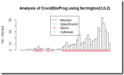
そして今回の新型コロナウイルス肺炎の騒ぎで、伝染病のサーベイランスと結果次第では早めの対応を日本でもできるようにという事で、「日本版CDC」をという議論が出てきているのだろうと思います。ただ、良く判らないのがその機能を担う機関が日本に全くないのかというとそういう訳でもないように思います。それは、さておき感染症のサーベイランスはどんな風にデータを評価しているのか少し調べてみました。Getting started with outbreak detection (アウトブレイクを検出することから始めよう)という論文によるとCDC algorithmという手法があります。新たに発症した症例数を週ごとに集計して、過去の発症例数と比較して変動の範囲を超えて感染者が増加した場合に、そのシグナルを検出する手法です。どんなふうになるのか、論理的な事や数式が出てきて良く判らなくなるよりは、実際のCOVID-19の日本のデータ(3月10日までの集計)を流し込んでどういったアウトプットが得られるのか、ながめてみることにしました。
図はFarringtonアルゴリズムの出力です。四角い柱で1日ごとの度数が表示されています。右端のピークが3月6日。初めのアラートが1月28日(3例報告の日)。

実は、CDCが感染の流行をモニターしているアルゴリズムは週ごとのデータしか解析しないということで、今回のような短期のデータを日ごとで集計しようとするとエラーになりました。そこで教科書にCDCのアルゴリズムと列挙されていましたもう一つのアルゴリズム Farringtonのアルゴリズムで集計してみました。とりあえず、過去50日分の報告件数から、変動の範囲内なのか流行の兆しなのかを計算しているようです。この手法は、日ごろから散発的に報告があるような疾患で、急に増えて流行の兆しではないかというのを早期に発見する目的で使用するのに適している様で、COVID-19の様に全く新しい疾患に対しては、この手法は向いていないように思いました。残念。
A statistical algorithm for the early detection of outbreaks of infectious disease, Farrington, C.P.,Andrews, N.J, Beale A.D. and Catchpole, M.A. (1996), J. R. Statist. Soc. A, 159, 547-563.
https://www.jstor.org/stable/2983331?seq=1
library(“surveillance”)
library(readxl)
X0020_STS <- read_excel(“COVID_STS.xlsx”)
CovidDisProg <- create.disProg(week = X0020_STS$week,
observed = X0020_STS$observed,
state = X0020_STS$state,
start = c(2018, 1),
freq=365,
epochAsDate=TRUE)
#Do surveillance for the last 50 days.
n <- length(CovidDisProg$observed)
#Set control parameters.
control <- list(b=2,w=3,range=(n-50):n,reweight=TRUE, verbose=FALSE,alpha=0.01)
res <- algo.farrington(CovidDisProg,control=control)
#Plot the result.
plot(res,disease=”COVID-19″,method=”Farrington”)
# sts.cdc <- algo.cdc(CovidDisProg, control = control)
# <<<error>>> algo.cdc only works for weekly data.
# plot(sts.cdc, legend.opts=NULL)
使用した集計済ファイル
https://gis.jag-japan.com/covid19jp/?fbclid=IwAR3FWAcLkQvXDTUUMtNwm7qRFhplIxSREML5m-rrPXWzfz7IxVANOBdSeSY
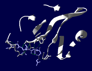
COVID-19の原因ウイルスであるSARS-CoV-2のMproというタンパク質の構造がPDBに公開されていました。エントリは6LU7。PDBの解説の書き方からすると、このウイルスのタンパク質で他にも構造が決定されている分子があるけれども、(無料で無条件に)公開されているのはこれだけだという様に取れます*1。新しいものを発見したとして、その知財を囲い込んで自分達の金儲けにするというのは20世紀的なアメリカンドリームであって、ものが不足していた頃の考え方で時代遅れでないかと。発見したもので社会の様々な問題を解決したり、世の中を良くする様にというような考え方が広がらないかなぁ。それはさておき、タンパク質の発現にバキュロと昆虫細胞を使った系が多い中、このタンパク質は私が慣れ親しんだBL21(DE3)で発現しています。公開されたものを見てみましょう。(レンダリングは私がしましたが、構造はPDB 6LU7を使用しています)
*1 その後多くの構造が公開されています。ACE2とウイルスのタンパク質の結合についてを別記事に追加しました。(2020.04.11)
SARS-CoV-2コロナウイルス3CLヒドロラーゼ(Mpro)のタンパク質で、登録された構造全体(1分子分)を表示しています。Mpro(白)以外にオリゴペプチド様の阻害薬(薄紫)が一緒に含まれています。

阻害薬付近が見えやすいように薄切り(Slab)にしてみます。

両分子間で水素結合がありそうなところを見やすい表示にしてみました。ちゃんとはまり込んでいるような感じになっています。

PDB newsによると、「PDBアーカイブのエントリーと比較すると、少なくとも90%の配列相同性を持つ蛋白質が95件のPDBエントリーで同定されました。さらに、これらの関連蛋白質構造には、約30個の異なる低分子阻害薬が含まれており、新薬の発見に役立つ可能性があります。」とのこと。それらの阻害薬は治療薬の開発の出発点になるかもしれません。
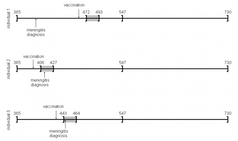
Self-controlled case series (SCCS) の解析方法を試しはじめてしばらく時間が経過しました。その間に、このSCCSを計算するためのRのパッケージが開発されていまして、一見したところ便利そうです。とりあえず、ご多分に漏れず、このパッケージを利用して、過去にやった方法や論文1と同じ結果が得られるのか試してみました。
install("SCCS")
適切なサーバーを選択してインストールが完了するのを待ちます。
library("SCCS")
以前Observation Islandで試したoxfordデータが,このパッケージではamdatという名前で含まれています。どんな内容か確認してみます。
amdat
   case sta end  am mmr
1     1 366 730 398 458
2     2 366 730 399 750
3     3 366 730 413 392
4     4 366 730 449 429
5     5 366 730 455 433
6     6 366 730 472 432
7     7 366 730 474 395
8     8 366 730 485 470
9     9 366 730 524 496
10   10 366 730 700 428
良く似ているけど微妙に調整が必要そうです
| indiv | eventday | start | end | exday |
| 1 | 398 | 365 | 730 | 458 |
| 2 | 413 | 365 | 730 | 392 |
| 3 | 449 | 365 | 730 | 429 |
| 4 | 455 | 365 | 730 | 433 |
| 5 | 472 | 365 | 730 | 432 |
| 6 | 474 | 365 | 730 | 395 |
| 7 | 485 | 365 | 730 | 470 |
| 8 | 524 | 365 | 730 | 496 |
| 9 | 700 | 365 | 730 | 428 |
| 10 | 399 | 365 | 730 | 716 |
前回試したoxfordデータでは開始日が365でした。このパッケージのamdatでは366に。うるう年にかかってしまったかな?などと思うのも良いのですが、とりあえず同じデータで開始したいので、試行する間はパラメータを投入する際にこの部分を前回と同じになるように調整。具体的にはスクリプトでパラメータを与える際に、
astart=sta
と与えるべきところを
astart=sta-1
にして調整しました。
前回試したoxfordデータでは症例10の接種日は716日目だったのが、今回パッケージ附属のamdatでは同じ症例が「症例2」になっていて,接種日が750日目になっていました。とりあえずここも、前回に合わせておきたいので
amdat[2,5] <- 716
とやります。なんだか、細かい質の部分に齟齬が残っているな。
上記2点の調整を含むスクリプトは次のようになります。
library("SCCS")

amdat[2,5] <- 716
am.mod2 <- standardsccs(event~mmr+age, indiv=case, astart=sta-1,
aend=end, aevent=am, adrug=mmr, aedrug=mmr+35,
expogrp=15, agegrp=547, data=amdat)
am.mod2
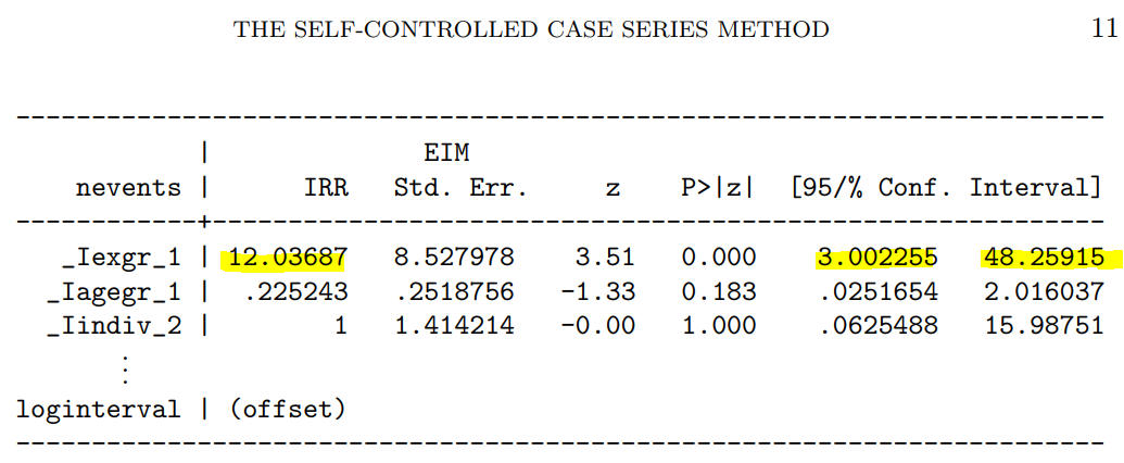
解りにくいかもしれませんが、mmrのオッズ比が12.037 (95%CI, 3.00226, 48.259)となりました。
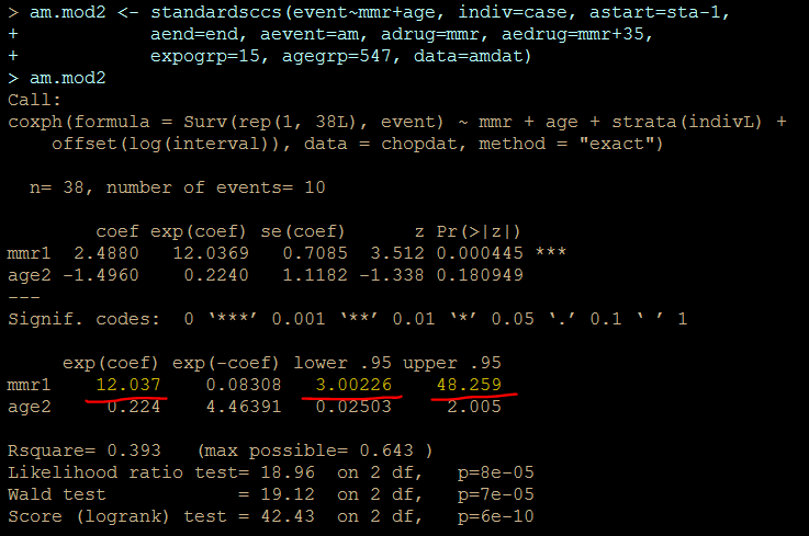
次に示すのが論文で掲載された結果です。今回の集計結果と論文の結果で、小数点以下2桁くらいまでは一致しています。誤差範囲と考えられますので、今回試したRのSCCSパッケージが思ったように機能することが確認できました。投入する前のデータさえきちんとしていたら、使えそうだという印象を持ちました。
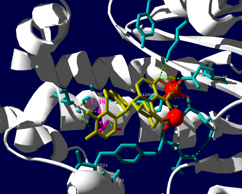
新規インフルエンザ治療薬に耐性を持つというウイルスが、その新規治療薬を使用した患者さんから検出されたという事で、2018.1.25にニュースが流れました。その治療薬は、キャップ依存性エンドヌクレアーゼ (cap-dependent endonuclease) 阻害薬で、一般名バロキサビルマルボキシル (baloxavir marboxil) と呼ばれる医薬品です。ニュースではどういった検査をして「耐性」を確定したかは述べられていませんでした。ソースの情報によるとターゲット分子であるキャップ依存性エンドヌクレアーゼの変異であるPA I38T、I38F等を監視していることが述べられています。これらの変異はNCBIのデータベースに以前より存在していますので、普通に世の中にいるウイルスが持っていた変異だろうと思われます。そして、治験時には10%弱の被験者にこの変異が見られました。治験の情報によりますと、この変異を持っているウイルスにかかった被験者では、治療5日目、9日目にウイルスが検出された割合が野生型のウイルスにかかった被験者より高くなりました。1
この治験データで少し目に留まるのは、プラセボ治療群より変異ウイルスに対する実薬治療群の方がウイルスが検出される被験者の割合が高くなる様に見える点です。力価のグラフを見ていると、耐性ウイルスは一旦力価が低下した後、6日目あたりに再び力価が上昇するようなカーブを描いて見えます。これらのデータが、臨床的に深刻な問題なのかは何とも言えません。詳しく知りたい方は原著1や販売メーカーの資材を見てご検討ください。
PA分子の結晶構造が公開されています2ので、これを利用し耐性のメカニズムに迫る。とか言うたいそうな話ではなく、とりあえず眺めてみました。黄色がbaloxavir acidです。(医薬品のbaloxavir marboxilとは、若干構造が違います)青が活性中心付近に側鎖を出しているアミノ酸残基。そして、ピンクが変異がある場所です。
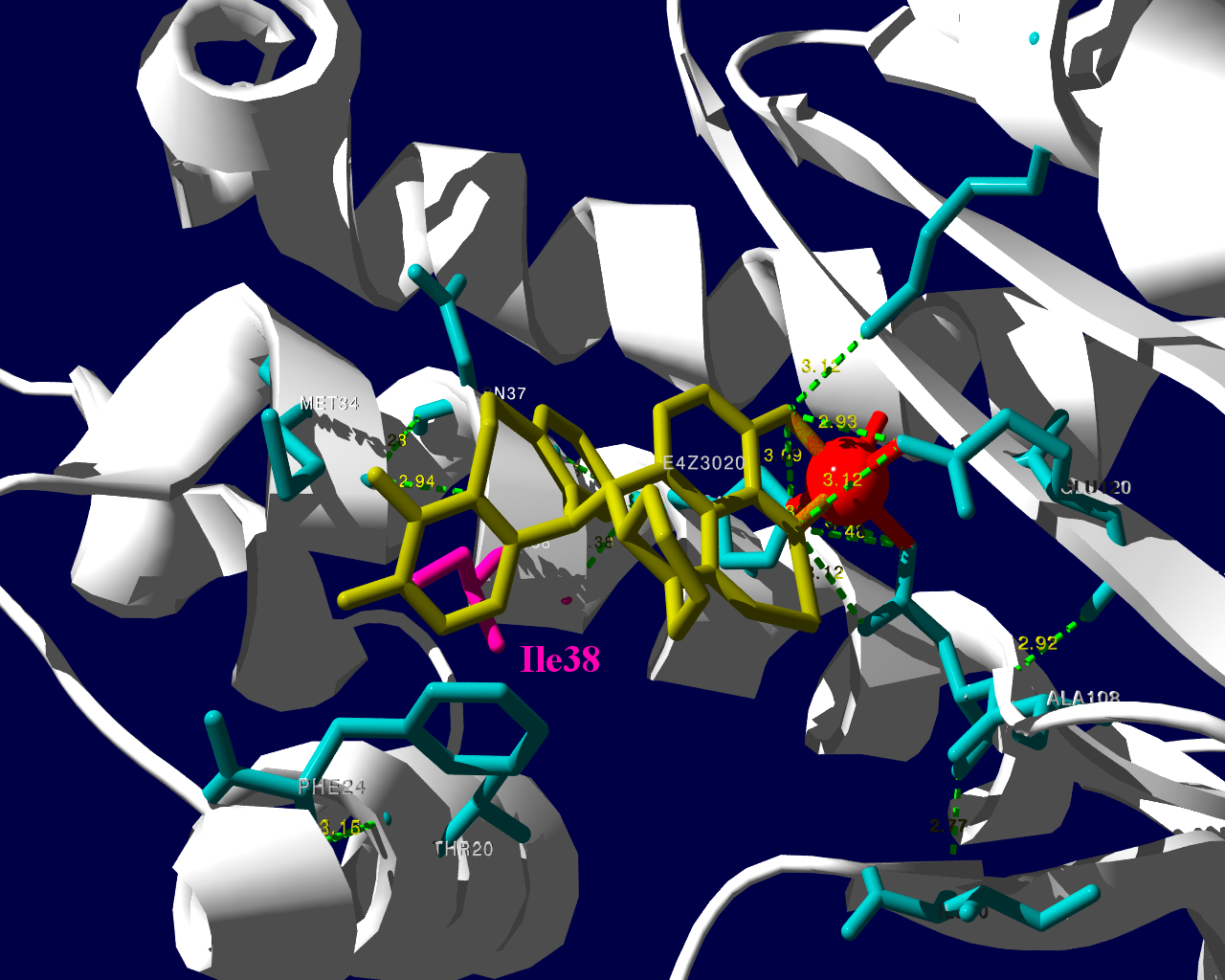
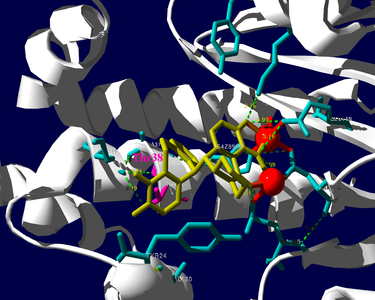
I38Tの変異があっても、作用点にbaloxavir acidが一見きちんとハマっているようです。水素結合を作っているであろう原子間の距離が微妙に違うので、ファンデルワールス力が違い、結合の強さに差が出るのかもしれません。科学的に厳密なディスカッションは、論文2をご確認ください。
お遊びで、いつもより多めに回してみました。
国内の副作用データベースであるJADERを用いた解析の結果を論文として公表しました。この論文は2017年に公表したもので、ごく最近出版という訳ではありません。出版された際に著者には無料で見ることのできるリンクが提供されています。そのリンクは個人で楽しむ目的で使用するものと思っていましたが、Circulationのインストラクションを読んでいましたところ、自身のホームページにリンクを張ることが許可されている事が判明しました。ですので、個人ブログにそのリンクを張ります。
…Circulation誌のインストラクション Q&Aパート…
Q—Can I post my article on the Internet?
A—Corresponding authors will receive “toll-free” links to their published article. This URL can be placed on an author’s personal or institutional web site. Those who click on the link will be able to access the article as it published online in the AHA journal (with or without a subscription). Should coauthors or colleagues be interested in viewing the article for their own use, authors may provide them with the URL; a copy of the article may not be forwarded electronically.
…
<http://circ.ahajournals.org/content/135/8/815>
Yasuo Oshima, Tetsuya Tanimoto, Koichiro Yuji, Arinobu TojoAssociation Between Aortic Dissection and Systemic Exposure of Vascular Endothelial Growth Factor Pathway Inhibitors in the Japanese Adverse Drug Event Report Database
https://doi.org/10.1161/CIRCULATIONAHA.116.025144
Circulation. 2017;135:815-817Originally published February 21, 2017
市販後の副作用報告データベースを解析して、副作用を研究するにあたって、意識しておくべき問題の一つに、アンダーレポーティングがあります。医薬品を製造販売する企業は、その医薬品の副作用情報を知った際には、一定の基準に該当する場合には、設定された期限内に規制当局へ報告することが義務付けられています。(一定の基準とは、自社の医薬品と有害事象の間に因果関係がある、有害事象が重篤である、の2点です。このほかに、「噂(うわさ)」ではなく、副作用を起こしたとされる患者が実在すること、医療目的で使用された医薬品であること、国内で使用された医薬品であることなど周辺の手続き的なコンディションが若干あります。)これに対して、医療現場の主プレーヤーである医師には、「保健衛生上の危害の発生又は拡大を防止するため必要があると認めるとき(薬機法68条の10-2)」に限って当該副作用を報告するように義務付けられています。もちろん、治験や臨床研究で一定基準のものを、どこかへ報告するように定めた契約が存在する場合には、その契約に基づく義務が発生します。
企業で副作用の仕事をしていると、規制当局であるPMDAの査察の際に厳しくチェックされるため、知った副作用情報の報告漏れが無いようにと意識を働かせる動機があります。一方、医師は副作用報告について、発現したものを報告漏れだというような指摘を受ける機会はほとんどなく、実際に発現した副作用を、どこかへ報告するという、動機が働きません。どこへも報告されない副作用が、だれに知られることもなく埋もれてしまう、というようなことも十分想定されます。その、発現しているにもかかわらず、規制当局に報告されない副作用が一定程度存在することをアンダーレポーティングと言っています。
アンダーレポーティングがある事で、規制当局や製造販売元企業がリスクに気づくのに遅れる可能性があります。また、様々な集計の際にしばしば2つ以上の何かを比較します。例えばA薬とB薬を比較する時に、この2つの薬剤で同じ頻度でアンダーレポーティングが起きているという前提がないと厳密になりません。この前提が正しいかどうかを明らかにするのは難しいものです。
感覚としては、起きた副作用がすべて規制当局に報告されているとことはないと思いますが、実際にそういう事が起きているというのが科学的に記述されているでしょうか。この点について、臨床現場の先生が有害事象を選んで報告していることを明らかにした英国及びアイルランドからの研究報告があります1,2。
また、スロベニアで一次市中病院から四次紹介先病院までの入院カルテをレビューした報告によると、医薬品の副作用による入院を医師が認識していても、コーディングしてデータを登録して報告することはまれでした3。
副作用が起きたとして、全てが規制当局に集約される様な仕組みではないので、仕方ないというか。全てが報告されることを基準にして、それより低いから「アンダー」という発想が現実からかけ離れたことを想定しているというか。まぁ、医療関係者も忙しいし、報告自体よりその仕組みを理解するのが面倒だったりというのもあり。全体に違和感のある部分ではあるのですが要因を分析して見ないことには、次に繋がらないのでこの辺りも少し調べました。
ベネズエラでの研究グループは、医師が自発報告のシステムについての知識が乏しい事が示され、これがアンダーレポーティングの原因であるという仮説を主張しました4。
スペインからの報告5では、
がアンダーレポーティングの要因として提唱されました。スペインからのもう一つの報告6では
がアンダーレポーティングの要因として提唱されました。
スペインの報告2の(1)を「関心の低さ」と訳しましたが、原文ではforgetfulnessでした。スペインでは薬剤師が(3)の判断をしているのかと少々驚きました。日本で調剤薬局の薬剤師から受ける報告では、「薬を使った」→「何か症状を訴えている」で、ほぼ何も考えず「副作用である」かのごとき報告がなされます。「副作用名」もほぼ「患者が訴える症状」あるいは、「診断根拠が希薄な病名」です。調剤薬局の薬剤師からの情報は処方箋に書かれた医薬品情報と患者さんとの会話でしか病状を把握できないことがほとんどで、基礎疾患や臨床検査値や治療の経過等の正確な情報が得られることはほとんどありません。その上、多くの場合処方した医師に対して、薬局薬剤師や企業が因果関係を問う事も難しいことが多く、薬局薬剤師の置かれた立場からすると、得られる情報が限定的なのもやむを得ないことです。結果として薬局経由の情報は症例評価には限界があります。
ドイツからの報告7で、メールにより1315名の医師にアンケートした結果によると、規制当局のシステムを使って報告するより、製薬企業を通して報告する方を好む医師が多かったということです。この報告によると、アンダーレポーティングを抑制するには、医師による自発報告を支援する事が提案されました。経済的インセンティブや教育活動によって、臨床家が副作用を報告する活動が改善することを報告した論文は複数あります8–12。副作用を疑ったら、規制当局に報告するという活動があることを知る患者は少なく、患者自身による副作用報告を提案する論文もあります13–15。
インセンティブを厚くすると、その副作用も心配です。容易に想像できるのはそのインセンティブ(お金)目当てで、あまり大したことのない副作用を多数報告する臨床家や、最悪存在しない副作用を報告するものも現れるかもしれません。私としては報告を少々増やすことと引き換えに、これらのノイズを多く混入させることが解析上の困難を引き起こすことを懸念します。
患者自身の副作用報告については、医学的な判断の入った診断と言うよりは主観的な症状が中心になります。患者は副作用を経験したと思ったら、規制当局に報告するより、疑わしい医薬品を処方した医師に相談して、医学的判断を仰ぐので良いのではないでしょうか。忙しそうにしている医師にわざわざ報告するほどでもない、という副作用であれば、規制当局的にも必ずしも重要視しないような病態ではないかと思います。
現在の自発報告の状況は完璧とは程遠いものです。でも、これまでいくつかの薬害を乗り越えて、副作用報告の制度が洗練されてきた医療用医薬品に関しては、深刻なほど、新規の副作用の検出力が低いとも思えません。
医薬品関連の業者Aが、「副作用の収集業務を始めました。サンプルとしてこういう情報を入手しています」として、数件の副作用情報を製薬企業Bに提供しました。薬事法(現薬機法)に基づきますと、製造販売元企業Bが副作用情報を入手した際には規制当局に報告する義務が発生します。ですのでその情報も当局へ報告しました。企業Bも海外本社のグローバルカンパニーで、一定の基準に合致する副作用は、米国FDAや欧州EMAをはじめ各国の規制に従ってそれぞれの規制当局へ報告されました。
製薬企業は、入手した情報について、具体的で詳細な情報を確認に行くように、と規制当局より常々指導されています。当初業者Aより入手した情報に基づき、情報源とされる調剤薬局や卸業者さんへ企業Bの営業担当者がそれぞれ手分けして確認に行きました。すると、行った先では「そのような副作用情報を報告していない」「業者Aが何かないかとしつこく聞くので適当に作り話を言った」というようなケースばかりで、副作用症例が実在しないことが明らかになったのです。ねつ造情報でも、それらしいものを企業に送り付ければ、ビジネスになるというような安易な理解で参入しようとしていたとの結論に至りました。副作用報告の規制の細やかさを理解していれば、虚偽の情報を企業が裏を取らない訳にはいかない事は明白なのですが、その規制すら理解していないようです。
ねつ造情報に基づいて、各地の営業担当者が薬局や卸さんを訪れ、さらに、「そんな情報はない」と言うような話のかみ合わない不快な時間を過ごしました。訪問された方も、業者Aにしつこく副作用の情報を求められ、その後製造販売元のAから再度詳細情報を求められ、と無意味な問い合わせの対応に時間を取られました。企業Bでは日本をはじめ各国の規制当局には、副作用情報を報告した後、さらに、取り下げの手続きを行ったりと大変な無駄な業務を余儀なくされました。その時には業者Aが解りやすくねつ造していましたので、まもなくねつ造が確認できました。でも、情報源である医療関係者が虚偽の報告を(少額の)お金のために作り始めると、なかなか裏を取ることは難しそうです。
<この記事は内科学会雑誌に掲載した記事のセルフアーカイブです。誤字脱字等も含め内容は公開版の最終稿と同一です。>
大島康雄
東京大学医科学研究所 先端医療研究センター・分子療法分野
郵便番号 108-8639
住所 東京都港区白金台4丁目6-1
℡ 03-6301-3845
電子メール 0-oshima@umin.ac.jp
医薬品医療機器総合機構(PMDA)のWebpageによると、2010年1月から11月までの期間に使用上の注意の改訂指示があった医薬品情報は170件あった (http://www.info.pmda.go.jp/kaitei/kaitei_index.html)。 この中でアンジオテンシンII受容体拮抗薬、いわゆるARBである、オルメサルタン メドキソミル、テルミサルタン、バルサルタンおよびそれらを薬効成分として含む合剤の使用上の注意へ、「横紋筋融解症」の副作用の記載をするようにとの指示が私の目を引いた。横紋筋融解症は一旦発現すると死亡に至る割合が1割近くもある深刻な病態である(1)。それに加え、ARBは臨床現場で多くの患者さんへ使用されているため、規制当局からの情報は大きな影響力を有しかねない。しかし、気になったのはそのためだけではない。HMG-CoA還元酵素阻害薬、いわゆるスタチン類では個人的な臨床経験としてあるいは同僚医師らとのコミュニケーションの中で、クレアチンキナーゼ上昇あるいはこれに筋症状等の伴った筋炎と考えられる症例を経験することがあり、スタチンの筋組織に対する傷害性を感じる機会があった。これに対して、ARBではこうした身近な経験をする機会が乏しかったのだ。厚生労働省のWebpage掲載文書である医薬品・医療機器等安全性情報No.271の記載によると、オルメサルタン メドキソミルでは、平成21年度1年間での使用者数おおよそ180万人に対し、集計当時の直近3年間に横紋筋融解症症例のうち因果関係が否定できない症例が1例報告されている、との記載がある。 同じくテルミサルタンでは1年間使用者数190万人に対し直近3年間で3症例、バルサルタンでも同じく410万人に対し4症例との記載である (http://www1.mhlw.go.jp/kinkyu/iyaku_j/iyaku_j/anzenseijyouhou/271-2.pdf)。医薬品・医療機器等安全性情報No.271には改訂指示の根拠となった症例の概要等に関する情報が紹介されている。それぞれの症例の臨床経過を見ると、症例で副作用が報告されていることは理解できるものの、添付文書上で注意喚起を行うという一種のリスクコミュニケーションが必要であると判断したロジックは読み取れない。医薬品・医療機器等安全性情報No.271に記載された数字には、副作用症例を経験された臨床現場の先生方が任意でご報告される、いわゆる自発報告に基づく数字が含まれると考えられる。自発報告の弱点として、発現していても報告されない症例が少なからずあると思われる、いわゆるアンダーレポーティングの問題が指摘されている。言い換えるならば、実際には報告されている症例より多くの有害事象が発現している可能性が考えられる。それにしてもこの程度の報告数であれば身近な経験が情報共有されないのも納得ができる。と同時に、添付文書上で注意喚起を行うというリスクコミュニケーションが本当に必要なのか、情報の受け手としての医師はこの情報をどの様に日々の臨床に生かすことが求められているのか疑問が湧く。
本稿では、医薬品使用中または投与後におきた医療上の好ましくない事象である有害事象が、本当に医薬品が原因で起きた副作用であるかどうか、すなわち有害事象と医薬品の因果関係についてどのような判断の方法があるのかについて、いくつかの例を紹介させていただく。
臨床試験中に生じた有害事象と試験薬との因果関係の評価は、重要な意味を持ちうるにもかかわらず、客観的で確立された基準があるとは言えない。疾患の経過中に起きた有害事象は、被疑薬による副作用のほか、被験者がもともと有していた病態に関連した症状、併用薬剤による事象、治療手技の合併症、それらとは無関係に偶然おこる偶発症などさまざまな可能性がある。原因についてのさまざまな可能性を臨床的に推論してゆく中で、相対的に他の要因が考えにくい場合に被疑薬との因果関係があると考えられる。つまり、いわゆる臨床推論そのものであり、一律に基準を設けるのは困難である。治験中に得られる安全性情報の取り扱いについて、INTERNATIONAL CONFERENCE ON HARMONISATION (ICH) E2Aという国際的ガイドラインがある。その規定によると、薬物投与後に起きた有害事象について、完全に否定することは論理的には困難であるにもかかわらず、「因果関係が否定できない場合に、合理性を以て因果関係の可能性があるとする」との考え方が記載されている(2)。脚注 このように基準となるべき文言についても客観的で一定の判断が常にできる基準とは言い難い。このほかにも考慮するべき点はいくつか報告されている。上記ICH E2Aの記述および、同じく国際的な治験や市販後の医薬品評価にかかわる議論を深めてきた国際医科学団体協議会(CIOMS, council for international organizations of medical science)が、因果関係の判断に関して考慮するべきとして指摘している点を4点以下に列挙する。あるべき姿として、評価できるだけの十分な医療上の情報を得たうえで判断がなされるべきである。
また、有害事象の性質や、被疑薬(代謝物を含む)の類薬についての以下のような情報がもしあれば、これらも含め総合的に因果関係が評価される場合もある。
上述の情報を考慮しても、個別症例の有害事象が被疑薬と因果関係があるのか否かの判断が困難なケースが少なくない。
臨床試験のうち、新医薬品等の承認を得るための臨床試験を治験と呼び、これはいわゆるGCP省令に基づいて行われ、治験届がなされている。治験では、個別症例の有害事象について、治験責任医師等がその因果関係判断を行う。治験責任医師等が当該有害事象と試験薬との因果関係を否定しないと、治験依頼者によって個別症例の副作用として報告等の必要な手続きが検討される。この場合試験が継続中であれば、規制当局および治験に参加している他施設への迅速報告が検討されるとともに、その重要度によっては試験の継続についても検討される。しかしながら、試験が終了し、集積検討をする段階では、個別症例についての因果関係評価に基づいてそのまま、「当該試験薬が当該副作用を引き起こす」というように医薬品が評価されるわけではない。むしろ逆である。Food and Drug Administration (FDA)では審査官(reviewer)向けのガイドブックが作成され公開されている。このFDAレビューワーガイダンスによると、有害事象の報告に責任のある治験責任医師(investigator)あるいは治験依頼者(新医薬品等の申請者としてapplicantの用語で登場する)が行った個別症例についての因果関係判断からは、あまり有用な情報が得られない、あるいは、無視するようにとも取れる記述がみられる。以下に因果関係評価についての記述をFDAのレビューワーガイダンスより引用する。(http://www.fda.gov/downloads/Drugs/GuidanceComplianceRegulatoryInformation/Guidances/ucm072974.pdf)
どうして個別症例の因果関係評価を無視するような記述になっているかと言うと、集積検討をする場合には個別症例の因果関係評価とは別の情報が加わるからである。どのような情報かについては、具体例を提示することで解説したい。以下に臨床試験に関する教科書であるStatistical Issues in Drug Developmentからの例を2つほど引用する(3)。元の教科書を参照していただければわかるが、これらの例は架空の例であり、過去に実施された治験についての記録ではない。しかし、本稿では過去に起きたような時制で文章を記述させていただくことをあらかじめお断りしておく。
これらの例で興味深いのは、個別症例の因果関係判断が、集積検討の結果覆る点である。集積検討で得られる情報で重要な情報は、比較対象であるプラセボ群との発現頻度についての情報である。お示ししたような例が論理的にはあり得るため、FDAでは医薬品の有害事象の因果関係判断を行うに当たって、治験責任医師や治験依頼者の行った個別症例の因果関係判断を必ずしもそのままでは受け入れず、7.1.1の死因の記述にある通り頻度を確認するようにしている。頻度が同程度であっても、実薬で早期に発現していないか、重症度が実薬で高くないか等が比較されることもある。
ここで、本稿の趣旨とははずれるが、もう一点強調しておきたい点がある。先の例では集積検討の結果、当初報告してきた治験担当医の因果関係評価は「誤り」となる。にもかかわらず、医薬品評価としては何の問題も生じない点である。開鍵後の集積検討の結果を知ることなしに、それまでの医学的な知識に基づいて、一定の合理的な判断をしている限り、結果として因果関係評価が誤りであったとしても、試験上は問題にはならないのである。筆者の知る限り、国内で試験に参加される先生の中には、こうした「結果として誤り」となることを恐れるあまりか、例1のような場合で、因果関係は絶対に否定しないお考えの先生方もおられる。そうした判断の考え方は例2のような場合には逆に結果として「誤り」となってしまう恐れがあることも考慮されておくべきであろう。治験責任医師らはご自身の知識と経験そして、目の前の患者さんの状況を鑑み、因果関係があるのかないのかを素直に医学的に判断して、それでも「結果として誤り」となることは避けられないものである。
また、臨床試験に参加される先生方のご心配は他にもあるようだ。「因果関係はないと思うが、治験責任医師らが因果関係を否定してしまうと、その事象が誰からも評価されることなく承認審査が行われるのではないか」と懸念され、因果関係を否定することに躊躇する先生方もおられる。これにも、誤解がある。個別症例の因果関係を「なし」とした場合、確かに試験継続中の他施設や規制当局への迅速な報告はなされないであろう。しかし、FDAレビューワーガイダンスに示した通り集積検討の段階では、因果関係が否定されている事象も含め、有害事象のリストに記載され、集計され、規制当局へ報告される。これは国内でも同様である。言い換えるならば個別症例の因果関係を否定したとしても、その有害事象の情報が闇に埋もれてしまう心配はない。
治験責任医師らは、自身の医学的知識と経験にもとづき、目の前の被験者の状況を鑑み、因果関係があるのかないのか、医学的に判断することに専念することが求められる役割であろう。
残念ながら、前述の例のようにプラセボと比較して実薬で発現頻度の高いものを「実薬による」とするように明快な判断ができる有害事象は、条件が整った限られたケースのようである。プラセボの情報が不十分な場合では、治療対象疾患の経過中に起きることが知られている合併症としての事象の頻度や、一般人口中での発症頻度、類薬での発現頻度などを比較の対象として判断する場合もあるかもしれない。いずれにしても上市時に得られている医薬品の副作用情報は限られている。市販後に初めてわかるような安全性情報も少なからずある。開発段階での安全性情報が不十分となる要因を先ほどとは別の教科書から引用する(4)。
このリストの中の問題の多くは、治験では選択基準に合致する限られた被験者に限られた期間のみ投与され、一定の観察期間のみの情報が収集されることから、市販後に起きる状況が十分評価できないのである。この要因の中で異質な点が5番目の要因である。ここに記載されている社会的要求が安全性の情報とのトレードオフとするような考え方に抵抗感を示す先生方もおられるかもしれない。しかし、過度な社会的要求は治験を最低限の期間で、かつ最小の被験者数で進めるような圧力になりかねない因子の一つである。そうした圧力の有無にかかわらず、治験段階での安全性評価は限られた情報であるとの認識に基づいて、市販後に安全性を監視し続けることが臨床医には求められていると考えられる。
市販後の安全性情報にはSolicited とUnsolicitedな情報がある。 Solicitedとは試験や調査等登録患者を一定期間観察して、有害事象が発症しないかを観察する、つまり観察される集団があらかじめ定義されている安全性情報をいう。市販後の情報の報告数を見るとSolicitedな情報も一部にはあるものの、数として多いのは自発報告等のUnsolicitedな情報である。自発報告とは、副作用症例を経験された臨床現場の先生方が任意でご報告される、副作用報告のことである。自発報告は2つの大きな問題を抱えており信頼できる発現頻度を計算することができない。第一は薬物曝露状況つまり、どのくらいの被疑薬投与症例に被疑薬がどのくらいの期間投与されたのか、事象の発現頻度であるincidenceを計算する場合の分母にできる数字がない。分母にできる数字の代替として思いつくものに、出荷数量から推計できる使用患者数がある。これについては、ヨーロッパの規制当局であるEMEA のガイドライン案によると、「すでに市販されている医薬品で、自発報告された有害事象数あるいは有害反応数を分子に、販売数を分母にした報告率は、医薬品使用者での有害反応の発生率の推定値として提示すべきではない。」とあり、少なくともヨーロッパでは好ましくないことと考えられている。出荷数量は流通在庫や期限切れによる廃棄の問題や一人当たりの使用量の推計が、どの程度実臨床の状況を反映されているのかが不明であるといった問題がある。このため分母が不正確にならざるを得ない状況があり、発生率の推定値としては好ましくないとしているのであろう。
第二は、実際に起きている有害事象のうち一部しか報告されていない、つまりアンダーレポートの問題があり、incidenceを計算する場合の分子にできる数字は、実際に事象が起きている件数より小さいと推定できる。そのほかにもいくつかの重要な問題があり以下にリスト化する。
不確実な診断は副作用報告の深刻な問題の一つである。自発報告では通常ごく限られた情報が報告されてくることから、規制当局や製薬企業が診断を確認することは困難である。さらに、報告者が薬局薬剤師、患者やその家族等であった場合は、診断や診断根拠を報告者自身が十分把握していない場合もある。副作用を診断した医師が報告する場合であっても、報告医師の専門分野以外の副作用については診断が正確でない場合が考えられる。また、他の病院などからの転院患者を引き受けて、その後起きた副作用を報告するような場合、前医で治療されていた基礎疾患やその臨床経過についてのデータを十分引き継いでいない場合もある。さらに、自発報告では仮によく知られている絞絡因子が当該症例にあったとしても、報告されてこないかもしれない。
診断自体に困難な点がない場合でも報告事象名の選択が悩ましいケースがある。例えば、高齢者の多発性骨髄腫の患者に化学療法が行われ、その後発熱および下痢を発症した。経過中、腎不全となり、死亡した。このように一連の経過で複数の病態が観察された場合に、報告者が副作用として選択する事象名にはぶれが生じうる。より多くの種類の病態が起きるような場合はさらに事象名の選択は複雑になる。これとは別の問題として、新聞やテレビといったマスメディアでセンセーショナルに取り上げられた副作用については、過去の経験にさかのぼって報告するなどにより急に副作用報告件数が増えることが知られている。また、多くの患者に使用される医薬品は、薬物とは因果関係のない偶発症等の情報を含め、多くの有害事象が報告されてくることになる。
臨床試験では開鍵後に集積検討をすることができるが、自発報告には分母にできる数字や比較対象にできるプラセボ群もない。かといって、集積検討が全くできない訳ではない。世の中で起きている医薬品の副作用について迅速にうかがい知るうえで、現状として最大の情報を蓄積しているのが市販後の自発報告を含む副作用データベースである。前項のような自発報告の欠点があることを把握したうえで、精度は落ちるものの大量のデータから科学的推論をすることは可能であるとされ、医薬品曝露情報(incidence の分母に相当する情報)に代わる何らかの指標を用いる手法がいくつか開発されている。原理のもとにある考え方は単純である。表に示した通り、安全性データベースの中で、興味の対象である医薬品Xについて、興味の対象である有害事象Aが何件報告されているかをn(X,A)と表現する(表 パネルA)。
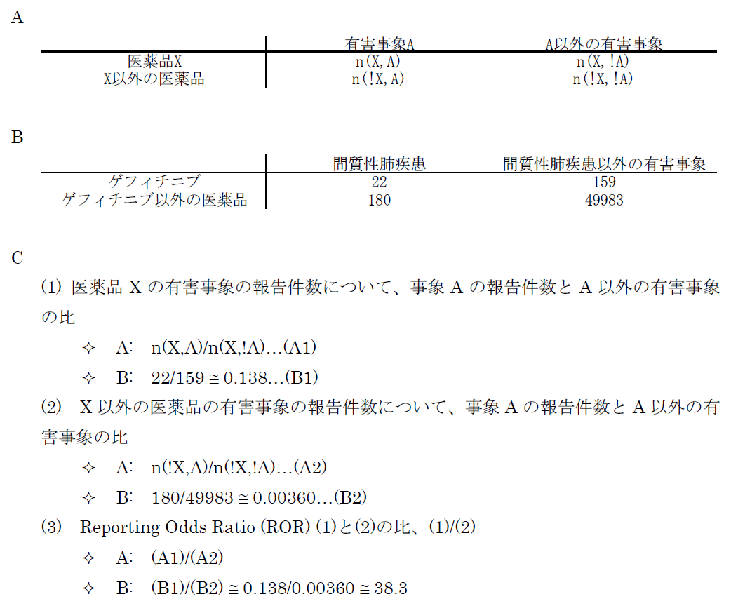
医薬品XについてA以外のすべての有害事象(!Aとする。以下同じ)の件数n(X,!A)とのオッズ比であるn(X,A)/n(X,!A)を計算する。X以外のすべての医薬品についても同様のオッズ比n(!X,A)/n(!X,!A)を計算し、この2つのオッズ比を比較する、すなわち、n(!X,A)/n(!X,!A)に対するn(X,A)/n(X,!A)の比を見ることで、相対的に医薬品Xについて有害事象Aが多く報告されていないかを検出する。これらの数字の比をROR(reporting odds ratio)と呼ぶ。具体的な数字を用いて計算過程を例示するため、2004年の第一四半期の3か月間にFDAに報告された副作用が疑われた症例の報告件数を表のパネルBに示す。この例ではゲフィチニブを興味の対象である医薬品とし、また、興味の対象である副作用を間質性肺炎とした。この3か月間にゲフィチニブが被疑薬として報告された間質性肺炎は22件あり、それ以外の報告事象は159件であった。ゲフィチニブについて、全有害事象報告件数に対する間質性肺炎の報告件数の比は、約0.138であった(パネルC-(1))。これに対して、同じ期間にゲフィチニブ以外の医薬品が被疑薬として報告された間質性肺炎は180件、ゲフィチニブ以外の医薬品が被疑薬として報告された間質性肺炎以外の事象は49983件であった。ゲフィチニブ以外の医薬品について、全有害事象報告件数に対する間質性肺炎の報告件数の比は、約0.00360であった(パネルC-(2))。ゲフィチニブのROR値は0.138と0.00360の比である、約38.3となる。ゲフィチニブについて、それ以外の医薬品と同程度の間質性肺炎が報告されてくると仮定すると期待されるROR値(帰無仮説H0 に基づくROR値)は1.00であるのに対し、計算結果は約38.3であった。閾値をどうするかという議論はあるが、この値は一般的にはシグナルと判断できる程度に大きい値である。ここで、原理を考えていただくためにお示ししたRORは、データベースに入力されている件数が少ない事象や被疑薬としての報告件数が少ない医薬品についての精度が不十分であるとの指摘もある。その精度を上げるべく開発されているものがいくつかある。「はずれ値」を検出するという目的から、neural networkやsupport vector machineといったアルゴリズムを応用することも検討されているが、本稿ではそうしたデータマイニング手法の一つを次の例としてお示しする。それは世界保健機構(World Health Organization, WHO)が開発したBayesian Confidence Propagating Neural Network (BCPNN) という手法であり、BCPNNを用いてFDAが公開しているAdverse Event Reporting System (AERS)データベースのデータを集計し、一般によく知られているいくつかの副作用等を継時的に表現し簡単な解説を加える。
本稿ではBCPNNの計算結果出力されるInformation Components (IC)値およびstandard deviation (SD) 値を示すが、BCPNNの計算方法や解釈についての詳細は他論文を参照していただきたい(5)。FDA AERSのデータを2004年第1四半期から2010年第2四半期まで過去に報告した方法に従い入手した(1)。四半期ごとにそれまでの集積状況をもとに計算した結果を表示したのが図1である。スタチンとして集計した医薬品には、simvastatin, atorvastatin, rosuvastatin, pravastatin, fluvastatin, losuvastatin, cerivastatin and pitavastatinが含まれる。また、アンジオテンシン変換酵素(ACE)阻害薬には、captopril, enalapril, alacepril, delapril, cilazapril, lisinopril, benazepril, imidapril, temocapril, trandolapril, perindoprilが含まれる。そしてARBには、olmesartan, telmisartan, valsartan, candesartan, irbesartan, losartanが含まれる。プロットされている点は2004年第1 四半期から各報告期間までに集積された累積のIC値である。エラーバーはSD の2倍である2SD が表示されている。BCPNNの開発時に過去の事例でシグナルの検出を試した結果、IC-2SD > 0 すなわち、図で言えばエラーバーの下限が0のラインより上に来たらシグナルとみなすこととされている。本稿の例ではゲフィチニブの間質性肺炎、スタチンの横紋筋融解症、ACE阻害薬の咳についてのIC値は、いずれの時点で見てもそれらのエラーバーの下限が0のラインを上回っている。言い換えるならば、BCPNN法を用いてFDAのデータを解析すると、医薬品リスクのシグナルが検出されたことになる。これに対し、ARBの横紋筋融解症についてのIC値は解析した期間中にエラーバーの下限が0のラインを上回っているポイントはなく、BCPNN法ではシグナルは検出されない。つまり、BCPNNのように相対的な報告頻度という観点からの集計では、ARBによって横紋筋融解症が起こりかねないと懸念する根拠を見出すことはできなかった。
なお、FDAのデータは日本からの報告も含まれるが、間質性肺炎等日本からの報告が多い一部の例を除くと、日本よりは米国での発現状況を色濃く反映していると考えられる。つまり、日本国内での副作用発現状況については、FDA AERSとは異なる可能性は否定できない。国内の副作用状況はPMDAが医薬品ごとの副作用情報を公開している。しかし全医薬品についての報告数を集計する必要のあるBCPNN等のデータマイニング手法は、PMDAの外部の研究者にとって現実的には難しい。本稿では紹介しなかったが、イギリスの規制当局で採用されているProportional Reporting Ratio (PRR)と言われる手法や、FDAで採用されているGamma Poisson Shrinker program (GPS)の手法も基本的にはBCPNNと同様のデータを用いて計算される。いずれも、大量のデータに埋もれている問題を拾い出す、新たな問題の提起に有用と考えられているが、検証的な評価には必ずしも向いていないとされる。
ある患者に治療を行い、その後治ったとする。その患者さんにとっては良いことかもしれないが、個別の症例を見ている限り、その治療が本当に効いたのかどうかについて判断することは困難である。同様に個別症例に治療を行い、その後有害事象が起きた。臨床経過を見るとその個別症例にとって医薬品による副作用と考えられる場合でも、その医薬品と有害事象の因果関係を判断することは困難である。臨床試験で検出できる医薬品のリスクも限界がある。本稿では個別症例および集積検討を行う場合の有害事象の医薬品との因果関係評価の考え方や、市販後副作用データベースを利用し、限られた現在の状況で医薬品の副作用リスクのシグナルを検出する方法等について紹介した。本稿で紹介したBCPNN等ではシグナルが検出されない医薬品リスクもあるだろう。冒頭のARBの例では、副作用として報告した臨床家の先生方、専門協議にご参加の先生方それぞれが、当該症例の報告について詳細な情報を検討され、当該医薬品について真摯にリスクとベネフィットをお考えの上で行動された結果が使用上の注意の改訂指示につながっていると理解している。使用上の注意の改訂等のリスクコミュニケーションは一般に、検出されたシグナルがはっきりリスクであったと確認される頃に発出されても被害が甚大となり、手遅れと言われかねないことを考えると、コンサーバティブな方向に偏るのもやむを得ないことと思われる。リスクコミュニケーションの結果、社会全体で救われる患者さんがわずかでもおられれば良いのかもしれない。一方でリスクコミュニケーションが過剰であったならば、必要な治療を受ける機会が狭められる患者が出る懸念や、リスクコミュニケーション自体の信頼性が低下しかねない懸念についても思いをはせる必要がある。情報の受け手である医師は提供された情報が、どの程度のリスクなのか、どのような情報に基づいて判断されたのかについて、その根拠を吟味し、科学的な視座より把握した上で日常の診療へ結び付ける努力が求められる。
報酬(サノフィ・アベンティス株式会社)
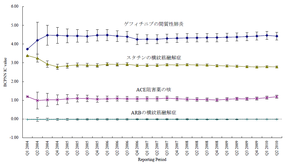
図1 報告期間とBCPNN IC値
ARBの横紋筋融解症および、副作用としてよく知られているゲフィチニブの間質性肺炎、スタチンの横紋筋融解症、ACE阻害薬の咳について四半期ごとに区切った報告期間までの累積BCPNN IC をプロットした。エラーバーは2SDを示す。よく知られた3つの副作用の例ではエラーバーの下限が0を超えておりBCPNN法でシグナルが検出された。一方、ARBの横紋筋融解症についてはエラーバーの下限が0を超える期間はなく、シグナルはBCPNN法で検出されなかった。
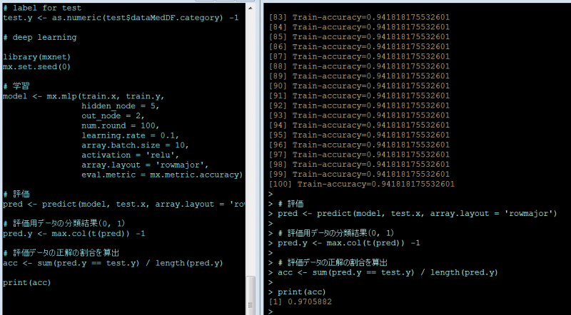
本稿はRのパッケージでdeep learningができると聞いて、ネットで調べながら、パッケージを使う道筋をつけるまでの、忘備録です。サンプルにしたのは、「A薬」で検索した結果と「B薬」で検索した結果を、テキスト形式でA.txt, B.txtとしてPCに保存したうえで、一部を学習用サンプル、残りをテスト用サンプルにして、学習の効果(?)を測定しました。集計に入る前に、ダウンロードしたデータの中の、検索キーワードを削除しました。(←これをしないとさすがに検索キーワードそのものがそれぞれの集団にばっちり入ってしまうので分類の性能が評価できないのではないかと)
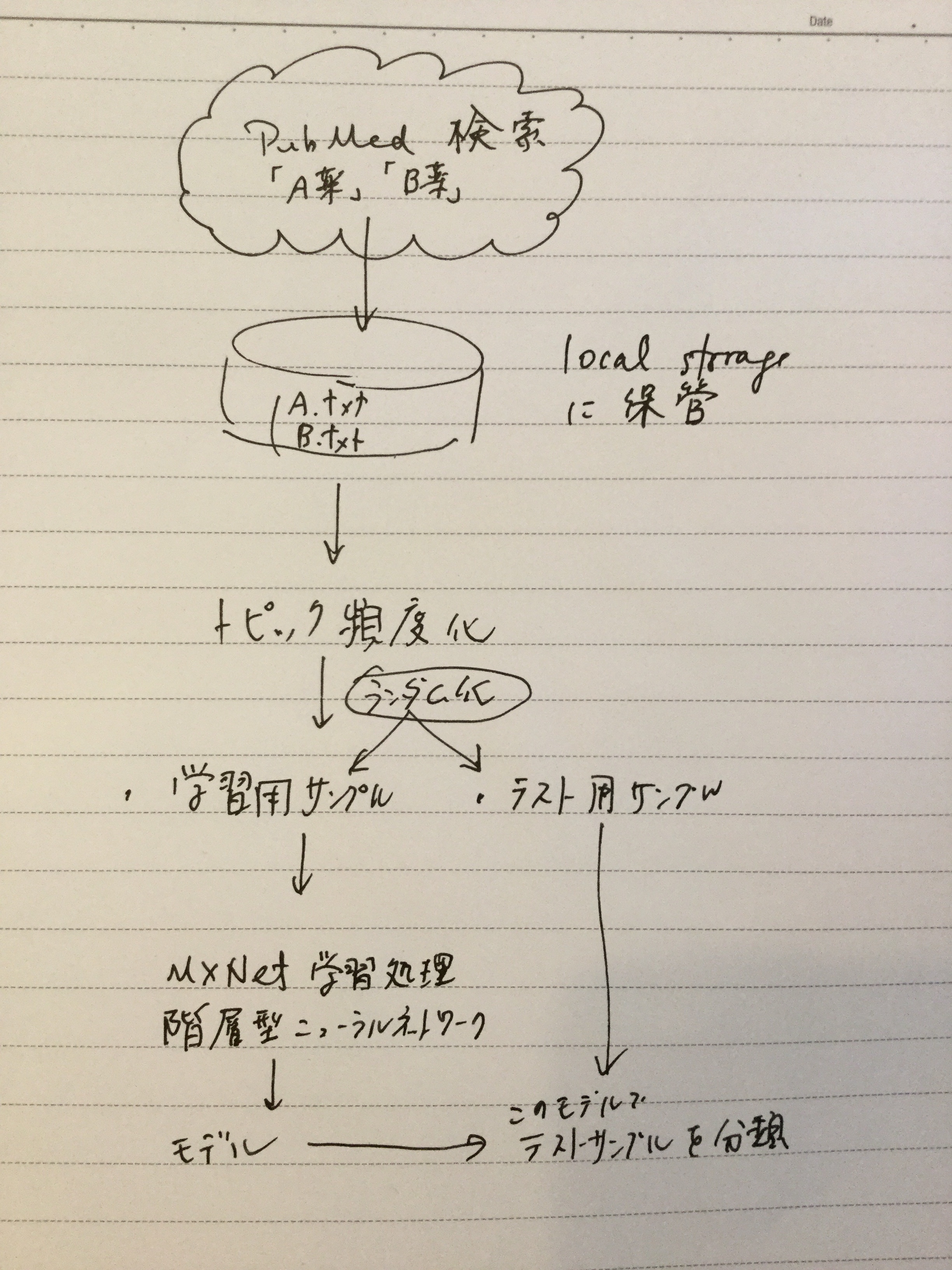
はっきり分類しやすいように、今回はAは抗癌薬、Bは免疫神経系疾患治療薬と治療対象の疾患の性質が違うものにしています。検索結果は、Medline形式でダウンロードします。このあたりの手順は、【Rで自然言語処理】を、ほぼそのまま利用しています。(「データ分析系男子」さんありがとうございます。)分類に使用したMXNetの周りのスクリプトは【RのMXNetでirisを分類】を、ほぼそのまま利用しています(「なんとなくなDeveloper」さんありがとうございます。)
とりあえずこのパッケージのインストールです。インストール方法は、他の日本語のサイトの説明通りでは、なぜかうまくゆきません。一応以下の流れでインストールできました。他のパッケージは特に苦労することなくinstall.packages()でインストールできました。
# first add the repo
drat::addRepo(“dmlc”)
# either install just one or more given packages
install.packages(“xgboost”)cran <- getOption(“repos”)
cran[“dmlc”] <- “https://s3-us-west-2.amazonaws.com/apache-mxnet/R/CRAN/”
options(repos = cran)
install.packages(“mxnet”)
検索キーワードは普通に入力して検索すればよいのですが、あまりたくさんの文献があっても取り回しが悪いので今回は検索対象を今年出版の文献としました。またアブストラクトで分類しますので、アブストラクトが入力されている英語の文献に絞って出力するようにしました。
保存に当たっては、send toからFile-Medline形式を選択しました。
setwd(“C:/Users/Oshima/Documents/2018/R deep learning/TXT/”)
## define function
medline <- function(file_name){
lines <- readLines(file_name)
medline_records <- list()
key <- 0
record <- 0
for(line in lines){
header <- sub(” {1,20}”, “”, substring(line, 1, 4))
value <- sub(“^.{6}”, “”, line)
if(header == “” & value == “”){
next
}
else if(header == “PMID”){
record = record + 1
medline_records[[record]] <- list()
medline_records[[record]][header] <- value
}
else if(header == “” & value != “”){
medline_records[[record]][key] <- paste(medline_records[[record]][key], value)
}
else{
key <- header
if(is.null(medline_records[[record]][key][[1]])){
medline_records[[record]][key] <- value
}
else {
medline_records[[record]][key] <- paste(medline_records[[record]][key], value, sep=”;”)
}
}
}
return(medline_records)
}## read Medline
fileVec <- list.files(file.path(getwd()),
pattern=”.txt”,
full.names = T)
categoryVec <- list.files(file.path(getwd()),
pattern=”.txt”)
dataMed <- lapply(fileVec,medline)## exstract Title, Abstract and CategoryVec
dataMedList <- lapply(seq(1,length(dataMed)),function(x){
res <- lapply(seq(1,length(dataMed[[x]])),function(y){
out <- data.frame(title=dataMed[[x]][[y]]$TI,
abst=dataMed[[x]][[y]]$AB,
category=categoryVec[x])
return(out)
# return(x)
})
return(do.call(rbind,res))
# return(y)
})dataMedDF <- do.call(rbind,dataMedList)
dataMH <- sapply(dataMed,function(i){
sapply(i,function(x){
if(all(!(names(x) %in% “MH”))){
strMH <- c()
}else{
strMH <- strsplit(x$MH,”;”)
}
strMHgsub <- gsub(” “,”_”,strMH[[1]])
strMHpaste <- paste(strMHgsub,collapse = ” “)
return(strMHpaste)
})
})
トピック頻度のデータフレームを作成しました。ここでは、上述のサイトに倣ってk=20でやっています。
library(textmineR)
library(text2vec)
library(tm)
library(topicmodels)# create vector of abstracts
allTexts <- sapply(dataMed,function(i){
sapply(i,function(x){
ti <- gsub(“\\[|\\]”,””,x$TI)
if(all(!(names(x) %in% “MH”))){
strMH <- c()
}else{
strMH <- strsplit(x$MH,”;”)
}
strMHgsub <- gsub(” “,”_”,strMH[[1]])
strMHpaste <- paste(strMHgsub,collapse = ” “)
paste(ti,x$AB,strMHpaste,collapse=” “)
})
})allTexts <- unlist(allTexts)
# preprocess
sw <- c(“i”, “me”, “my”, “myself”, “we”, “our”, “ours”,
“ourselves”, “you”, “your”, “yours”, tm:::stopwords(“English”))
preText <- tolower(allTexts)
preText <- tm::removePunctuation(preText)
preText <- tm::removeWords(preText,sw)
preText <- tm::removeNumbers(preText)
preText <- tm::stemDocument(preText, language = “english”)# tokenize(split into single words)
it <- itoken(preText,
preprocess_function = tolower,
tokenizer = word_tokenizer)
#, ids = abstID)# delete stopwords and build vocablary
vocab <- create_vocabulary(it,
stopwords = sw)# word vectorize
vectorizer <- vocab_vectorizer(vocab)# create DTM
dtm <- create_dtm(it, vectorizer)
# Term frecency
TDF <- TermDocFreq(dtm)# modeling by package “topicmodels”
model <- LDA(dtm, control=list(seed=37464847),k = 20, method = “Gibbs”)termsDF <- get_terms(model,100)
topicProbability <- data.frame(model@gamma,dataMedDF$category)
今回は学習用サンプルを80%, 評価用サンプルを20%にして、分けました。
train_size <- 0.8
n <- nrow(topicProbability)
perm <- sample(n, size=round(n * train_size))# data for training
train <- topicProbability[perm, ]# data for test
test <- topicProbability[-perm, ]# imput data for training
train.x <- data.matrix(train[1:20])# label for training
train.y <- as.numeric(train$dataMedDF.category) -1# imput data for test
test.x <- data.matrix(test[1:20])# label for test
test.y <- as.numeric(test$dataMedDF.category) -1
以上データの前処理でした。
データの前処理が終わりましたので、ここからがいわゆる機械学習の処理になります。iris記事に倣って、本稿でも次のようにしています。
| 引数 | 備考 | 今回のパラメータ |
|---|---|---|
| hidden_node | 隠れ層のノード(ニューロン)数 デフォルトは1 | 5 |
| out_node | 出力ノード数(分類数、今回はA薬とB薬の2) | 2 |
| num.round | 繰り返し回数(デフォルトは10) | 100 |
| array.batch.size | バッチサイズ(デフォルトは128) | 10 |
| learning.rate | 学習係数 | 0.1 |
| activation | 活性化係数(デフォルトは'tanh') | 'relu' |
‘tanh’, ‘relu’とはなんぞや、というのは解らない。「フリーランスのプログラマ」さんによると、「結論から言うとReluを使おう」なのだそうです。
# deep learning
library(mxnet)
mx.set.seed(0)# 学習
model <- mx.mlp(train.x, train.y,
hidden_node = 5,
out_node = 2,
num.round = 100,
learning.rate = 0.1,
array.batch.size = 10,
activation = ‘relu’,
array.layout = ‘rowmajor’,
eval.metric = mx.metric.accuracy)# 評価
pred <- predict(model, test.x, array.layout = ‘rowmajor’)# 評価用データの分類結果(0, 1)
pred.y <- max.col(t(pred)) -1# 評価データの正解の割合を算出
acc <- sum(pred.y == test.y) / length(pred.y)print(acc)
次の通り97.1% (95%CI; 92.6 – 99.2) の割合で正解に分類できました。
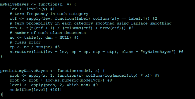
その昔、2001年~2007年にかけて、遺伝子発現解析をやっていた頃、SVM (support vector machine)やNeural Networkを使用していました。肝臓由来の細胞に対し肝臓関連の副作用が知られている医薬品と、そうでない医薬品を曝露して、曝露後の遺伝子発現のパターンを見て、医薬品の肝毒性をin vitroで予測する、実験モデルを組み立てようとしていました。あまり、基礎的な経験のない中であれこれ考えても打開策が見つからず、また今思えば、根本的なデザインに無理があったようでもあり、結局なかなかよい出力が得られなかった苦い経験でした。
今回は基礎体力をつける意味で、インターネット上ですでにうまくいっているようなデータやスクリプトを基に自分なりに試してみます。正解があるものをトレースするのは、良い練習になります。
今回試したのは、「ナイーブベイズ分類器」というものです。なぜこれを試すかと言うと、良い資料を見つけたからです。その資料を基に、試してみたという記事もあるようです。ざっと見たところ、数式でクラクラするのを我慢すると、何をやっているのかおぼろげながら見えてきます。あるカテゴリで相対的に高い頻度で出現する単語を指標にモデルを構築することになるようです。
機能する仕組みは使いながら考えるとして、スクリプトは次のようになります。全くリンク先の資料通りでは本当に芸がなさすぎるので、ちょっとだけ変えてみました。サンプルとしては、森鴎外と夏目漱石の作品を見分けるという課題で、MeCabのサイトで配布されているもの、を学習用の文章として、あとは青空文庫から「草枕」「こころ」(以上漱石)「花子」「あそび」(以上鴎外)をテスト用文章として、用いました。なお、青空文庫の文章はルビがうるさいので、delruby.exeを用いて処理したものでテストしました。
ルビの処理の様子(MS-DOSのコマンドプロンプトから)
delruby asobi.txt > ogai_asobi.txt
delruby hanako.txt > ogai_hanako.txt
delruby kokoro.txt > soseki_kokoro.txt
delruby kusamakura.txt > soseki_kusamakura.txt
これらの出力ファイルとMeCabのサイトから入手したデータをまとめて、setwdで指定したディレクトリの下の/data/writers/の下に置いて、次を実行しました。
library(RMeCab)
# data is downloaded from
# shift JIS
# http://web.ias.tokushima-u.ac.jp/linguistik/RMeCab/data.zip
# UTF8
# http://web.ias.tokushima-u.ac.jp/linguistik/RMeCab/data.tar.gz# indicate data folder
setwd(“C:/Users/Oshima/Documents/2018/R MeCab/”)# convert text files to vector
d <- t(docMatrix2(“data/writers”))myNaiveBayes <- function(x, y) {
lev <- levels(y) #1
# term frequency in each category
ctf <- sapply(lev, function(label) colSums(x[y == label,])) #2
# term probability in each category smoothed using Laplace smoothing
ctp <- t(t(ctf + 1) / (colSums(ctf) + nrow(ctf))) #3
# number of each class documents
nc <- table(y, dnn = NULL) #4
# class prior
cp <- nc / sum(nc) #5
structure(list(lev = lev, cp = cp, ctp = ctp), class = “myNaiveBayes”) #6
}predict.myNaiveBayes <- function(model, x) {
prob <- apply(x, 1, function(x) colSums(log(model$ctp) * x)) #7
prob <- prob + log(as.numeric(model$cp)) #8
level <- apply(prob, 2, which.max) #9
model$lev[level] #10!!
}train.index <- c(1:2, 5:9, 11)
y <- factor(sub(“^([a-z]*?)_.*”, “\\1”, rownames(d), perl = TRUE))
# y; c(“ogai”, “soseki”)model <- myNaiveBayes(d[train.index,], y[train.index])
predict(model, d[-train.index,])
ファイルは名前順にソートされますので、テストサンプルは、ogai, ogai, soseki, sosekiの順に出力されれば正解です。
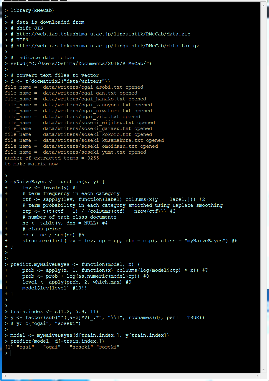
とりあえず、正解が得られていますが、これは元のリンク先の方の功績でしょう。正確な方法で他の手法と比較して実行時間を測定した訳ではないので印象なのすが、この手法は学習がかなり速いです。いずれにしても、とりあえずこのスクリプトの使い方は理解できたぞ。
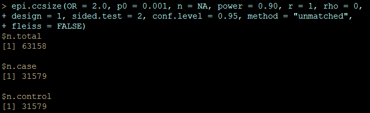
臨床試験だと、試験に参加する被験者をリクルートするのは骨が折れる仕事ですので、必要最低限の被験者で正確な結果を得たいという欲求は大きく、「サンプルサイズ」の正確な見積もりが求められます。ケースコントロールスタディをする場合も、最終的に元資料を確認したり、新たにデータを入手したりする手間は少ない方が良いので、精密な見積もりが出来た方がベターです。しかし、新たにデータを得ることを想定していないデータベース研究では、サンプルサイズを見積もる要求はどのあたりに発生するでしょうか?データベースをベンダーから購入したり、解析をCROに依頼する際に目的の結果にアプローチできるだけの情報を持っているかどうかを見積もる場合には有用かもしれません。まぁ、流行だということで偉い人からの号令で動いているような多くの人は、何らかの結論にアプローチしたいのではなく「アプローチしている姿勢を見せる」と言う、行動計画ありきで動いているみたいですので、当該ベンダーのデータには、リサーチで明らかにしたい結論に到達できるような、十分なデータが含まれないことが購入前あるいは解析の発注前に明らかになったとして、頭を切り替えるかそのまま突き進むかは目に見えていますが。
それはさておき、単純にケースおよびコントロールでそれぞれ、何人中何人が被疑薬に曝露されていて、そのオッズ比を求めるというようなデザインでのサンプルサイズの求め方がありますので、次の資料のデータをトレースしてみます。
Woodward M (2005). Epidemiology Study Design and Data Analysis. Chapman & Hall/CRC, New York, pp. 381 – 426.
(p. 412) A case-control study of the relationship between smoking and CHD is planned. A sample of men with newly diagnosed CHD will be compared for smoking status with a sample of controls. Assuming an equal number of cases and controls, how many study subject are required to detect an odds ratio of 2.0 with 0.90 power using a two-sided 0.05 test? Previous surveys have shown that around 0.30 of males without CHD are smoker.
事前の見積もりに必要なのは、odds ratio 2.0, power 0.90, two-sided 0.05 testという、研究者が設定するパラメータと、先行研究から得ておくべき背景の情報として「冠動脈疾患にかかっていない男性の30%がスモーカーだ」という、コントロール群の曝露頻度に相当する情報です。あと、コントロールを選ぶ際はマッチングは行わないで、ケースと1:1となる人数にするとしています。ここで設定しているオッズ比は、「オッズ比2.0以上だとリスクとして警告する価値がある」と研究者が思い込むような任意の数字で、基準があるわけではないです。これを、認識しているかどうかで、結果が出た際に(特に差がつかなかった時に)データの解釈の書き方が大きく変わります。
> epi.ccsize(OR = 2.0, p0 = 0.30, n = NA, power = 0.90, r = 1, rho = 0,
+ design = 1, sided.test = 2, conf.level = 0.95, method = “unmatched”,
+ fleiss = FALSE)
$n.total
[1] 376$n.case
[1] 188$n.control
[1] 188
答えは
A total of 376 men need to be sampled: 188 cases and 188 controlsだそうですので、一応、数値は正解です。
「冠動脈疾患にかかっていない男性の30%がスモーカーだ」という先行研究も、よくよく考えると書かれていることがあいまいです。冠動脈疾患にかかっていない男性が将来かからないとは言えないですし。禁煙に成功した人をどう扱っているのか情報もないです。ま、それもさておき、背景の喫煙男性が30%も世の中にいたおかげで、少ないサンプルで研究が成立しそうです。これが、世の中の男子の1%しか使用していない曝露(これが医薬品への曝露なら、世の中の1%の男性が使用しているような薬ならブロックバスターですが)曝露との関係を見ようとすると、次のようになります。
> epi.ccsize(OR = 2.0, p0 = 0.01, n = NA, power = 0.90, r = 1, rho = 0,
+ design = 1, sided.test = 2, conf.level = 0.95, method = “unmatched”,
+ fleiss = FALSE)
$n.total
[1] 6418$n.case
[1] 3209$n.control
[1] 3209
6418例の情報を収集する必要が出てきます。このくらいの数になると、どのようにデータを集めるにしても自前でデータを準備して集計するのは大変そうです。組織だって行動する必要がありそうです。さらに、背景の曝露を0.1%に下げると、次のように6万人超えのサンプルの収集が必要になります。
> epi.ccsize(OR = 2.0, p0 = 0.001, n = NA, power = 0.90, r = 1, rho = 0,
+ design = 1, sided.test = 2, conf.level = 0.95, method = “unmatched”,
+ fleiss = FALSE)
$n.total
[1] 63158$n.case
[1] 31579$n.control
[1] 31579
副作用を研究対象にしていると、このcaseの3万人超えの副作用が出ていないと、結論が出せないように見えます。つまり、副作用の例にあてはめますと、3万人以上の患者さんが副作用になるという、結構な大惨事になってからしかこの方法で結論が出せないという、悲惨な手法です。どこに間違いがあるのでしょうか。おそらくそれは、有名なレンツの研究では結果として上記の例よりかなり大きな数字になっているパラメータでしょう。「オッズ比が20~50になるくらいの本当の強いリスクかどうか」を検証したいという、リサーチクエスチョンを立てるのです。
もう一点できる事やるべき事は、背景での曝露頻度を上げるために、対照集団を絞り込むこともできそうです。結論部分で述べたい一般論との兼ね合いにもなりますが、多くの場合世の中一般の集団からサンプルを得る必要はなく、気になる医薬品が使用されるような特定の基礎疾患にかかっている人の中での曝露でp0を設定すれば、調査対象数を少なく見積もることもできそうです。
Don’t forget to load a library prior to the above-mentioned scrips.
library(epiR)
ここに提示されるデータは、治験・市販後の実データを元にしていますが、実際のデータではありません。LearnBayesというRのパッケージはベイズ推計を行えるような関数を提供しています。説明書を読みながら、このパッケージの一部機能を使ってみてみました。
海外の治験のデータがすでにあり、その後国内で試験を行って副作用データが新たに得られた。と言う場合を想定した解析をしてみた。
海外臨床試験では、被験者135例中50例に副作用が報告された。普通の頻度の解析によると副作用が報告される割合は、本剤使用者の37.0% (95%CI; 28.9 – 45.8)となる。
> binom.test(50, 135)
Exact binomial test
data: 50 and 135
number of successes = 50, number of trials = 135, p-value = 0.00328
alternative hypothesis: true probability of success is not equal to 0.5
95 percent confidence interval:
0.2888945 0.4576672
sample estimates:
probability of success
0.3703704
この計算結果をもとに、β分布を推定する。95%信頼区間の上限(p=0.975)を与えるxの値は0.4576672であり、最尤値(p=0.5)を与えるxの値は0.3703704。この2点を与えれば事前確率のβ分布のパラメータが推定できる。
quantile2 <- list(p=.975, x=.458)
quantile1 <- list(p=0.5, x=.370)
beta_parm <- beta.select(quantile1, quantile2)
a <- beta_parm[1]
b <- beta_parm[2]
国内臨床試験では海外より被験者が少なく、23例が安全性解析対象症例となった。23例中11例で副作用が報告された。この結果と事前推定されているβ分布のパラメータを元に前後の分布を図示する。
# 事後分布
curve(dbeta(x,a+s,b+f), from=0, to=1, xlab=”p”,ylab=”Density”,lty=1,lwd=4)
# 実験結果から出てくるイベント発生頻度の尤度
curve(dbeta(x,s+1,f+1),add=TRUE,lty=2,lwd=4)
# 事前分布
curve(dbeta(x,a,b),add=TRUE,lty=3,lwd=4)
legend(.7,9,c(“Prior”,”Likelihood”,”Posterior”), lty=c(3,2,1),lwd=c(3,3,3))
国内試験のデータの分布(荒い破線)のデータが得られた後も、事後の分布(実線)は事前分布(細かい破線)と大きく変わらないようだ。
# 事後の分布による推定
> # 90%信頼区間
> qbeta(c(0.05, 0.95), a+s, b+f)
[1] 0.3222927 0.4550214
> # 点推定
> qbeta(0.5, a+s, b+f)
[1] 0.3872558
事後の確率は0.39 (90%CI; 0.32 – 0.46)で、国内のデータ0.48 (90%CI; 0.30 – 0.66)とずいぶんずれているように見える。
# 国内データのみによる推定
> binom.test(11, 23, conf.level=.9)
Exact binomial test
data: 11 and 23
number of successes = 11, number of trials = 23, p-value = 1
alternative hypothesis: true probability of success is not equal to 0.5
90 percent confidence interval:
0.2960934 0.6648524
sample estimates:
probability of success
0.4782609
上記の臨床試験の結果を元に承認申請がなされ、製造販売の承認を得た。市販後はこの医薬品は治験に参加した被験者の数よりはるかに多い患者さんに使用されて多くの安全性データを得た。治験の結果を事前分布、市販後のデータを加えて事後の分布を集計してみる。
上記の分布を事前分布の確率密度関数のパラメータ推計に用いる
# 90%信頼区間の上限 0.95のx値は0.455
quantile4 <- list(p=.95, x=.455)
quantile4$x <- qbeta(0.95, a+s, b+f)
# 事前確率(点推定; p=0.5)は0.387であった
quantile3 <- list(p=0.5, x=.387)
quantile3$x <- qbeta(0.5, a+s, b+f)
beta_parm <- beta.select(quantile3, quantile4)
a <- beta_parm[1]
b <- beta_parm[2]
国内の市販後の調査に登録され安全性解析対象とされた患者は2072例であり、そのうち964例に副作用が報告された。この結果と事前推定されているβ分布のパラメータを元に前後の分布を図示する。
s <- 964
f <- 2072-s
# 分布を見てみよう
# 事後分布
curve(dbeta(x,a+s,b+f), from=0, to=1, xlab=”p”,ylab=”Density”,lty=1,lwd=4)
# 実験結果から出てくるイベント発生頻度の尤度
curve(dbeta(x,s+1,f+1),add=TRUE,lty=2,lwd=4)
# 事前分布
curve(dbeta(x,a,b),add=TRUE,lty=3,lwd=4)
legend(.7,35,c(“Prior”,”Likelihood”,”Posterior”), lty=c(3,2,1),lwd=c(3,3,3))
市販後の調査のデータの分布(荒い破線)のデータが得られた後、事後の分布(実線)は事前分布(細かい破線)から大きく右へシフトした。
# 90%信頼区間
> qbeta(c(0.05, 0.95), a+s, b+f)
[1] 0.4427958 0.4776115
> # 点推定
> qbeta(0.5, a+s, b+f)
[1] 0.4601712
図から受ける印象の通り、事後の確率は0.46 (90%CI; 0.44 – 0.48)は、事前のデータ0.39 (90%CI; 0.32 – 0.46)とずれているように見える。実は、事後の確率は、国内治験のデータ0.48 (90%CI; 0.30 – 0.66)を精密にしたように見える。
ここまでやってみた感想
疑問がより具体化したので良しとしよう。
前回の記事のつづきです
このアプローチでは、観察期間を単位期間ごと(この場合は1hr)に分割して、イベントが発生した時以外は、コントロールとして、多くのcontrolと少数回のcaseを観察したcase-control studyのようにみなします。原文では[the case-crossover design can be viewed as matched case-control design with 1:M matched pairs]となっていまして、この、「みなす」というのが感覚的によくわからないのですがそういうことらしいです。例題では一人につき1年間観察して、1回AMIが発症たことにしていますので、1例の症例が、集計上8759例のcontrolと1例のcaseのように扱われます。例題では10例いますのでトータルの集計上の観察症例数は87600例と表示されます。matched pairを示す指標としてcase idを使用した、conditional logistic regression modelを用います。Formulaには[case~exposure+strata(id)]を入れます。
ちなみに、このスクリプトで使用されていますreshape2というライブラリのmeltは、こんなデータの変形をしたいと思うときに手作業でやってるようなデータの変形をやってくれる興味深い関数です。
matrix<-matrix(round(c(rr,lo,hi,or,lo.or,hi.or),2),nrow=2,byrow=TRUE)
rownames(matrix)<-c(“RR”,”OR”)
colnames(matrix)<-c(“Value”,”low 95% CI”,”high 95% CI”)
matrix
mat<-matrix(, nrow = T-1, ncol = 0)
for (i in 1:10) {
if (T%%frq[i]==0) {
exposure<-c(rep(c(1,rep(0,T/frq[i]-1)),frq[i]))[-T]
} else {
exposure<-c(rep(c(1,rep(0,trunc(T/frq[i])-
1)),frq[i]),rep(0,T-frq[i]*trunc(T/frq[i])))[-T]
}
mat<-cbind(mat,exposure)
}
commat<-rbind(efftime,mat)
library(reshape2)
data.wide<-as.data.frame(commat)
colnames(data.wide)<-c(1:10)
data<-melt(data.wide,measure=c(1:10))
colnames(data)<-c(“id”,”exposure”)
data$case<-rep(c(1,rep(0,T-1)),5)
head(data)
library(survival)
mod<- clogit(case~exposure+strata(id),data)
summary(mod)
結果として得られたodds ratioは、前記事の未調整のORと大体同じになります。
Case crossover designではcase自身をcontrolとして用いるため、年齢・性別・既往歴や基礎疾患といった症例の背景因子のような交絡因子は調整されているとして扱われています。しかしながら、トレンドの交絡を避けることができません。トレンドの交絡とは?ということですが、参考にしている文献(中国論文1とMaclure文献 2)では、MIの発現は日内変動のパターンを取ることが知られていることを例にしています。そしてコーヒーを飲むのもおそらく日内変動のパターンを取りそうです。そこで、朝、昼、午後、夜に対応して1, 2, 3, 4の値を取る変数clockを導入して調整します。(ただし、例題ではAMIの発症時刻が不明ですので、データがないということでwarningが出ます。私の感覚ではvariable にmissing dataがあるとその観察は計算から除外され、自由度が減るという方がしっくりきます。)
data$clock<-c(rep(1,T/(3654)),rep(2,T/(3654)),rep(3,T/(3654)),rep(4,T/(3654)))
mod.adj<- clogit(case~exposure+clock+strata(id),data)
summary(mod.adj)
先日の記事でBCPNNは、WHOが使用しているシグナル検出方法だ、というようなことを書きましたが実はWHOは少し軸足を別のものに移してきています。その名前はvigiRank。1,2
vigiRankとはどういうものでしょうか。まずは、説明です。3
vigiRank is a data-driven predictive model for emerging safety signals. In addition to disproportionate reporting patterns, it also accounts for the completeness, recency, and geographic spread of individual case reporting, as well as the availability of case narratives. Previous retrospective analysis suggested that vigiRank performed better than disproportionality analysis alone.
曰く、新興安全性シグナルを検出する、データ駆動予測モデル。不均衡な報告パターンに加えて、個別症例報告の以下の点を考慮する。
- 完全性 4(具体的には性別・年齢・被疑薬の使用理由・投与開始日・イベント発現日・narrative・dechallenge rechallenge情報や転帰情報の有無を織り込んだ指標)
- 最新性 (文献では直近3年の報告の件数(割合?)が示されていました)
- 地理的な広がり (文献では複数国からの報告が例示されていました)
- 病歴が入手されているか(定型文や断片的な情報は未入手扱い)
単純なdisproportionality分析より優れたパフォーマンスを示す可能性が示唆されている。
使うパラメータが増えた分利用できる症例数は減りそうです。次の動画の最後の方で紹介されています。この演者は全体にわかりやすいはっきりとした発音なのですが、WHOを「ダブリュエイチオー」ではなく、「フー」と発音しているので聞き落しなく。
<http://www.imi-protect.eu/documents/PROTECTSymposium-Tutorial-Statisticalsignaldetection-UMC.pdf>
前回のコードを少し詳しく見てゆきます。
コーヒーの一時的な効果は、飲んでから1時間継続すると仮定します。Vector c には、AMIで救急外来を受診した患者さんから聞き取った、コーヒーを飲んでからAMI発症までの時間(hr)を代入します。
1年間に何杯のコーヒーを飲むかという頻度(杯/year)をfrqに代入します。今回のこの値の使い方に基づき、一般化してこのスクリプトを使用する上では、1年あたりのTransient effect time(hr)がfrqという見方の方が良いだろうと思います。
Tには、1年間は何時間かという値を入れます。今回は全症例1年を観察期間にしたので定数になっていますが、一般化する上では、評価の対象にした観察期間と理解すると良いだろうと思います。症例ごとに観察期間が違う場合はTもベクターにできると思います。
efftimeには、AMIの発症がコーヒーを飲んで1時間以上経過していたらfalse (0), 1時間未満であればtrue(1)というフラグを代入します。Transient effect timeを1hrにしていますので、判定の条件は t>=1を使用していますが、Transient effect timeが2hrなら判定条件をt>=2にしたらよいでしょう。その際もフラグ(返り値)は 0, 1のままで結構です。
Mantel-Haenszelの計算式からRR (relative risk) を計算します
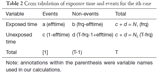

としましたので、次の式になります。
分散を求める式では
この部分をコード化すると
標準誤差は分散の平方根で以下のようになります
オッズ比は次の式で表現されますので
これをコード化すると
分散は次のように表現されますので(元論文のこの式の「=」の左側、var[ln(RRchm)] は、おそらくvar[ln(ORchm)]の誤植だろうと思っています)
これをコード化すると次のようになります
標準誤差は分散の平方根で以下のようになります
で、集計にはこれとは別のアプローチが紹介されていましたので次の記事へつづきます
前記事で悩んでいた部分がクリアになってきました。そして、自宅SASのライセンスが切れていたという問題も解決しました。
このSASは無料で使用できてちょっとテストコードを走らせるのにはいいんですが、ビッグデータは扱えないなどの制限があります。OSIM2の巨大データも読み込めません。ただ、元データが大きくても実際の解析対象をデータを抽出して、絞ってデータのサイズを小さくすれば無料SASでも十分データ集計ができます。とりあえず、抽出した後の、_drug _conditionのデータからスタートです。こんな感じのSASスクリプトを実行しました。
これは、基本的に他人様の書いたスクリプトなので、この結果が正解だろうという前提で提示しています。
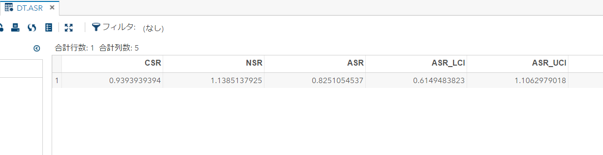
で、同じデータを自作のスクリプトでも実行。自作スクリプトはSQLで集計して、統計的な集計はRで実行、と言う2段構えにしました。データ集計はSQLが快適で良いのですが、F分布の確率密度関数の扱いがSQLだけでは私が苦手なので、データを出力してRスクリプトを実行しました。初めからRでデータ集計をしたら良いのでは?と思うかもしれませんが、Rは大きなデータをデータフレームに入れようとすると、全部オンラインメモリに読み込もうとするのかメモリを食うわ、何かデータのコピーを繰り返すのかスピードが落ちるわ。しまいにはゲロはいて死んでしまいます。ですので、仕方なしにこんなことしています。で、次が実行結果です。
ASR_UCI, ASR_LCIの値が、SASの出力と微妙に一致しません。今回はすぐ気付いたけど、実は当初悩んでいたのも、この問題だったりして。
上手のASRやNSRの出力を見て気づきました。以前と同じ失敗をやらかしてしまったようです。windowsのコントロールパネルの言語設定の追加の設定
の数値タブの小数点以下の桁数を増やします。
データを読み込みなおして、気を取り直して実行です。
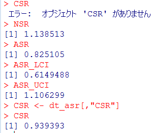
これなら、SASの正解と一致します。めでたしめでたし。
SSAの理解も深まってきたし、これで集計する道筋がついたぞ。
以前Sequence Symmetry Analysis (SSA) がイマイチうまく算出できないという話を書いて、そのまま放置していましたけど、ここの所American College of Physiciansで新しいプロジェクトを開始するという件が、いよいよ動き出すことになってその準備が佳境に入ってきています。先週は、平日に会社を1日休んで準備にあてていました。勤労感謝の今日もかなりの時間をその準備に使っています。旗振り役の某大学の先生とも電話で打ち合わせしましたが、彼女は勤労感謝の今日も休日出勤で一日中病院にいらしたという事で、それでも、学会のプロジェクトの仕事もされていたようです。そうまでして、こういうプロジェクトをしようと言うバイタリティには脱帽です。わたしも、ACPのプロジェクトが忙しくなってきたので他の事はぼちぼち進めます。
SSAについて、まずは日本語の資料から少しずつ読み解いてゆこうと思います。粗順序比は難しくないので、元資料でよいとおもいます。悩んでいるのは、無効果順序比の集計の説明パートから。
まず、ここで疑問が発生。ここに至る前段階で「調査期間中に新規にAとBが発生した患者」を選択しているので、この定義だと、必ずN=nになります。Nとnを分けて記述する意味があるのか? あるとして、いったいどういう事だろうか。
次に、aを求めるところで、分母にxについての∑があるので、観察期間人数の情報になると思うのだが、それを人数nの次元で割って確率になるのだろうか? 分母にも観察期間人数の次元のデータを以て来なくていいのだろうか?
この点を原著に戻って確認しないと、コード化できない感じです。つまり、入口の理解でつまずいていることが確認できました。
2017年はproductivity の高い年を過ごしました。この文章の大部分を書いているのは2017年秋ですが、この記事を公開できるのはAnnals of Internal Medicine誌およびJAMA oncology誌でarticleが出版され公開された後にしましたので、もう2018年の冬です。2017年1年でCirculation のリサーチレター、Bone Marrow Transplant, Ann Int Med のレターそしてJAMA oncologyの短報が受理・出版されました。C誌、A誌、J誌でそれぞれ驚いた点があります。
Circulation: この雑誌に掲載された私の論文はVEGFシグナル系の阻害薬についての論文でした。投稿から受理まで、編集部・レビューワーとやり取りしてる間、一貫してVEGF阻害薬という表現でコミュニケーションしていました。解析したのはVEGFつまりリガンド側を阻害するものと、その受容体側を阻害するものがありました。これらをひっくるめて受容体の活性化を阻害するものという事で、広義ではVEGF阻害薬とまとめて表現しても間違っているわけではありません。その表現で一応専門家によるレビューも通っているのでアクセプトした状態から、その表現を変えるようにリクエストが来ることは通常はありません。ですが、今回はいざ出版という、ガリプルーフをもらうタイミングで「(狭義で)VEGF阻害といえば、リガンドの阻害薬であって、受容体の阻害薬を含める表現ではない」というような横やりが入り、出版直前で論文のタイトルの修正を依頼されました。一旦受理されていますので、出版部の方は低姿勢で依頼してきました。もちろん快く引き受けて、タイトルから本文、何か所も修正しました。ちゃんと全部修正ができているか念のため確認したりするのに神経と時間を使いました。
欧米の出版社とかは、業務をやっつけ仕事としてやっている人が多いだろうと思っていたので、出版物のクオリティを高めるけど出版スケジュールに悪影響が出かねない今回の様な対応をとったことは驚きでした。
Ann Int Med: この雑誌は、レターの投稿方法が一風変わっています。あたかもFacebookや一般のblogにコメントするような形で投稿します。ホームページ上で掲載された多くの研究論文には、下の方にコメント欄があって、そこに入力すれば投稿することになります。簡単な審査はあるようですが、スパムのようなものでなければ、投稿したコメントはしばらくしたら、ホームページ上で公開され、インターネットを介して誰でも見れるようになります。ただし、ホームページで公開されたコメントがすべて雑誌に掲載されるわけではありません。ホームページで公開されますと、一般の読者や元の研究論文の著者らの目に触れ、そうした人たちがコメントに対してさらにコメントしたりします。こういった、世の中の反応を見て編集者が雑誌に掲載するコメントを選びます。おそらく、盛り上がったやり取りがなされていたら、それはつまり、世の研究者らの関心が高い話題についての議論だということでしょう。ホームページにコメントを公開することで、世の中の注目度を観察して、それを参考に編集者は選んでいるのです。インターネットでの記事の公開と、紙面での雑誌の編集が双方向に作用しているのです。
一方で、この手軽さが問題を引き起こしました。通常の雑誌の記事の投稿であれば、投稿時に共著者の情報も正確に提出することが求められます。しかし、今回はとりあえずコメントと、筆頭著者の連絡先だけが求められていました。ですので、accept のレターには、共著者のメールアドレスを教えてほしい、という内容が書かれていました。ここで、大変な粗相をしてしまいました。じつは別のコメントについてacceptのレターが来たのと勘違いして、別の共著者にCOIのフォームやcopyright transferの確認をしてしまったのです。この時連絡を取ったみなさん、Ann Int Medにお名前が掲載されるとして喜ばれたはずです。「間違っていました、別の共著者と投稿した奴」でしたと説明するのが本当に気まずかったです。
JAMA oncology: こちらの編集の方にも驚かされました。投稿して2-3週間ほど経過したときにdecision letterが来ました。1週間ほどで来る連絡は通常忘門前払いです。編集者がざっと見てレビューワーにも回さずに返却します。2-3週間も速い方です。このタイミングで来る返信も経験的にはrejectが少なくありません。レビューワーがあまり深く読み込まずに、「この雑誌には向いていない」とか言って返します。でも今回は忘れもしません。健康診断を受けるために近くの医療センターで検査を待っているときにメールが届きました。健康診断の検査を受け、その待ち時間に何度もメールを読み返しました。それとほぼ同時にCOIのフォームやcopyright transferのレターが共著者の方にも送られていました。そして、内容はと言うとレビューワー二人がそろって興味を示してくださっていました。
・ This article should be prioritized for publication. (reviewer#1)
・ The conclusions are important to disseminate to practitioners quickly. (reviewer#2)
ところが、このprioritize, quicklyは若干曲者で、再解析が必要な内容を含め2-3週間で回答するようにという内容でした。通常であれば、2-3か月の間にリバイスするように要求されるのですが、異例の短さです。幸い、初回の投稿前に検討したようなデータでしたので、実際には再解析することなく、以前検討したデータを探してテーブルにまとめる程度で対応できました。
さらに、奇妙な指摘は続きます。「FDAのデータを使用したということだが、FDA内部でこの件は検討されているのか?」そう言われても、FDAを辞めたのは20年前だし、知り合いがいないわけではないが内部の事を聴けるような間柄ではないし。「公式の公開文書を見る限り、FDAが検討した形跡はない」としか答えられません。
異例なことは次のリバイスでも起きます。reviewer#2がなぜかご自身の名前を明かしたうえで、リバイスをリクエストしてきました。そんなに難しいことではなかったのですが10日ほどで対応しろと、その、スケジュール感が若干つらかったです。幸い、その週は会社の仕事がそこまで厳しくなかったので、平日も帰って夜にも集計をする気力が残っていました。
無事アクセプトされ、ガリプルーフが来ると驚いたことに、タイトルを修正され、アブストラクトの項目を結合して文章をまとめ、テーブルのタイトルを修正し、とかなりジャーナルのスタイルを優先した形での変更がなされていました。数値が多いのでQC箇所が多数です。テーブルも体裁が修正されたので一通り数値をチェックです。数か所コメントと修正依頼を書いて、それでアップルーブしました。アップルーブ後に共著者から、修正した個所に文法的な間違いが発生していることを指摘されましたが、データやデータの解釈等論文の主旨にかかるものではないエラーであるため、アップルーブ後の修正を求めないことにしました。
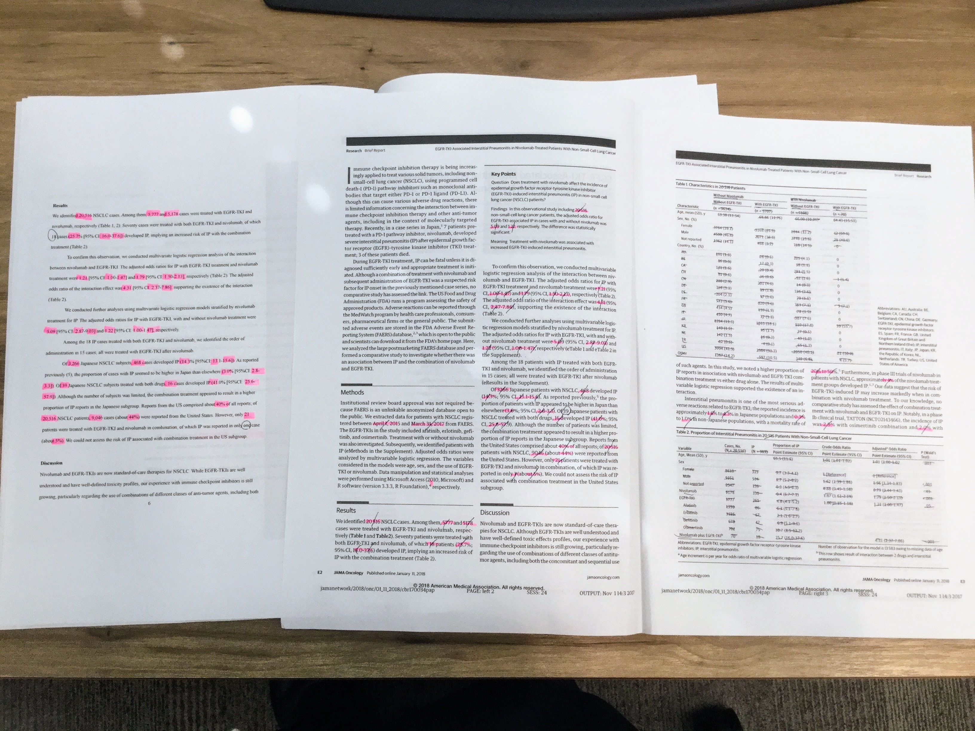
最後に、もう一点、JAMA oncologyは初回のレビューが終わった時点でtwitterでつぶやく言葉を一緒に述べるようにとリクエストしてきました。そう。出版社がつぶやく記事の宣伝のためにtwitter用の言葉も一緒に提出させるのです。このJAMAのtwitterやAnn Int Medのレターを見ますと、新しい技術・仕組みを取り入れて出版社も生き残りにチャレンジしているのです。また、Circulationの件のようにリスクを冒しても質を高めるようなこだわりの側面を見ました。これまで抱いていた欧米人のイメージを書き換えるような経験です。彼らチャレンジャーは旧態依然としたままでは、それぞれの世界で生き残れないのを知っているのでしょう。
2017年の年末に、東京大学医科学研究所の病院同窓会が開催されました。そこでの、研究所の所長の挨拶が印象に残っています。まず、第一声がマスメディアのカメラの前で頭を下げなければならないような事態が発生せず無事年を越せそうだ、として、職員に対して感謝の意を述べました。このくだり、言葉は違いますが同じ内容を病院長も延べられました。東京大学の研究所やその附属病院という、世間からの注目度も高い、そして、かなり大きな組織ですので、その組織の長をすることで神経をすり減らしていることが伝わってくるご挨拶です。
次に述べられたのが、研究所の歴史に絡んで、今後の生き残りについてのお話でした。東京大学医科学研究所は昨年開所125周年を迎えた記念行事を開催しましたが、開所当時は国民の健康に大きな影響を持っていたのは感染症でした。開所当時の伝染病研究所(現医科学研究所)が戦った標的は、感染症であり、感染性病原体でした。そしていまから50年前には、医科学研究所に改組され、遺伝子やゲノム研究に研究対象や手法がシフトしてゆきました。そして、現在医科研は研究対象を実社会で膨大に拡張してきている大規模データに舵を切ろうとしています。これもまた、生き残りをかけて新しい可能性にチャレンジしようとしているものだと思われます。
OHDSI Symposium 2017の様子を撮影したビデオが公開されています。
SCCSを自分なりにもう一度噛み砕いて計算の流れを納得した上で、それが間違っていないことを確認したいというのが目的再び挑戦です。前回使用した他人さまの書いたプログラムを参考に、計算の細かい考え方がわかったところで、もう一度どういう計算が必要かを考えています。始めは写真のような、手書きのスケッチで考え方を整理。
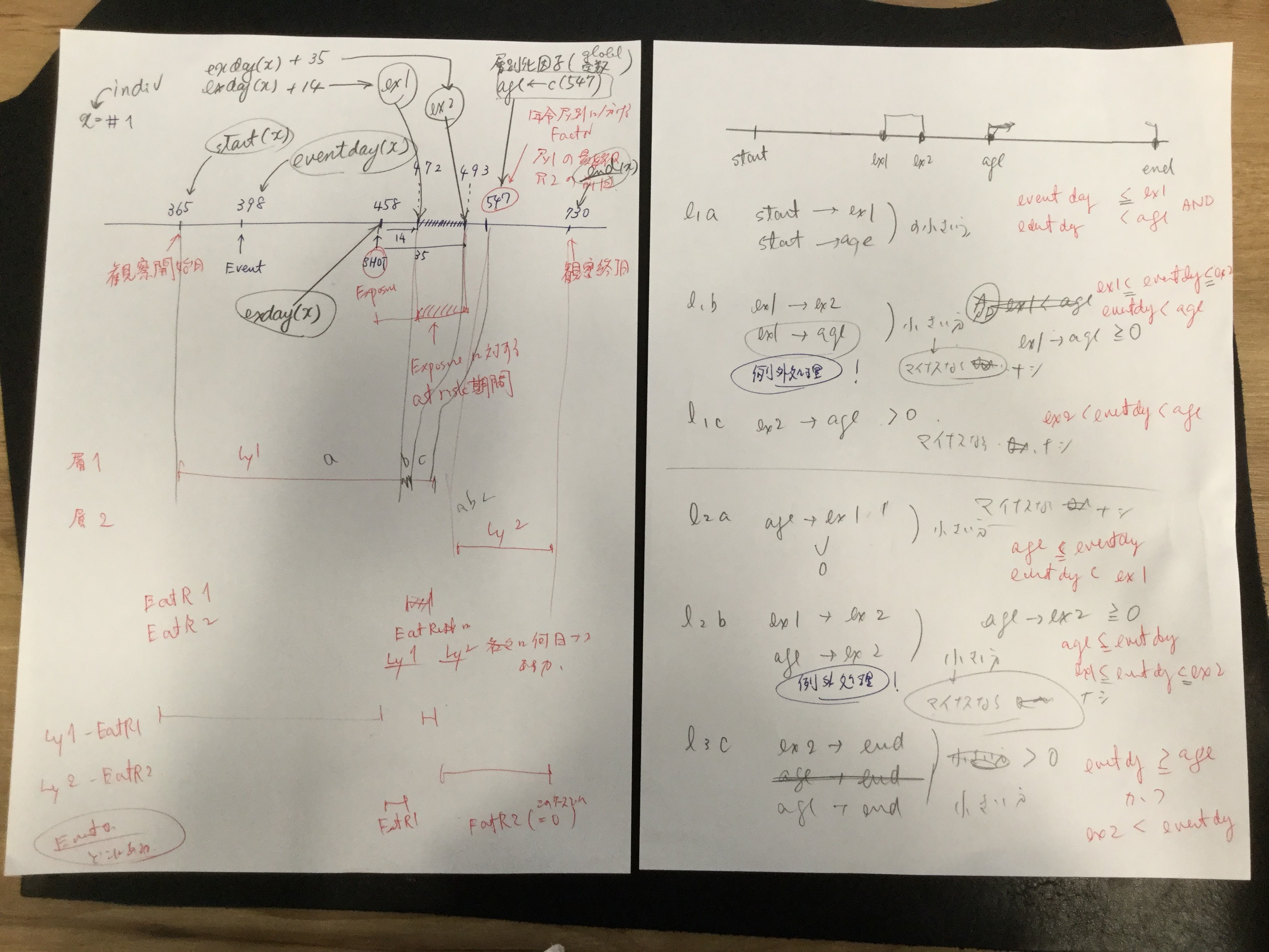
他人様の書いたRスクリプトを、SQLで表現しなおして、中間テーブルのデータを比較。結果を出力すると、正しいスクリプトだと38行になるところが、今回作成したスクリプトでは39行に?観察期間外にワクチンが接種された患者さんがいることを考慮した例外処理を含め忘れていました。
そんなこんなで、例外処理をするスクリプトを加えた結果が次の写真です。logの有効桁数が違うけどそれ以外内容は同じになりました。

上の通り、中間テーブルは一致しましたが、オッズ比が一致しません…そんな馬鹿な?しかも、だいたい同じくらいになるんだけど、微妙に不一致。
自分の集計結果:

論文の集計結果:
いろいろ調べていると、SQL出力をcsvファイルにして、それをRに取り込んだところでデータの桁数(小数点以下)が減っています。元々小数点以下6桁あったはずなのに、2ケタに丸められています。何でこういうことになるのでしょうか? 読み込むRのread.csv関数の設定か? はたまた、読み込んだ後にdata.frameにするところで、宣言しなくてはいけないのか?
結局読み取り側の問題ではなく、書き出しに問題ありでした。書き出しの際には、Windowsのコントロールパネルの言語設定のところから桁数を2 -> 6 と大きくすることが必要だということです。

ちゃんとSQLのデータを吐き出すことに成功し、読み取って計算すると、論文のデータと一致しました。だいぶ理解が深まってきたぞ。

スクリプトはこちら
Letters to the editor merit your consideration as a publication option:
– first, because letters and short pieces stand a better chance of being published than longer articles,
– and second, because published letters to the editor generally are titled and indexed, thus making them retrievable as articles in the journal.
Reference: LaVigne P. Letters to the editor. In: Taylor RB, Munning KA, eds. Written communication in family medicine. New York: Springer-Verlag; 1984:50.
“I would like to congratulate Dr. Dellinger for anexcellent overview of cardiovascular management of septicshock.” で始まり, “This is a very useful clinicalreview in the management of a condition with a high mortalityrate, and I would certainly use this decision tree in my clinicalpractice”と結ぶようなレターの例がないわけではないが、その領域で名の知れた専門家でない限り、一般の研究者・医師がこの型のレターを投稿しても、紙面を割いてもらえる機会はあまり期待できないだろう。
Reference
Pravinkumar E. Letter: cardiovascular management of septic shock. Crit Care Med 2004;32(1):315
記事で述べられた知識をもとに、さらに議論を深めたいと思うことがあるだろう。糖尿病性足潰瘍の治療について述べられた記事に対して、2人の読者が“An effective adjunctive therapy for wound debridement that was not mentioned is maggot therapy”としてレターを投稿した。
糖尿病性足潰瘍に対するうじ虫治療の効果について、私は詳しくないが、6報の文献を参照しその科学的根拠を示していることに加え、その治療法を2名の読者が指摘するという点がその意義を支持している。
Rererence
Summers JB, Kaminski J. Letter: maggot debridement therapy for diabetic necrotic foot. AFP 2003;68(12):2327
記事に反対意見を表明する読者もいる。不妊患者のボディマスインデックス(BMI)と妊娠第一期の転帰について議論した記事に対して、2人の読者が“The authors finally concluded that outcome of singleton pregnancies in patients with infertility was not influenced by BMI. We disagree with these results”とレターを投稿した。
この場合も、複数の読者が反対意見を表明しているという点が一般性を支持している。もし、本当におかしな結論を導いている記事があれば、反対意見を表明するのは重要なことである。
Reference
Bellver J, Pellicer A. Letter: impact of obesity on spontaneous abortion. Am J Obstet Gynecol 2004;190:293
家庭の銃器と殺人・自殺のリスクを調査した疫学調査(ケースコントロールスタディ)の記事に対して、1人の読者が著者の主張(と編集者)に対して疑問を投げかけた。“I doubt the Annals’ editorial board would have published without commentary an article by a pro-gun organization purporting to defend gun ownership. The author’s affiliations with anti-gun ‘research’ groups are no less compelling an argument for bias”このレターと同じページに「銃所持反対」の著者によって書かれたという申し立てとともに掲載された。
今であればconflict of interestで明記すべき内容かもしれない。銃所持支持団体が銃のリスクを論じる文献を投稿したのであれば、バイアスが懸念されるのは当然のこと。ただ、COIに明記されているのであれば、あえて懸念があると指摘することはほとんど意味がないだろう。
Reference
Fritz DA. Letter: lies, damned lies, and statistics. Ann Emerg Med 2004;43(1):141
特に記事を引用することなく、主張を述べる、一種の論説。”Medicine is not exact, and bad outcomes happen. The notion that physicians can follow a formula and avoid successful litigation is false”
確かに、医療は完全ではないので、悪い結果が出ることはあるもので、マニュアルに従っていれば訴訟を避けられるというのは嘘だろう。依頼されていない”Sounding Off” レターはタイムリーで的を得た内容で、うまく叙述されていなければ掲載されないだろう。特に著者が無名の場合には。
References
Grant DC. Letter: I don’t want to hear about the “standard of care.” Ann Emerg Med 2004;43(1):139
元記事に重要な事実の誤認~特に患者の治療方針にかかわるような誤認~があった場合に、指摘されれば掲載される見込みが高いだろう。痛風に対する低用量コルヒチンについての記事に対して、薬剤師が次のような指摘をした。
“discussed the use of low dose colchicine in gout. The treatment dose of colchicine, which has remained at 1 mg initially, followed by 500 mcg every 2-3 hours for many years, should be reviewed. However, they are incorrect to say that the current BNF (British National Formulary) recommends a regimen for colchicine that is unchanged since the 1966 edition. In September 1999 the BNF reduced the total dose of a course of colchicine from 10 to 6 mg. Before 1981 the BNF did not even state the higher limit of 10mg”
ガイドラインの記述を元記事の著者がちゃんと押さえていなかったのは、元記事の著者らの確認不足です。きちんと指摘してあげましょう。ごっちゃんです!
ちなみに、この”Gotcha”、英語版でpokemon goをプレイしている人にはポケモンを捕まえた時に出る言葉としておなじみだろう? 論文で重要な事実の誤認に気づくことは「ポケモンゲットだぜ!」みたいな、感覚で指摘して見ると良いだろう。
References
Cox AR. Letter: colchicine in acute gout. BMJ 2004;328:288
Letterの項に症例報告や原著に値する内容が掲載されることがある。おそらく原著として作成された原稿がいくつかのピアレビュージャーナルでrejectされ、そのうち編集者が短いレターにまとめるなら掲載できるかもしれないと持ちかけたのではないか。迷いとともに原著の情報の多くは無慈悲にもカットされ、Letterになるのであった。
最近では”research letter”というページを提供しているジャーナルもあり、”research letter”のページでは、語数が少ないだけで、原著と同様のピアレビューをする事が謳われているジャーナルが少なくない。
Letter to the Editorを成功に導くのは、努力というよりはインスピレーションです。雑誌の記事を読んでいて手紙を書きたいという衝動にかられる事でしょう。たとえば、「私はこの話題について何かを知っている」とか「私が共有したい意見を持っています。」とか。もちろん、上で述べたとおり、一部のLetterは出版された記事に対してコメントするものではありません。
編集者への手紙のほとんどは、出版された記事に対するコメントです。それらの例では、次のような一般的な構造があります。
執筆を開始する前に、まず各紙のinstructions to authorsを読みます。通常instructionにはLetter to the Editorを投稿する際に満たすべき要件が記載されています。例えば、米国医師会雑誌(JAMA)では、「最近のJAMAの記事を議論するLetter to the Editorは、記事の発表から4週間以内に投稿すること、文章は400語以内で、参考文献は5報を超えてはならないとあります。New Engl J Medでは3週間以内。
同誌ではケース・シリーズや症例報告を含むオリジナルの研究を報告する研究論文もまた歓迎されています。その際には、文章は600語以内で、参考文献は6報を超えてはならず、表または図を1点まで含めることができます。
最近では多くのジャーナルで電子的に投稿することを求めています。
Letter to the Editorは、レビュー論文と同じように提出する必要があります。つまり、タイトルで始める必要があり、レターヘッドのない、普通の白紙に、二重の間隔で原稿を作成する必要があります。Letter to the Editorの原稿は、あなたが単に編集者宛に連絡しているのではないことを示すために、カバーレターと共に送付する事を求めるジャーナルもあります。
あなたはその話題について、何かを述べるだけの背景があることを示すような属性について述べる必要があります。また、潜在的な利益相反についても明らかにする必要があります。
最後に:手紙で議論する記事の著者と個人的に知り合っている場合は、書くべきではないかもしれません。あなたが研究を賞賛するなら、友情があることであなたのLetterは信用を損なうかもしれません。もっと悪いことは、研究を批判すると、あなたのコメントは個人的な攻撃として解釈される可能性があります。
Reference
Journal of the American Medical Association. Instructions for Authors. Available at: http://jama.ama-assn.org/inora_current/dtl.
/谷本先生から戴いたコメント/
臨床試験に関する書簡では、実際に臨床応用する場合の限界に着目し議論を進めると、採択の可能性を高めることができるでしょう。例えば、臨床試験の多くは合併症のない若年者が選択される場合がほとんどですが、実臨床では高齢者や臓器障害を有する患者に多く遭遇します。そのため、臨床試験から得られた知見をそのままの形で用いると問題が生じ得ます。編集者、さらには読者の内在的論理を的確に捉えた上で、彼らにとって、ひいては患者にとって有益な議論を構築して行くことが推奨されます。
/*参考資料1*/ 片岡裕貴先生によるLetterの書き方のLinkedInスライド
/*参考資料2*/井上和男先生によるLetterの書き方のブログ
/*参考資料3*/片岡裕貴先生によるLetterの書き方のワークショップ資料
/*参考資料4*/岩田健太郎先生のブログ. なぜレター執筆が優れた学習、教育手法なのかについて
ここの所注力してきた仕事が一段落して、この週末は良い具合に一息つけます。
さかのぼること数か月、今後使うかもしれない、自分にとって新しい手法を試しておこうと、 Sequence Symmetry Analysis (SSA)をやってみたんだけど、これがイマイチ。何がイマイチって、製薬工業協会のホームページにSASのプログラムが公開されていて、それを見ながらやっているんだけど細かい数字が合わない。結果はだいたい近いところまでは行くんだけど、何か織り込むべきアイディアが足りないのか。ちなみに、作成にかかわったタスクフォースの方々の名誉のためにもう少し書いておきますと、この公開されているプログラムがおかしいというのではなく、まず、他人の書いたプログラムから、何がなされているのかというのを読み解くのはとても難しい作業で、このプログラムを参考にして、何がされているのかを読み取って、そのうえで自分にとってわかりやすいように書き換えるので、おかしなことが起きているのです。おそらくNull effect sequence ratio, NSRの計算のところがキモなのではないかと思いつつ、しばらくこちらは放置して頭を冷やすことにしていました。。
同じself-controlledデザインのSCCSを試してみます。原理はこのスライド2ページ目。当時PMDAで東大epistatの竹内 由則さんが学会発表したスライドからです。

データが公開されているので、手法を試すのにちょうどよいということで、試してみるのは、この文献Whitaker HJ, Farrington CP and Musonda P. Tutorial in Biostatistics: The self-controlled case series method. Statistics in Medicine 2006, 25(10): 1768-1797.に出てくるMMRワクチン後の髄膜炎。Table 2にOxford dataとして提示されています。
| indiv | eventday | start | end | exday |
| 1 | 398 | 365 | 730 | 458 |
| 2 | 413 | 365 | 730 | 392 |
| 3 | 449 | 365 | 730 | 429 |
| 4 | 455 | 365 | 730 | 433 |
| 5 | 472 | 365 | 730 | 432 |
| 6 | 474 | 365 | 730 | 395 |
| 7 | 485 | 365 | 730 | 470 |
| 8 | 524 | 365 | 730 | 496 |
| 9 | 700 | 365 | 730 | 428 |
| 10 | 399 | 365 | 730 | 716 |
データは10例ですべて。観察したのは、全員生後366日から730日。データのカラムstart, endは観察期間の開始を生後の日数で示しています。 exdayがワクチン接種の日、eventdayが髄膜炎と診断された日、で、これも生後の日数で示しています。
元論文では、at risk 期間をmumps virusのreplicationにかかる期間に基づいて、shotから15 – 35日後と設定しました。(元文献のTable 2では、ワクチン接種日は「pre-riskから14を引いた日」になります。ワクチン接種から14日目までがpre-risk, 15日目からがat-riskという考え方だと思います)ダウンロードしたデータにはワクチン接種日がexdayとして入力されていますので次のようにpre-risk(ex1), risk end (ex2)を計算します。設定したat riskの期間によってはスクリプトを触るべき個所がココということになります。
ex1 <- dat$exday + 14
ex2 <- dat$exday + 35
観察期間中のすべての日を、at riskの期間かどうか正確に分類したいので、ワクチン接種が331 – 715日のワクチン接種歴を要求した(原文)ということです。case #10は、716日にワクチンを接種していますが、潜伏期間が観察期間終了後まで継続しますので、結果として観察期間中にat riskの期間がありません。
データをグラフィカルに提示している図があったので、引用。灰色の期間がat riskの期間。そして、547で線が引いてあるのは、ここで年齢層を分けて調整因子として使用しているので、それを示すつもりで線を入れたのでしょう。(例示として示した図の中には、年齢層をまたぐリスク期間を有している症例が出てこなかったので、何を説明したくて547日で線を入れたのかわかりにくくなっていますが。)366 – 547 を1層、548 – 730を2層にしています。観察期間中にイベントが発生したら、それ以降は観察期間にしないというような操作を通常行いますが、この集計では、そうではありません。全体の観察期間を集計して、イベントがどの期間に発生したかというような思想で集計するようです。
年齢層をプログラムしているのはここです。
#age groups
agegr <- cut(cutp, breaks = c(min(dat$start), age, max(dat$end)), labels = FALSE)
agegr <- as.factor(agegr)
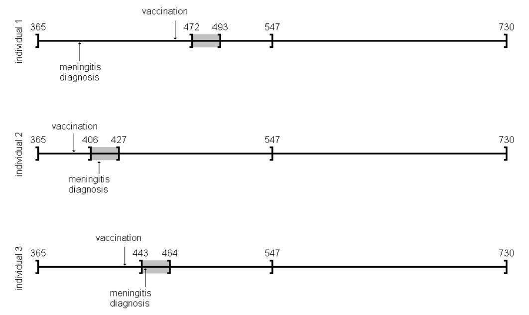
論文の結果が次の通りで、
自分で実行した結果が次。めでたく、結果が一致していました。めでたしめでたし。
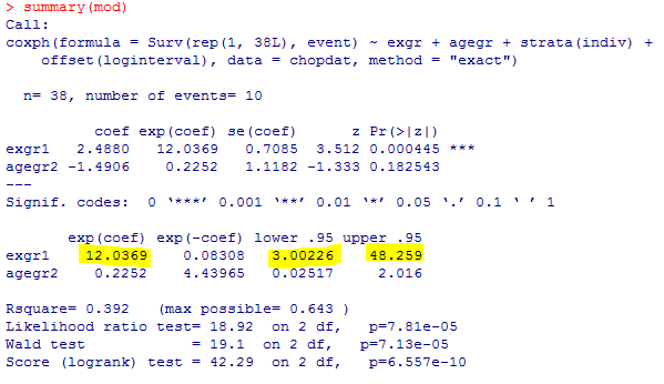
実行したRのスクリプトがこちら。実行に当たっては私の環境に合うようにOpen Universityのホームページのスクリプトを一部改編しました。実行結果が論文で提示されていたものと一致するので、悪くはないだろうと思います。これでまた、新たな手法を用いたいろいろな評価ができる道筋が付きました。(つづく)

Case 36-2025: A 55-Year-Old Woman with Dyspnea, Fatigue, and Gastrointestinal Bleeding
表題の論文をAIとともに読み込みました
(本記事は元文献を見ながら読んでいただく前提ですので、詳細な病歴、画像や臨床検査所見等は元文献をご参照ください)
この資料は、反復的な消化管出血と貧血に苦しむ55歳女性の複雑な症例を解説しています。当初の内視鏡検査では出血源を特定できず、不明熱性出血とされましたが、CT血管造影やMRIによって詳細な病態が判明しました。過去の胆管損傷に対する手術の影響で、門脈狭窄とそれに伴う非肝硬変性門脈高血圧症が生じていたことが原因です。最終的に、手術部位の近くに形成された空腸静脈瘤が出血源であると特定されました。治療として、血管内治療による門脈ステント留置と静脈瘤の塞栓術が施行され、血流の改善が図られています。
Podcast: Play in new window | Download
Case 33-2025: A 27-Year-Old Man with Abnormal Behaviors, Confusion and Seizure
表題の論文をAIとともに読み込みました
(本記事は元文献を見ながら読んでいただく前提ですので、詳細な病歴、画像や臨床検査所見等は元文献をご参照ください)
ニューイングランド医学ジャーナルに掲載された症例報告の抜粋で、異常な行動、錯乱、および発作を呈した27歳の男性の症例報告です。患者は双極I型障害の既往があり、自己判断で薬物治療を中止した後に症状が悪化し、入院に至りました。医師たちは、患者の精神医学的背景と、発作や甲状腺疾患の既往などの医学的特徴を統合し、躁病エピソード、アルコール離脱、および甲状腺中毒症を含む鑑別診断を進めます。最終的に、血液検査、画像検査、および放射性ヨウ素摂取スキャンなどの診断結果に基づき、過去のリチウム使用に関連した可能性のある亜急性無痛性甲状腺炎という診断に至りました。
Podcast: Play in new window | Download
表題の論文をAIとともに読み込みました
(本記事は元文献を見ながら読んでいただく前提ですので、詳細な病歴、画像や臨床検査所見等は元文献をご参照ください)
ニューイングランド医学ジャーナルに掲載された症例報告の抜粋で、呼吸困難、浮腫、およびペースメーカーリードの変位を訴える79歳男性の症例を取り上げています。この症例は、心臓の画像診断に基づいて、当初は血栓や感染性心内膜炎などの可能性が検討されましたが、最終的には急速に成長する悪性腫瘍であることが示唆されました。詳細な診断検査と病理学的議論の結果、患者は稀な原発性心臓びまん性大細胞型B細胞リンパ腫と診断され、その治療計画と残念ながら予後不良であった経過が記述されています。さらに、このリンパ腫がペースメーカーリードの留置困難や洞停止といった初期症状に関連していた可能性についても考察されています。
Podcast: Play in new window | Download
表題の論文をAIとともに読み込みました
(本記事は元文献を見ながら読んでいただく前提ですので、詳細な病歴、画像や臨床検査所見等は元文献をご参照ください)
56歳男性の複雑な症例についての詳細な検討であり、当初はセリアック病やクローン病などの診断が疑われました。患者は慢性的な下痢、貧血、およびIgA・IgM欠乏症などの免疫不全の兆候を呈し、小腸と大腸の間に腸結腸瘻が見られました。初期治療にもかかわらず症状が再発した後、最終的な診断は、特発性原発性低ガンマグロブリン血症に起因するクローン病様腸症を合併したびまん性大細胞型B細胞リンパ腫でした。このケーススタディでは、様々な専門分野の医師が画像診断、病理組織学的検査、および鑑別診断の過程を通じて、最終的な診断とそれに続く化学免疫療法による治療に至るまでの経過を詳述しています。
Podcast: Play in new window | Download
https://www.nejm.org/doi/full/10.1056/NEJMcpc2412536
表題の論文をAIとともに読み込みました
(本記事は元文献を見ながら読んでいただく前提ですので、詳細な病歴、画像や臨床検査所見等は元文献をご参照ください)
播種性結核とHIV感染の症例
43歳の女性患者の症例り、抑うつ状態、自殺念慮、および発熱を呈している進行したHIV感染症を持つ患者に焦点を当てています。症例提示と診断の過程を詳述しており、当初の精神科入院に至るまでの症状、身体所見、および重度の免疫不全(低いCD4+ T細胞数)を示す検査結果が提供されています。医師たちは、患者の臨床的特徴と全身に均等に分布した粟粒状の肺結節を示す画像所見に基づいて鑑別診断を検討し、最終的に播種性結核(Mycobacterium tuberculosis感染症)と診断を下しています。さらに、この文書は、HIVと結核の同時感染の複雑な管理、特に抗結核治療とART(抗レトロウイルス療法)の開始時期、そして免疫再構築炎症症候群(IRIS)のリスクについても議論しています。
Podcast: Play in new window | Download
Case 27-2025: A 53-Year-Old Man with Embolic Stroke and Left Ventricular Apical Aneurysm
はじめに
「脳卒中」と聞けば、多くの人は脳の血管に起きた問題だと考えます。また、「心不全」の原因としては、喫煙や食生活といった長年の生活習慣を思い浮かべるでしょう。これらは医学的な常識として広く知られています。
しかし、もし脳卒中の症状が、実は心臓からの警告であり、その心臓の問題の原因が、生活習慣とは全く関係のない、数十年前に感染した寄生虫だったとしたらどうでしょうか。
この記事では、医学誌『New England Journal of Medicine』に掲載されたある53歳男性の症例報告をもとに、彼の複雑な医療の旅路から得られた驚くべき発見を紐解いていきます。常識が覆されるこの物語は、私たちの健康がいかに複雑で、予測不能なものであるかを教えてくれます。
発見1:脳卒中は「心臓からの警告」だった
この53歳の男性が最初に病院を訪れた理由は、3日間続いた腹部の不快感とコーヒーかすのようなものを吐いた後の、突然の右腕と右脚の脱力感、そして言葉がうまく話せないという症状でした。これらは典型的な脳卒中の兆候であり、彼は神経内科に入院することになりました。
しかし、精密検査を進めるうちに、この医学ミステリーの真の発生源は脳ではなく、心臓にあることが判明しました。彼の心臓は重度の機能不全に陥っており、血液を送り出す能力を示す「左室駆出率」は、正常値(通常50%以上)を大幅に下回る20%まで低下していたのです。
彼の脳卒中は「心原性脳塞栓症」と呼ばれるものでした。これは、著しく弱った心臓の中で血流が滞留(血流の停滞)し、それによってできた血の塊(血栓)が、血流に乗って脳まで運ばれ、脳の動脈を詰まらせることで発生します。つまり、彼の脳卒中の症状は、脳自体の問題ではなく、静かに進行していた重篤な心臓病が発した、最初の「警告」だったのです。
発見2:真犯人は数十年前の寄生虫
医師たちの次なる課題は、彼の心臓がなぜこれほどまでに弱ってしまったのか、その原因を突き止めることでした。心臓は「拡張型心筋症」という状態にあり、特に心臓の先端部分(心尖部)の壁が薄くなる「心尖部瘤」を形成していました。
最初の容疑者は、彼の生活習慣でした。彼は20年間の喫煙歴があり、週末には大量のビールを飲む習慣がありました。しかし、ここで捜査は思わぬ壁にぶつかります。心臓の血管を調べる冠動脈CT血管造影検査を行ったところ、動脈硬化による閉塞が全く見られなかったのです。彼の血管はきれいなままでした。
生活習慣病という最大の容疑者が否定され、診断は振り出しに戻ります。そして様々な検査を経て下された最終診断は「慢性シャーガス病」。これはTrypanosoma cruzi(クルーズトリパノソーマ)という原虫によって引き起こされる寄生虫感染症でした。驚くべきことに、この男性は脳卒中で倒れるまでの10年間、一度も医療機関を受診したことがありませんでした。彼の体を静かに蝕んでいた病の真犯人は、数十年前に体内に侵入し、長く潜伏していた寄生虫だったのです。
発見3:故郷の記憶が診断の鍵となる
正しい診断に至るまで、医師たちは遺伝性疾患、自己免疫疾患、ストレス性心筋症など、幅広い可能性を検討し、一つずつ除外していくという、まさに医学探偵のようなプロセスを辿りました。この複雑なパズルを解いたのは、2つの決定的な手がかりでした。
第一の手がかりは、心臓に見られた「左室心尖部瘤」という特徴的な所見です。心臓の先端に動脈瘤ができること自体が稀ですが、この特定の場所にできることは、シャーガス病による心筋症患者に極めてよく見られる、ほぼ「指紋」のような特徴だったのです。
そして第二の、そして最も重要な手がかりは、彼の人生の背景にありました。彼はこの診断の約15年前に中央アメリカから移住していました。中央アメリカは、シャーガス病が風土病として存在する地域です。T. cruziの感染は、数年から数十年もの間、無症状で潜伏し、その後、心臓に慢性的な問題を引き起こすことがあります。心尖部瘤という強い物証に加え、彼の故郷の記憶という状況証拠が揃ったことで、数ある可能性の中から唯一の正しい診断へとたどり着くことができたのです。
発見4:治療の焦点は「原因」ではなく「結果」に
診断は確定しましたが、治療は単純ではありませんでした。彼のように50歳を超え、すでに慢性的な心筋症を発症している患者に対しては、寄生虫そのものを駆除する抗寄生虫薬治療が有効であるという有力な証拠はありません。慢性期には、身体へのダメージは寄生虫そのものによる直接的な害よりも、長年の感染に対する体の免疫反応と、それによって引き起こされた線維化(組織が硬くなること)が主となるためです。
そのため、治療の焦点は病気の「原因」である寄生虫を攻撃することではなく、それが引き起こした「結果」である心臓のダメージを管理することに置かれました。ベータ遮断薬など心機能をサポートするための複数の薬剤を組み合わせる「ガイドラインに基づく内科的治療(GDMT)」が治療の中心となったのです。
この治療は功を奏しました。治療開始から1年後、彼の心臓の駆出率は約20%から42%まで大幅に回復。心尖部の瘤は残ったものの、心機能は著しく改善したのです。この症例は、現代医療が、特に感染が遠い過去に起きた場合、病気の根本原因を根絶するのではなく、それがもたらした長期的な結果をいかに管理していくかに重点を置くことがある、という現実を示しています。
まとめ
アメリカ北東部での脳卒中の発症から、数十年前に遠く離れた中央アメリカで感染した寄生虫病の診断へ。この一人の男性の旅は、私たちの健康の物語が、最初に見ただけでは想像もつかないほど複雑であることを浮き彫りにしました。一つの症状が、全く予期せぬ原因へと繋がり、診断の鍵が患者の人生そのものに隠されていることもあるのです。
この症例は、私たち自身の健康について、どのような思い込みを見直すきっかけを与えるでしょうか?
Podcast: Play in new window | Download
Case 26-2025: An 11-Year-Old Girl with Chest Pain and Bone and Liver Lesions
表題の論文をAIとともに読み込みました
(本記事は元文献を見ながら読んでいただく前提ですので、詳細な病歴、画像や臨床検査所見等は元文献をご参照ください)
本症例は、11歳少女が呈した胸痛、腕の痛み、そして画像検査で判明した多発性の骨・肝臓病変という、多臓器にわたる非特異的な所見から最終診断に至るプロセスを分析する上で、極めて示唆に富む一例である。初期症状の曖昧さは鑑別診断の幅を著しく広げ、悪性腫瘍、炎症性疾患、感染症といった多様な可能性を考慮する必要があった。この複雑な臨床像に対し、丁寧な病歴聴取、体系的な鑑別、そして検査所見の統合的解釈という臨床推論の基本原則がいかに重要であったかを本稿で考察する。
本症例の初期評価における主要な情報は以下の通りである。
診断に至る過程で、以下の既往歴および生活歴が重要な手がかりとなった。
患者の主観的な訴えと生活歴からいくつかの可能性が浮上したものの、症状は非特異的であり、診断を確定するためには客観的な検査所見の綿密な分析が不可欠であった。次のセクションでは、臨床検査データと画像診断所見を詳細に分析し、それらがどのように鑑別診断の方向性を絞り込む上で寄与したかを検証する。
本症例の客観的評価は、炎症の重症度を示す血液検査と、病変の解剖学的位置と特徴を明らかにした画像診断の二本柱で進められた。これらの情報がパズルのピースのように組み合わさり、当初は広範であった鑑別診断のリストから、最も可能性の高い病態へと焦点を絞り込む道筋を示した。特に、炎症マーカーの上昇と画像で捉えられた特異的な病変パターンが、診断推論の重要な転換点となった。
本症例で得られた臨床検査データのうち、診断的価値が高かったものを以下に示す。
複数の画像モダリティを駆使して得られた所見は、病態の解明に決定的な役割を果たした。
顕著な炎症反応、慢性病態を示唆する血液所見、そして骨・肝臓・脾臓・リンパ節に及ぶ多発性病変という多彩な検査所見は、悪性腫瘍、自己炎症性疾患、そして感染症という、全く異なるカテゴリーの疾患を鑑別診断の俎上に載せることを余儀なくさせた。次のセクションでは、これらの可能性をいかに論理的に、かつ体系的に評価し、絞り込んでいったかのプロセスを詳述する。
小児において骨、肝臓、リンパ節に多発性病変を認める場合、その原因は多岐にわたるため、体系的な鑑別診断アプローチが不可欠である。本症例では、最も重篤な転帰をたどる可能性のある悪性腫瘍、次に慢性的な経過をたどる炎症性疾患、そして最後に疫学的背景から疑われた感染症の3つのカテゴリーに分けて、臨床所見と検査結果を照らし合わせながら論理的に可能性を評価していく手法が採用された。
小児に好発する悪性腫瘍について、本症例の所見との比較検討を行った。
| 疾患名 | 支持する所見 | 否定する所見 |
| 骨肉腫/ユーイング肉腫 | 骨病変の存在 | 病変部位(骨肉腫などは骨幹端に好発するが、本症例は骨端部であった)、軟部組織腫瘤・骨膜反応・皮質骨破壊の欠如、肺転移の欠如 |
| 白血病/リンパ腫 | 肘窩リンパ節腫大、骨髄信号異常、肝病変 | 正常な血算、全身性リンパ節腫大・脾腫の欠如 |
| ランゲルハンス細胞組織球症 | 多臓器(骨、肝臓、皮膚)への関与の可能性 | 発症年齢(1~3歳が好発)、病変部位(頭蓋骨が好発)、画像所見(典型的な溶骨性病変や骨膜反応の欠如) |
上記の分析に基づき、画像所見(病変部位や性状)や血液検査結果が、いずれの典型的な小児がんのパターンとも一致しないため、悪性腫瘍の可能性は低いと結論付けられた。
次に、非感染性の炎症性疾患について検討した。
| 疾患名 | 支持する所見 | 否定する所見 |
| 慢性非細菌性骨髄炎(CNO) | 病変のある骨(上腕骨、胸骨)、良好な全身状態 | 高値のCRP、肝病変の存在 |
| サルコイドーシス | 骨・肝臓への病変の可能性 | 発症年齢、両側肺門リンパ節腫大や肺実質病変の欠如、骨病変の好発部位(手足)との不一致 |
| 慢性肉芽腫症(CGD) | 皮膚感染症の既往、骨髄炎、肝膿瘍、炎症マーカー高値 | 肺炎の既往がない、正常な成長、全身性のリンパ節腫大や臓器腫大の欠如 |
これらの炎症性疾患は、本症例のいくつかの特徴と一致するものの、いずれも臨床像全体(特に肝臓・脾臓への病変の存在や特異的な検査所見の欠如)を完全に説明するには至らず、その可能性は低いと判断された。
悪性腫瘍および炎症性疾患の可能性が低下したことで、感染症が最も可能性の高い原因として浮上した。
体系的な鑑別診断プロセスを経て、疫学的背景と臨床像からバルトネラ・ヘンセラ感染症が強く疑われる状況となった。この臨床的確信を客観的な証拠で裏付け、診断を確定するため、次のステップとして特異的な検査の実施が計画された。
鑑別診断により最も可能性の高い仮説が導き出された後、診断を確定させる上で特異的な血清学的検査が果たす役割は決定的である。本症例では、臨床的に強く疑われたバルトネラ・ヘンセラ感染症を証明するため、血清抗体検査が実施された。
実施された血清抗体検査では、以下の結果が得られた。
IgM抗体の陽性は急性期の感染を示唆し、IgG抗体が著しい高力価であることは、活発な免疫応答が起きていることを示す。これらの結果は、臨床的および疫学的な疑いを裏付ける、揺るぎない客観的証拠となった。
以上の臨床経過、多彩な画像所見、そして決定的な血清学的証拠を統合し、本症例の最終診断は以下の通り確定した。
最終診断: 播種性バルトネラ・ヘンセラ感染症
本症例の診断プロセスは、非特異的な症状と多臓器にわたる病変という複雑な臨床像の中から、正確な診断に至るために不可欠であった思考の転換点を明確に示している。それは、基本に忠実な臨床推論の積み重ねが、いかにして稀な病態の解明に繋がるかを示す好例と言える。
本症例の鑑別診断プロセスから得られる重要な臨床的教訓は、以下の3点に集約される。
患者はドキシサイクリンとリファンピシンの28日間経口投与を受け、臨床症状は完全に消失した。治療終了後の血液検査では、CRPの正常化、ESRの改善が認められ、臨床的および血清学的には治療が奏効したと考えられた。しかし、フォローアップで実施された全身MRI検査では、予想に反し、既存の肝・脾病変が増大し、さらに大腿骨、脛骨、手根骨、右上腕骨骨端部などに新たな骨病変が出現していることが判明した。
この**「臨床的改善と画像所見の悪化」という乖離**は、播種性バルトネラ症の治療効果モニタリングにおける重要な課題を提示している。症状がなく炎症マーカーが改善しているにもかかわらず、画像上の病変が進行するこの現象は、治療期間や薬剤選択の最適化に関するさらなる知見が必要であることを示唆する。本症例では、この結果を受け、アジスロマイシンとリファンピシンによる6ヶ月間の長期併用療法へと治療方針が変更された。
本症例は、丁寧な病歴聴取、体系的な鑑別診断、そして検査結果の統合的解釈という、臨床推論の基本原則に忠実に従うことで、非典型的かつ重篤な播種性感染症の診断に到達できた模範的な事例である。さらに、治療後の経過は、臨床反応と画像所見が必ずしも一致しないという重要な臨床的教訓をもたらした。複雑化する現代医療において、診断から治療モニタリングに至るまで、基本に立ち返った論理的思考プロセスと、予期せぬ所見に対する柔軟な対応がいかに重要であるかを改めて浮き彫りにしている。
Podcast: Play in new window | Download
Case 25-2025: A 93-Year-Old Woman with Dyspnea and Fatigue
表題の論文をAIとともに読み込みました
(本記事は元文献を見ながら読んでいただく前提ですので、詳細な病歴、画像や臨床検査所見等は元文献をご参照ください)
この医療記録は、93歳の女性患者の呼吸困難という主訴から始まり、大動脈弁狭窄症の進行とその他の併存疾患の診断プロセスを詳細に記述しています。医師たちは、患者の症状の原因として心臓および非心臓の両方の可能性を検討し、最終的に大動脈弁狭窄症と、その進行を複雑にした消化管出血による貧血と診断しました。記録は、患者の治療選択肢に関する熟考、特に経カテーテル大動脈弁置換術(TAVR)という選択肢と、最終的に彼女が医療介入ではなく緩和ケアを選択した経緯に焦点を当てています。この事例は、共有意思決定の重要性と、患者の価値観や目標を理解することの必要性を強調しており、医療提供者の視点と患者自身の視点の両方を提供しています。
Podcast: Play in new window | Download
表題の論文をAIとともに読み込みました
(本記事は元文献を見ながら読んでいただく前提ですので、詳細な病歴、画像や臨床検査所見等は元文献をご参照ください)
電子マッサージガン使用後に左膝の痛み、腫れ、内出血を発症した37歳の女性の症例について説明しています。 彼女の病状は貧血と肺高血圧症へと進行し、様々な検査が行われましたが、最終的にビタミンC欠乏症(壊血病)と診断されました。 その後、ビタミンC補給により、患者の血液学的、肺、および皮膚の異常はすべて劇的に改善しました。 本稿は、壊血病の稀な臨床症状、特に輸血を必要とする鉄欠乏性貧血や肺高血圧症などの症状について詳述し、綿密な病歴聴取の重要性を強調しています。
Podcast: Play in new window | Download
Case 24-2025: A 32-Year-Old Woman with Fatigue and Myalgias
表題の論文をAIとともに読み込みました
(本記事は元文献を見ながら読んでいただく前提ですので、詳細な病歴、画像や臨床検査所見等は元文献をご参照ください)
この記事は、疲労と筋肉痛を訴え、最終的にライム病と診断された32歳の女性の症例を提示しています。記事では、患者のSARS-CoV-2感染後の症状の経過、複数の医療機関での評価、および心臓伝導障害の悪化について詳しく説明しています。また、ライム心炎の診断に至るまでの鑑別診断が議論され、血清学的検査と抗菌薬治療の重要性が強調されています。さらに、ライム病の診断方法である二段階検査の利点と限界、および患者の視点も提供されています。
Podcast: Play in new window | Download

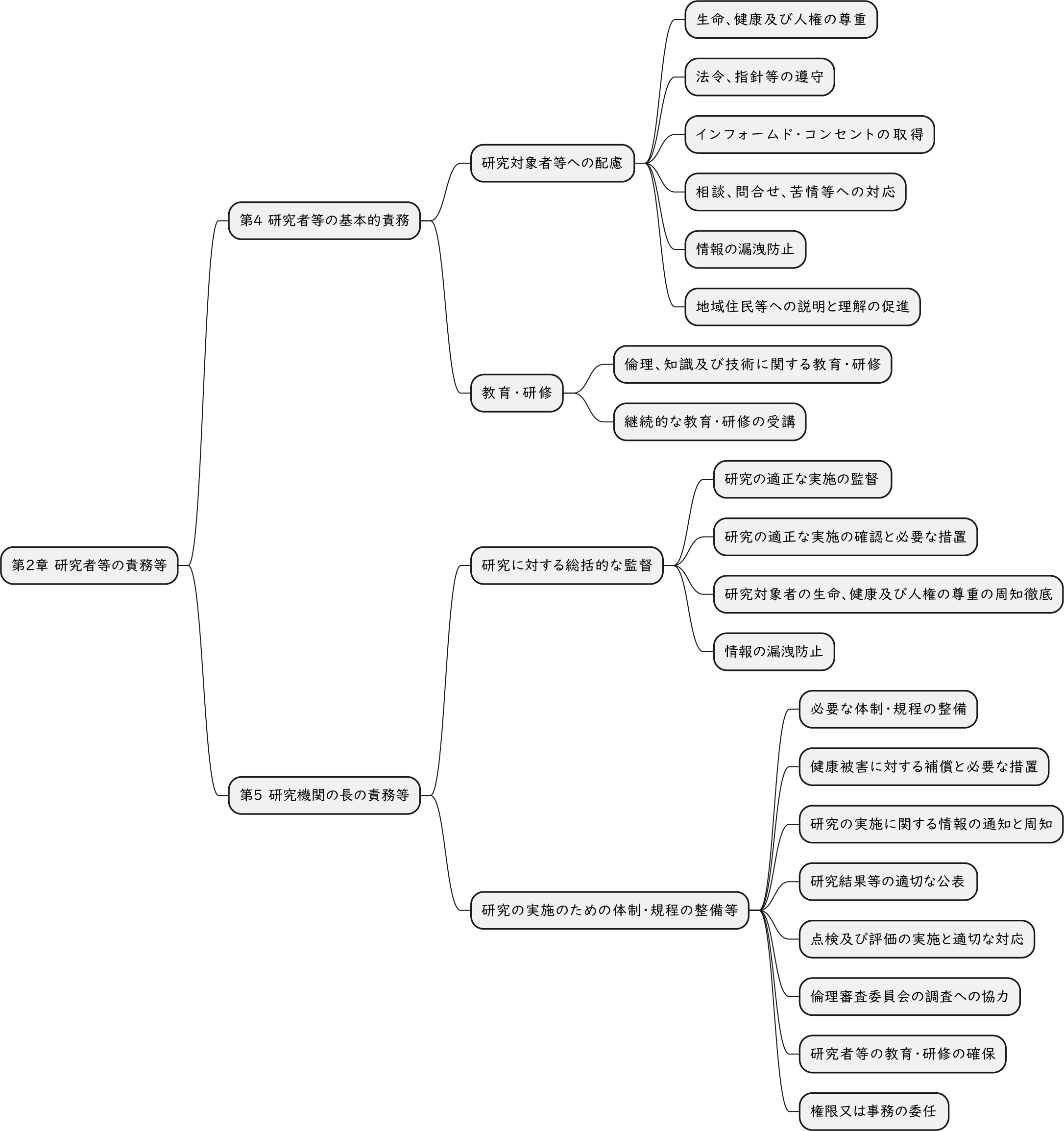
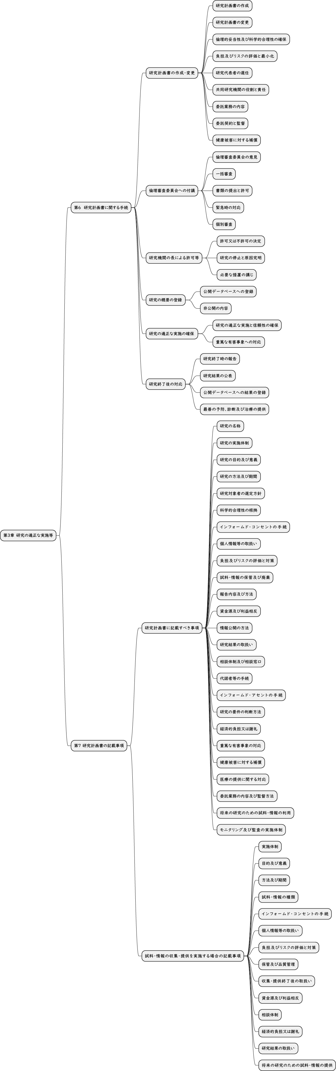
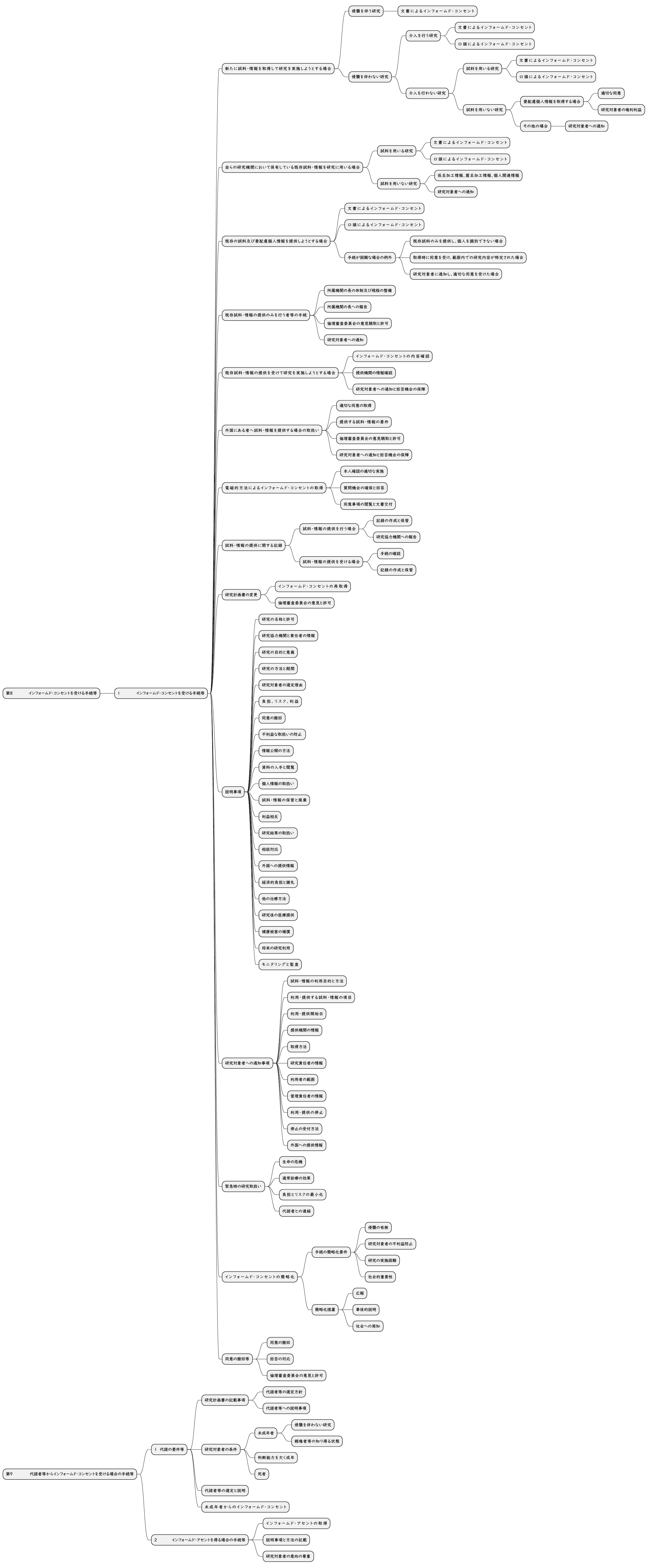
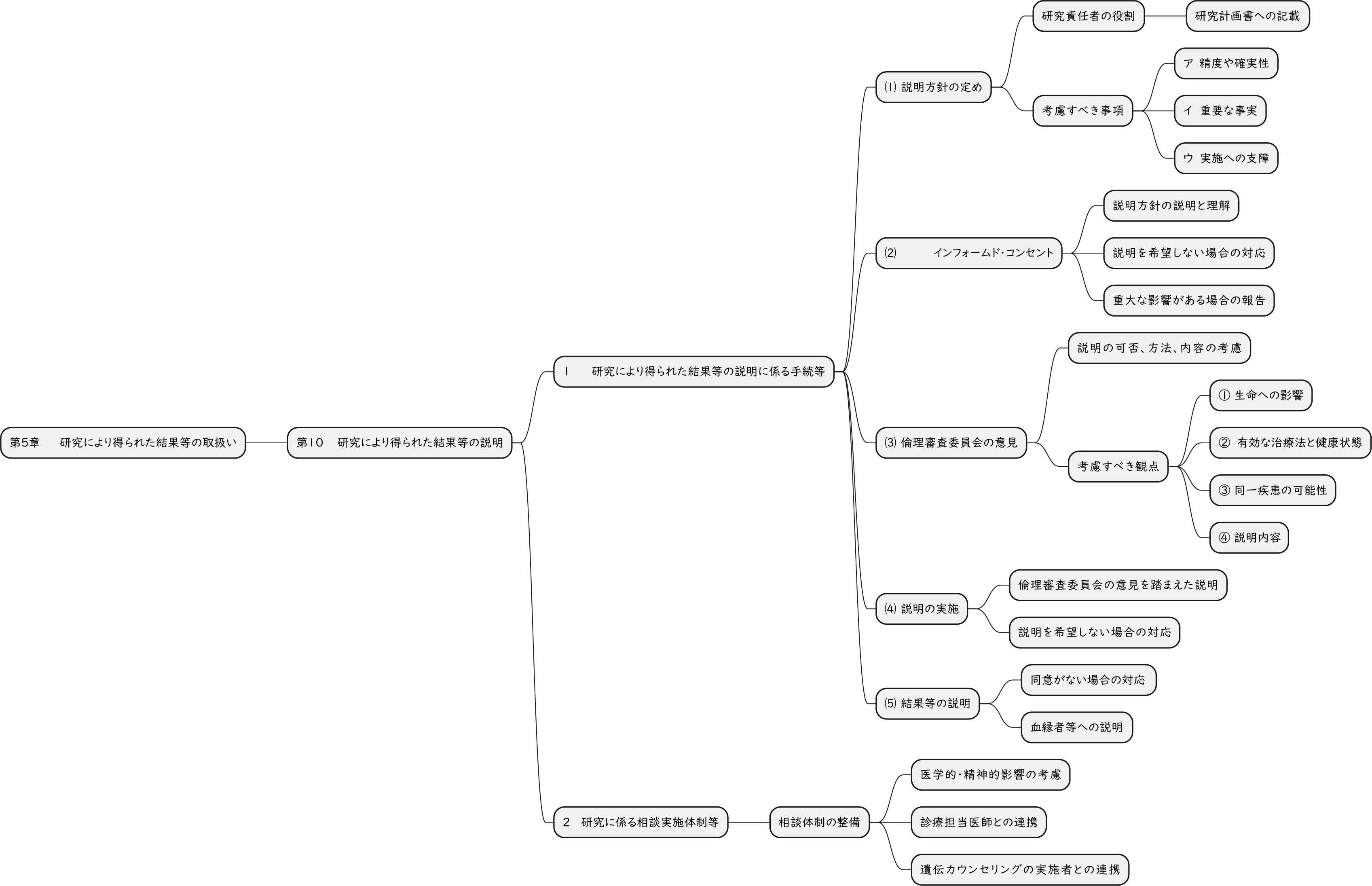
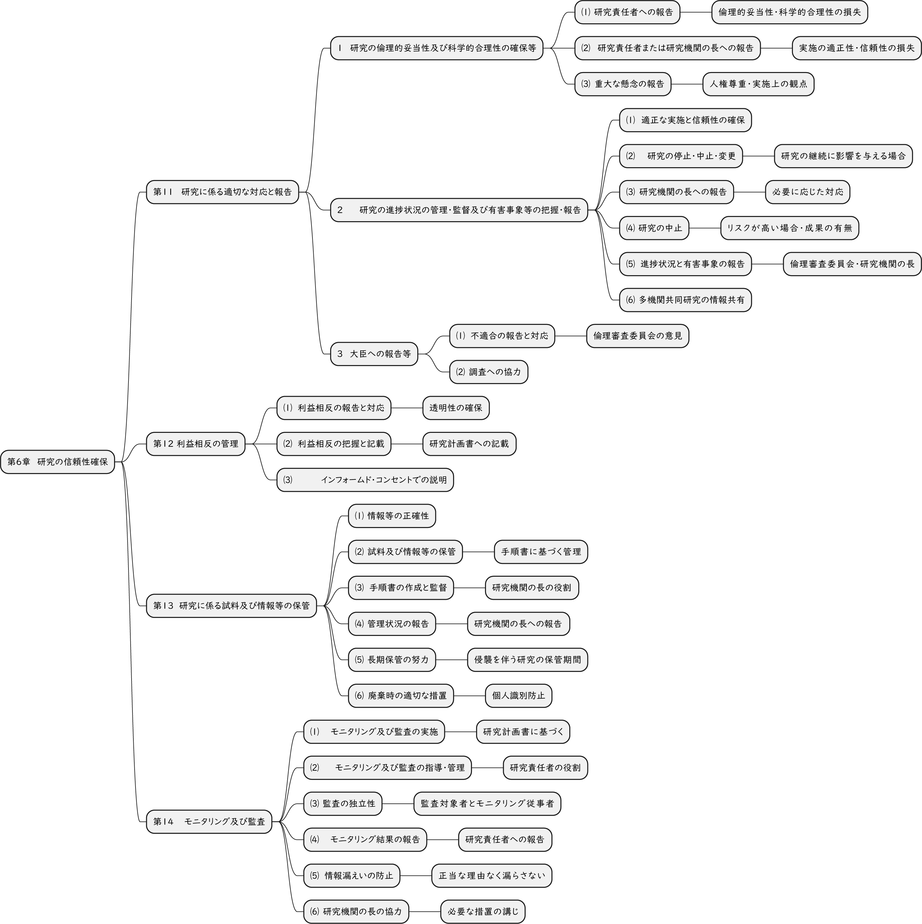
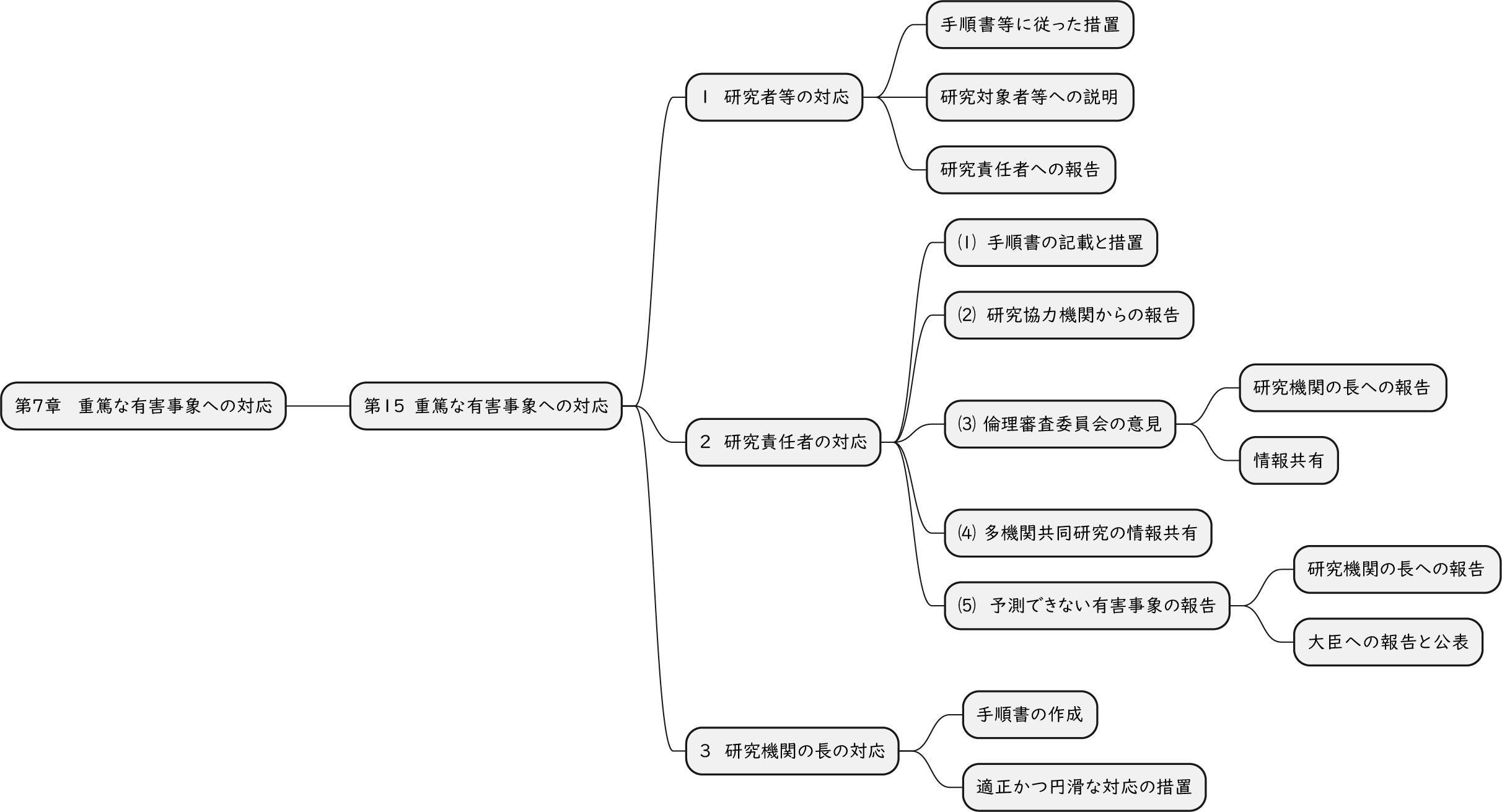
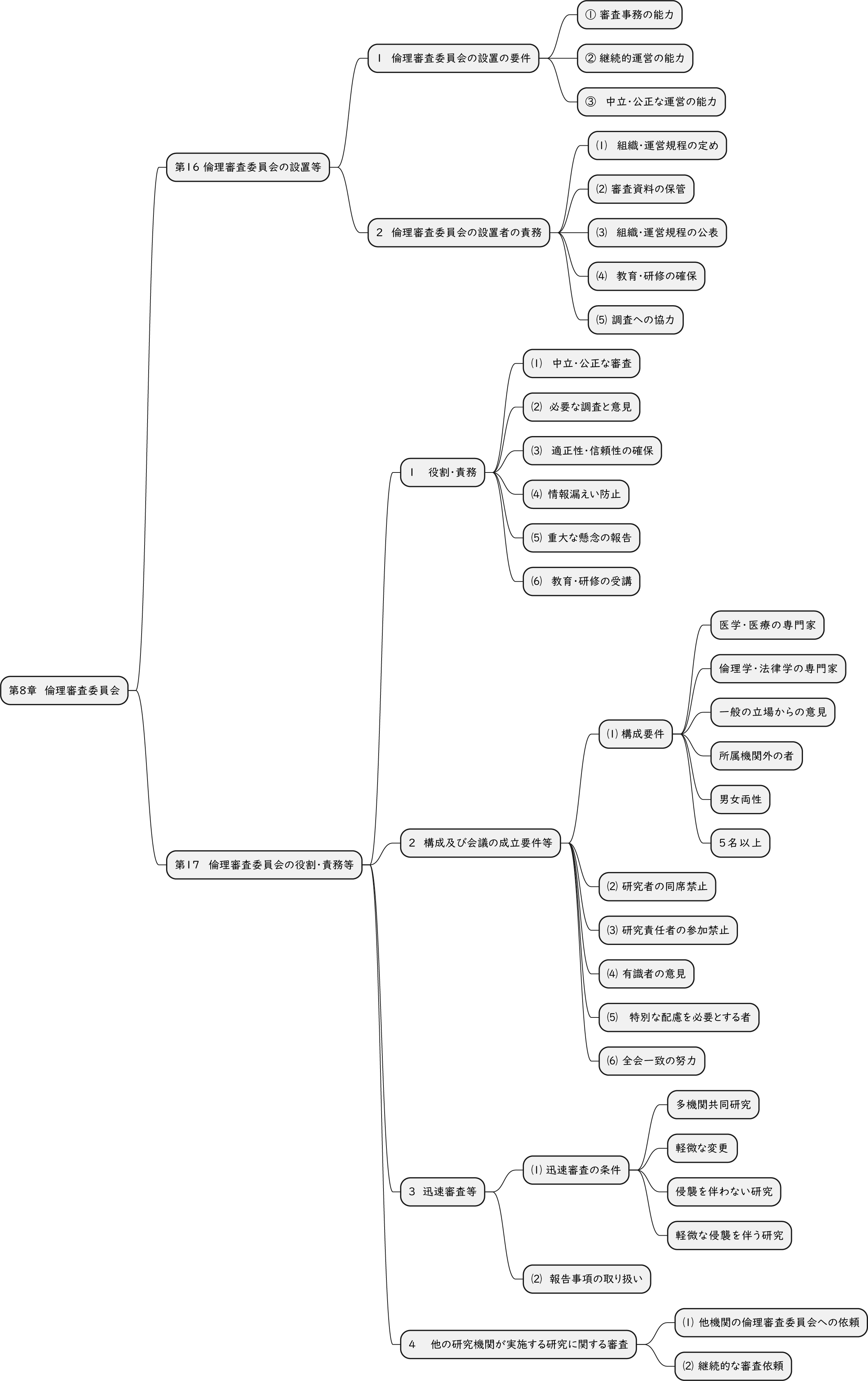
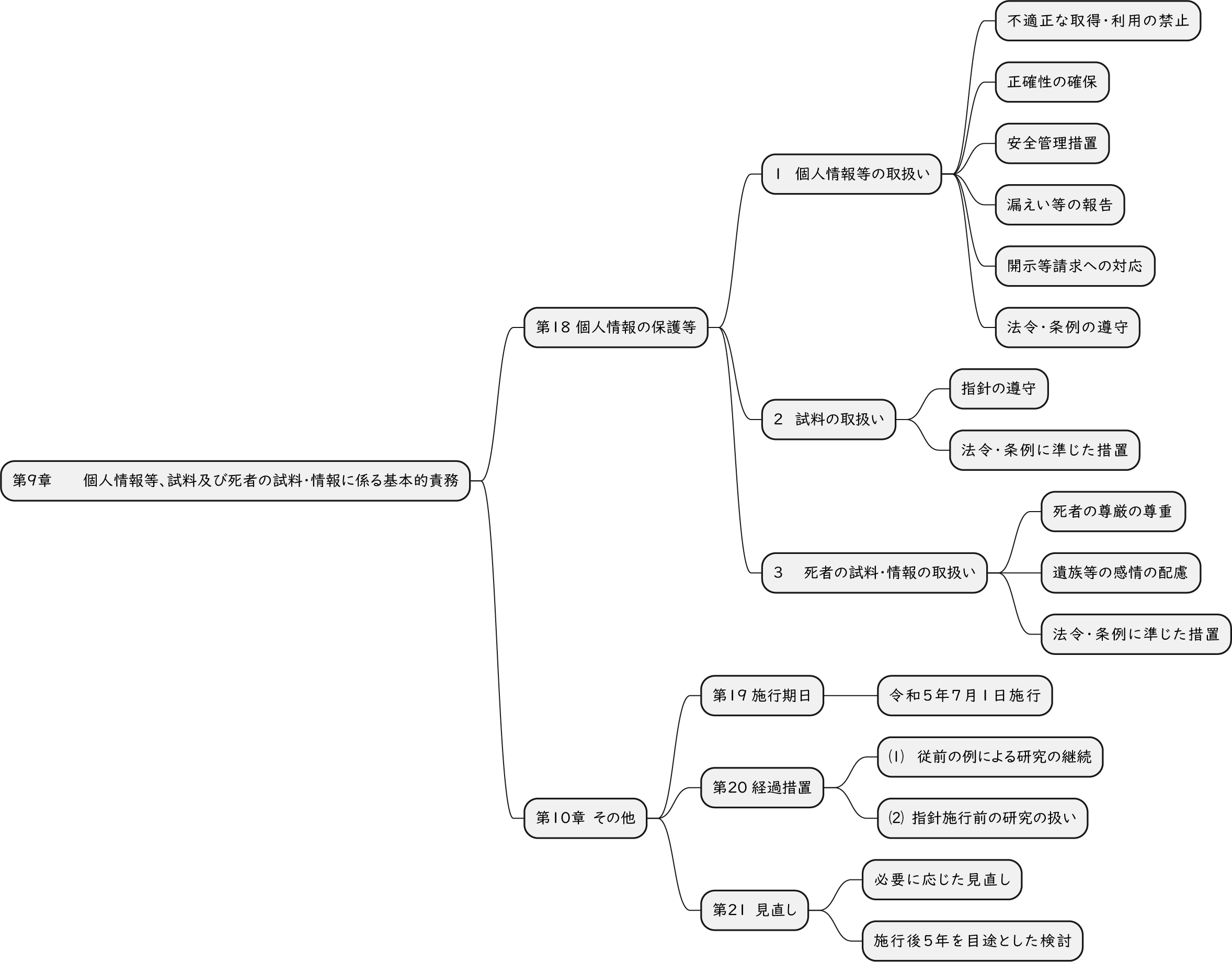
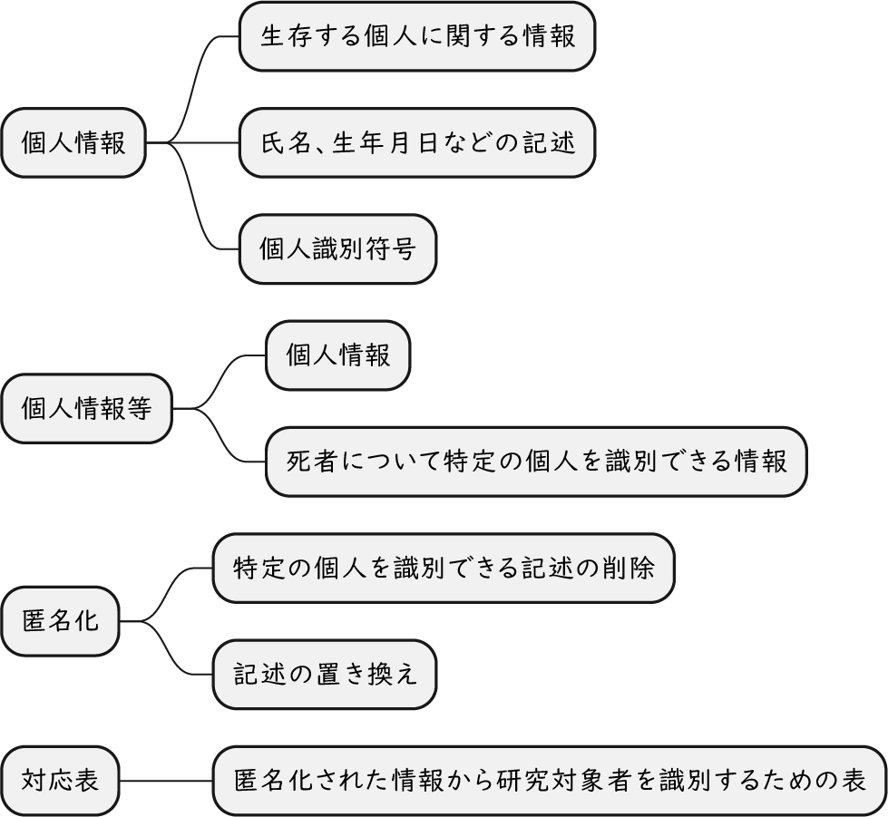